The Breathable Data Grid: How Inner Borders and Transparent Headers Reduce Cognitive Load in Enterprise Data Tables
The Spreadsheet Nightmare in Modern SaaS
For most B2B enterprise software, the data table is the undisputed heart of the application. It is where your users spend the majority of their working hours.
Whether they are managing financial ledgers, tracking global logistics, or processing university enrollments, executives rely on data tables to make high-stakes decisions.
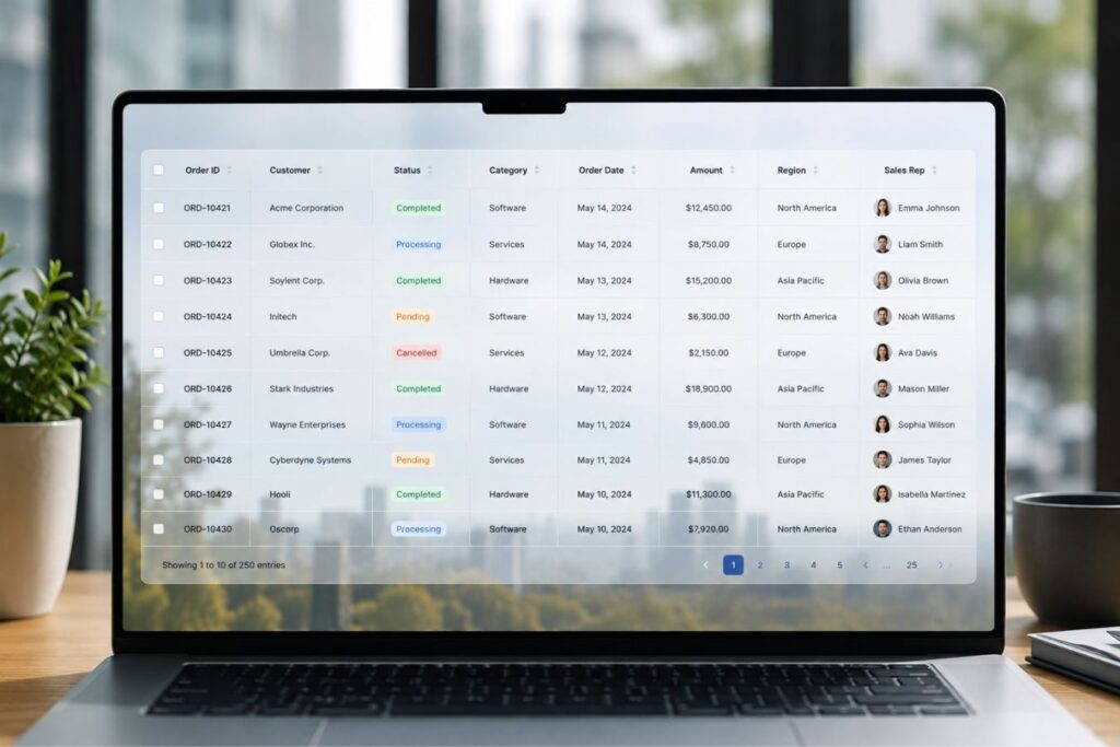
Yet, most SaaS companies treat data table design as an afterthought, opting for clunky, out-of-the-box components that look like Excel spreadsheets from 1995.
💡 Executive Insight: The Cost of Visual Clutter When a data table is overly dense, bordered heavily, and visually chaotic, it creates massive cognitive friction. Your high-ticket clients will experience immediate eye strain, leading to workflow errors, frustration, and ultimately, enterprise churn.
Today, we are unpacking a foundational concept in premium UI/UX design: “The Breathable Data Grid.”
We will explore how stripping away heavy structural elements and leaning into extreme whitespace transforms a boring table into an instrument of digital luxury.
By the end of this guide, you will understand how to engineer high-fidelity data grids that look expensive, load instantly, and demand executive attention.
Why Legacy Data Tables Fail the Executive User
Cognitive load refers to the total amount of mental effort required to process information. In a poorly designed data table, the user’s brain has to work overtime just to separate the data from the design.

When you use heavy, dark borders around every single cell, you are forcing the user’s eye to process the grid itself before it processes the numbers.
This is a massive architectural failure. The interface should be entirely invisible; only the data should command attention.
The psychological triggers of data table fatigue:
- The “Jail Cell” Effect: Wrapping every row and column in a solid border traps the data, making the screen feel incredibly claustrophobic and rigid.
- Aggressive Zebra Striping: Using highly contrasting alternating row colors (like bright gray and white) creates visual vibration, physically fatiguing the retina over long sessions.
- Zero Visual Hierarchy: When the table header, the primary data, and the secondary data are all the same font weight and color, the user cannot scan for critical anomalies.
Over the last 9+ years of engineering digital experiences, we have found that enterprise buyers inherently distrust ugly software. They equate cluttered UI with a messy, unstable backend.
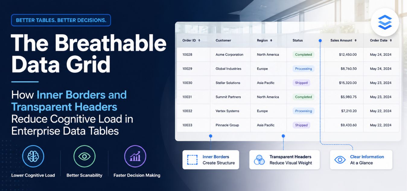
Engineering the Breathable Data Grid
To achieve a true enterprise-grade aesthetic, you must completely rethink the structural anatomy of your tables. By embracing absolute minimalism and mathematical alignment, you transform claustrophobic spreadsheets into frictionless digital environments where data appears to float seamlessly on the screen.
| The User Challenge | The Architectural Solution | The Business Benefit |
| Cognitive Overload: Dense, rigid gridlines cause immediate visual fatigue for executives who analyze complex data all day. | Structural Restraint: Systematically strip away vertical borders and thick bounding boxes, replacing them with extreme negative space. | Frictionless Analysis: A breathable environment where data scanning feels effortless, accelerating workflow and reducing UI-driven churn. |
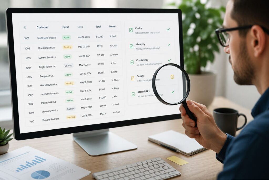
Before vs. After: The Aesthetic Evolution
- Before: A cramped, 1995-style spreadsheet. Data is trapped inside harsh black boxes, tight rows cause eye strain, and a bulky colored header visually disconnects the table from the rest of the software.
- After: A premium, high-fidelity interface. The data floats effortlessly on the dashboard, guided only by invisible mathematical alignment, transparent headers, and soft 10% opacity horizontal dividers.
Here is the exact structural anatomy required to build a Breathable Data Grid:
- Zero Outer Borders: We completely remove the thick, bounding box that traditionally surrounds a table. The data should flow naturally and natively into the background of the dashboard.
- Subtle Inner Borders: We only use horizontal lines to separate rows never vertical lines. These lines are rendered at an incredibly low opacity (e.g., 10% white in a premium dark mode).
- Massive Padding: We double the standard vertical padding between rows. This injects crucial “oxygen” into the table, giving the user’s eye a place to rest as they scan horizontally across the screen.
- Transparent Headers: We strip the background color entirely out of the table header. The column titles blend seamlessly into the dashboard background without creating a harsh visual break.
By systematically removing visual barriers, you eliminate cognitive friction and ensure that your most complex data becomes your most beautiful, highly readable asset.plex data analysis feels effortless.
The Power of the Transparent Table Header
One of the most common mistakes in SaaS design is treating the table header like a massive, colorful block that sits on top of the data.
Designers often fill the header with a solid gray, blue, or harsh black background to “separate” it from the rows below.
This creates a harsh, unnatural visual break that stops the user’s eye from moving smoothly down the page.
Why transparent headers elevate the digital experience:
- Seamless Integration: A transparent header allows the table to feel like a native, organic part of the dashboard, rather than an isolated widget embedded on the page.
- Focus on the Payload: By making the header background transparent and the text slightly muted (e.g., a soft gray), you ensure the actual data below it remains the most vibrant element on the screen.
- Modern Aesthetic: Transparent headers are a hallmark of high-ticket, Silicon Valley-grade software design. It instantly communicates technical maturity and aesthetic sophistication.
Instead of a bulky colored box, simply use a slightly thicker, solid horizontal line underneath the transparent header text to separate it from the first data row.
Creating a More Breathable Visual Hierarchy
A transparent header shifts attention from the table structure to the information itself. Instead of relying on background color to define columns, designers can use typography, spacing, and subtle separators.
This approach creates a hierarchy that feels natural:
- Column labels remain visible and readable.
- Data becomes the primary focal point.
- The table integrates seamlessly with the surrounding interface.
- Users can scan information more quickly without visual distractions.
The result is a cleaner experience that supports productivity rather than competing with it.
Using Typography Instead of Background Color
When removing a header background, typography becomes more important. Well-designed transparent headers typically use subtle text styling to establish hierarchy without introducing additional visual weight.
Recommended practices include:
| Element | Recommended Approach |
| Font Weight | Semi-bold (500–600) |
| Text Color | Slightly darker than row content |
| Letter Spacing | Minimal increase for clarity |
| Text Alignment | Consistent with column content |
| Padding | Generous horizontal spacing |
Rather than shouting for attention through color, the header quietly guides users through the data structure.
The Mathematics of Tabular Typography
You cannot design a high-fidelity data table using default browser typography. The way numbers and text align is critical to reducing cognitive friction.
If your numbers do not line up perfectly on the decimal point, or if your text zigzags down a column, your platform will look cheap and unreliable.
Tabular design is a strict, unforgiving mathematical discipline.
The golden rules of data table alignment:
| Data Type | The Alignment Rule | The Aesthetic Reasoning |
|---|---|---|
| Text (Names, Statuses) | Left-Aligned. | Matches the natural reading flow of Western languages, ensuring immediate scannability. |
| Numbers (Currency, Metrics) | Right-Aligned. | Allows decimal points to stack perfectly vertically, making it effortless to compare magnitudes at a glance. |
| Headers | Matches the Data. | The header must align exactly with the data below it (e.g., a right-aligned number column must have a right-aligned header). |
Pro-Tip for Enterprise Platforms: Always use “Tabular Lining” or fixed-width fonts for columns containing critical numbers. This guarantees that a “1” takes up the exact same horizontal space as an “8”, ensuring perfect vertical columns.
Supporting Design with Next.js and Laravel
A beautifully designed, breathable data grid is entirely useless if it causes your user’s browser to freeze. To maintain the illusion of digital luxury when handling massive datasets, your underlying architecture must be optimized to render thousands of data points instantly.
Real-World Scenario: The Q3 Earnings Panic
Imagine you are a CFO preparing for a critical board meeting, and you need to urgently sort 10,000 financial records by highest revenue. You click the top of the “Revenue” column.
Scenario A: The browser freezes, a spinning loading wheel appears, and you stare at the screen for six agonizing seconds waiting for the table to reload. Your frustration peaks. Scenario B: You click the header, and the data instantly snaps into perfect numerical order in milliseconds, feeling as responsive as a native desktop application.
That instantaneous snap is the exact moment an enterprise buyer decides to renew their software contract.
This level of frictionless performance is where the synergy between a decoupled Next.js frontend and a hyper-fast Laravel backend becomes an absolute necessity.
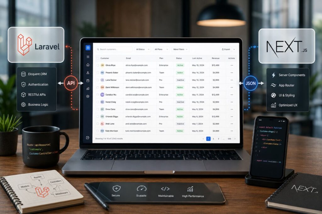
Here is how modern Full-Stack engineering actively protects and elevates your table design:
- Virtualization (Windowing): Using Next.js, we implement list virtualization. The browser mathematically renders only the 20 rows currently visible on the screen, rather than struggling and freezing to load 10,000 hidden rows at once.
- Instant Sorting: A clean, heavily optimized Laravel API delivers data so efficiently that when a user clicks a transparent header to sort a column, the user interface updates in milliseconds without a single page reload.
- Zero Layout Shift: The Next.js architecture mathematically reserves the exact spatial dimensions for the data grid before the API response even arrives, preventing the page from violently jumping and causing misclicks.
As we remotely operate and scale enterprise platforms across the globe from hubs like Islamabad, we ensure that regional network latency never disrupts the frictionless feel of your data grids.
Designing the Breathable Grid in Dark Mode
In the corporate enterprise ecosystem, Dark Mode is a mandatory requirement. Professionals staring at complex tables for eight hours a day demand interfaces that prevent eye fatigue.
However, designing a breathable data grid in dark mode requires absolute precision. You cannot simply invert your colors.
If you use pure black backgrounds or pure white text, you will cause severe visual “haloing” and destroy the premium aesthetic.
How to engineer luxurious dark-themed data tables:
- The Charcoal Foundation: Use deep, rich charcoal or very dark gray (
#121212) for the dashboard background, never pure black (#000000). - Muted Typography: Use soft, light grays for the standard table data. Reserve pure white only for the most critical, actionable metrics that require immediate attention.
- The Signature Accent: Reintroduce your brand’s primary color like a sophisticated, glowing purple exclusively for active hover states, selected checkboxes, and primary buttons.
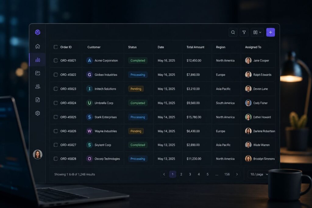
A meticulously crafted dark theme instantly signals technical sophistication. It makes your SaaS product feel like an elite, exclusive digital environment.
Case Study Snapshots: The ROI of the Breathable Grid
Theoretical design discussions only matter if they move the needle on enterprise revenue. Upgrading your core UI components is one of the most profitable investments a company can make.
When you remove friction, users adopt the software faster, complain less, and renew their high-ticket contracts without hesitation.
Here is how the Breathable Data Grid solves real-world operational bottlenecks:
Case Study Snapshot: The Logistics Manifest Portal
- The Bottleneck: A global freight company had a chaotic, heavily bordered data table for tracking daily shipments. The interface was so dense that dispatchers were constantly misreading tracking numbers, leading to costly routing errors.
- The Solution: We deployed a complete UI/UX audit. We stripped out all vertical borders, introduced transparent headers, and right-aligned all weight metrics using tabular fonts.
- The ROI: Cognitive ease was fully restored. Routing errors dropped by over 40% within the first month. The dispatchers reported significantly less end-of-day eye strain, boosting overall operational efficiency.
Case Study Snapshot: The FinTech Reconciliation Dashboard
- The Bottleneck: A financial SaaS platform was struggling to close enterprise deals. Prospects loved the sales pitch but felt the actual software looked “cheap and outdated” during the live demo due to heavy zebra-striping on their ledger tables.
- The Solution: We replaced their legacy tables with the Breathable Data Grid. We implemented a sleek dark mode with subtle 10% opacity inner borders and deep purple active-state accents.
- The ROI: The perceived value of the software instantly matched its high-ticket price tag. The sales team’s close rate increased by 25%, simply because the software finally felt like a reliable, luxury financial instrument.
Executing the Minimalist Table Audit
You do not need to rewrite your entire application to benefit from breathable design. Upgrading your data tables is a highly targeted, high-ROI UI intervention.
It requires discipline and a willingness to delete unnecessary styling rules from your CSS.
Every line, border, and background color must justify its existence. If it does not actively help the user read the data faster, it must be removed.
Here is the exact step-by-step framework to execute a minimalist table audit:
- Phase 1: The Border Purge: Go into your codebase and set
border: noneon the main table container and all vertical<th>and<td>elements. - Phase 2: The Inner Restraint: Apply a single, hyper-subtle bottom border to your table rows. If you are on a light theme, use a very soft gray. If on a dark theme, use a 10% opacity white line.
- Phase 3: The Header Transparency: Remove any background colors from your
<thead> - Phase 4: The Padding Expansion: Identify your current table row padding and double it. Notice how immediately breathable and scannable the complex data becomes.
By standardizing this visual language, you ensure that your most complex data becomes your most beautiful asset.
Start by Evaluating Visual Weight
Visual weight refers to how much attention a design element demands. When too many elements compete for attention, users struggle to focus on the actual data.
Review the following components:
| Table Element | Audit Question | Recommended Action |
|---|---|---|
| Outer Borders | Are they required for structure? | Reduce thickness or remove if possible |
| Inner Borders | Do they improve row separation? | Keep subtle, low-contrast borders |
| Header Backgrounds | Do they dominate the table? | Consider transparent or very light backgrounds |
| Icons | Are they functional or decorative? | Remove non-essential icons |
| Row Colors | Are multiple colors being used? | Limit color usage to status indicators |
| Shadows | Do they add meaningful hierarchy? | Remove unnecessary shadows |
| Typography | Are multiple font styles used? | Standardize text hierarchy |
The objective is to reduce competing visual signals so the data itself becomes the primary focus.
Final Thoughts: The Privilege of Clarity
Simplicity in software design is not the absence of effort; it is the ultimate expression of mastery.
It takes an immense amount of creative confidence to look at a complex B2B data set and decide to remove the borders, strip out the colors, and let the numbers breathe.
In a market overflowing with bloated, frustrating, and chaotic digital tools, absolute visual clarity is your ultimate competitive advantage.
When you utilize the Breathable Data Grid, you are respecting your user’s time, protecting their mental energy, and elevating the perceived value of your brand.
Stop overwhelming your clients with legacy spreadsheet designs. Strip away the noise, embrace the invisible grid, and transform your data into a frictionless, high-fidelity experience.
Frequently Asked Questions (FAQs)
1. Without vertical borders, how do users know which column a number belongs to?
When you utilize extreme whitespace and perfect mathematical alignment (left-aligning text, right-aligning numbers), the human eye naturally creates an “invisible” vertical column. The empty space itself acts as the divider. If a table has incredibly wide columns, we implement a subtle, low-opacity background highlight that triggers only when the user hovers their mouse over a specific row, acting as a visual guide.
2. Can we still use zebra striping if we have really massive data tables?
While aggressive zebra striping is outdated, highly subtle row alternation can be used for massive datasets. However, the contrast must be barely perceptible just enough for the subconscious brain to track the line. For example, in dark mode, alternating between a #121212 background and a #161616 background provides enough tracking assistance without causing the visual fatigue associated with high-contrast striping.
3. Does increasing the padding mean the user will have to scroll more?
Yes, and that is a perfectly acceptable trade-off. Modern users are entirely accustomed to frictionless vertical scrolling, especially with modern trackpads and scroll wheels. Cramping data together to “avoid the scroll” creates intense cognitive overload and eye strain, which causes far more user frustration than simply scrolling down a beautifully spaced, highly legible page.
About the Author