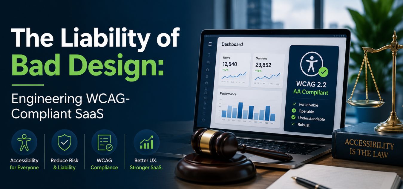
The Liability of Bad Design: Engineering WCAG-Compliant SaaS Platforms
The Hidden Risk in Your UI/UX
For many SaaS founders, UI/UX design is purely about aesthetics and conversion rates. They obsess over color palettes, typography, and sleek animations to attract premium clients.
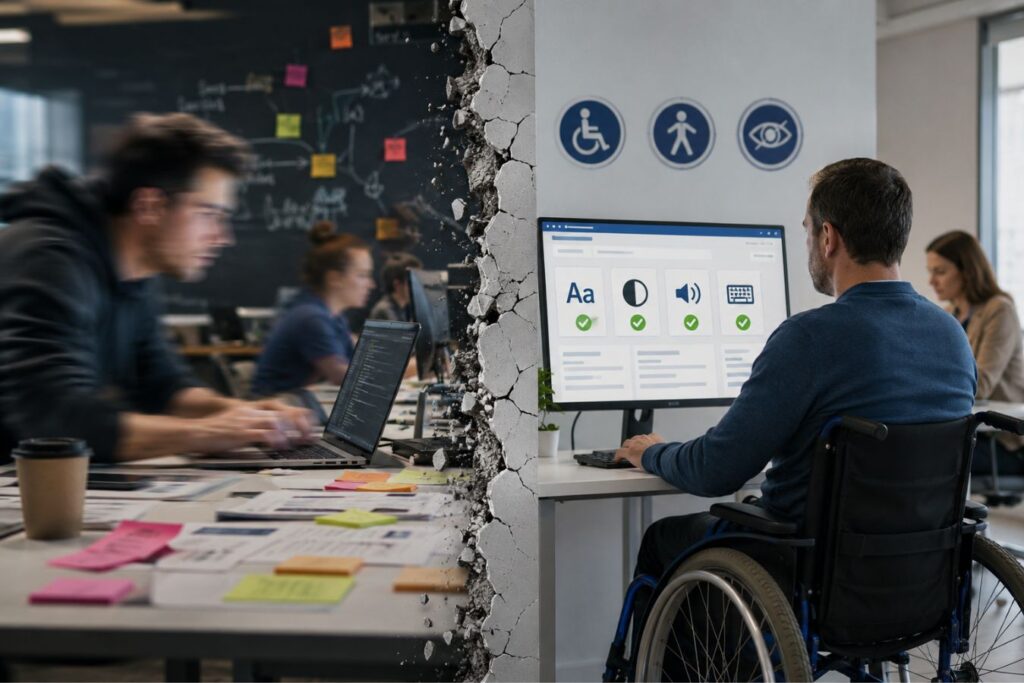
However, beneath the surface of a beautiful interface lies a massive, often ignored vulnerability: digital accessibility.
If your platform cannot be navigated by users with visual, auditory, or motor disabilities, you are not just providing a poor user experience. You are actively exposing your brand to severe legal and financial liabilities.
💡 Expert Insight: The Compliance Reality
Digital accessibility is no longer a “nice-to-have” feature. In the enterprise space, WCAG (Web Content Accessibility Guidelines) compliance is a strict legal requirement. Ignoring it instantly disqualifies you from lucrative government and corporate contracts.
Today, we are unpacking the critical importance of inclusive design. We will explore how engineering a WCAG compliant SaaS platform protects your business and actively expands your market share.
By the end of this guide, you will understand how to seamlessly blend premium, high-end aesthetics with uncompromising accessibility.
Why “Move Fast and Break Things” is Now a Liability
The old tech mantra of “move fast and worry about edge cases later” is incredibly dangerous in today’s regulatory environment. Launching inaccessible software no longer just annoys users; it actively exposes your brand to devastating digital lawsuits.
When enterprise companies evaluate SaaS vendors, they conduct rigorous, uncompromising compliance audits. If your platform fails a basic accessibility test, the procurement team will drop your software immediately to protect their own legal standing.
You are not just losing a single frustrated user you are burning the entire enterprise account.
To understand the true cost of ignoring inclusivity, look at how non-compliant software destroys business momentum:
| Business Metric | The “Move Fast” Non-Compliant Platform | The WCAG-Certified Enterprise Platform |
| Legal Exposure | High risk of costly digital accessibility lawsuits and permanent brand damage. | Protected against legal claims; actively demonstrates corporate social responsibility. |
| Enterprise Sales | Instantly disqualified from lucrative government, education, and healthcare bids. | Clears strict procurement audits effortlessly, unlocking massive, high-ticket sectors. |
| User Retention | Alienates up to 15% of the global population living with disabilities. | Creates a frictionless, welcoming experience that builds deep, long-term brand loyalty. |
Poor UX Slows You Down More Than It Speeds You Up
Ironically, cutting corners to ship faster doesn’t actually save time. Teams end up spending months fixing avoidable issues rebuilding components, rewriting CSS, redesigning flows, and scrambling through expensive rework that could have been prevented with an accessible-first approach.
When the foundation is broken, growth stalls. When accessibility is treated as optional, scalability becomes impossible.
Interactive Challenge: Spot the Liability
Let’s test your UI intuition. Imagine you are reviewing a newly designed SaaS dashboard for a major enterprise rollout. You encounter the following element on the settings page:
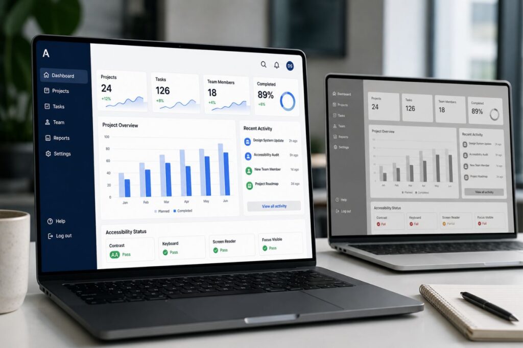
The Scenario: A sleek, minimalist form features a “Save Changes” button. The button is light gray with crisp white text. When a user navigates to the button using only their keyboard’s “Tab” key, nothing on the screen changes to show that the button is currently selected.
Take five seconds. What are the two massive legal liabilities hidden in this specific design?
The Breakdown (How many did you catch?):
- Liability 1 (Failed Contrast Ratio): Light gray and white fail the strict WCAG mathematical contrast ratio (4.5:1). A visually impaired user literally cannot see the text inside the button.
- Liability 2 (Missing Focus State): Keyboard-only users (including those with motor disabilities) have no visual indicator to show they are currently hovering over the button.
If this single button makes it into production, your software instantly fails an enterprise procurement audit. In the modern B2B landscape, flawless aesthetics must be backed by flawless accessibility.
Speed Still Matters But Not at the Cost of Accessibility
Modern product teams must shift from “Move fast and break things” to:
✔ Move intentionally and design sustainably
✔ Build accessible components from the start
✔ Ship fast, but ship responsibly
This mindset doesn’t slow teams down it prevents costly backtracking, protects your brand, and ensures your SaaS platform passes every WCAG audit with confidence.
Decoding WCAG: The P.O.U.R. Framework
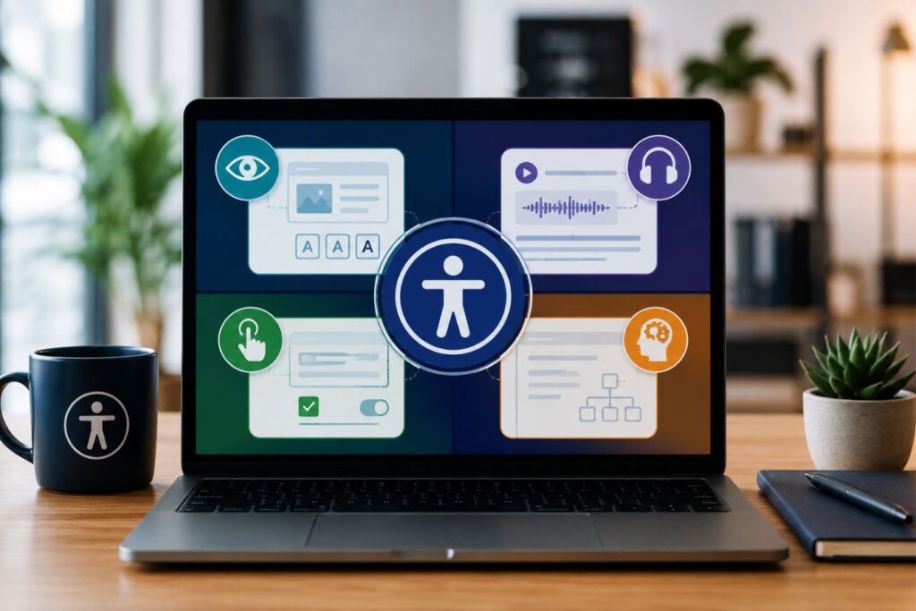
WCAG compliance can feel overwhelming to development teams who are unfamiliar with the legal terminology. However, the entire standard is built upon four highly logical pillars.
Every screen, form, and dashboard you build must pass the “P.O.U.R.” test. If your interface fails even one of these pillars, it is legally inaccessible.
The P.O.U.R. Principles
- Perceivable: Information cannot be hidden from any user’s senses. If you use a chart to display data, you must provide a text-based alternative for screen readers. Contrast ratios must be strictly mathematically calculated.
- Operable: The interface cannot require interactions that a user cannot perform. Your entire complex SaaS dashboard must be fully navigable using only a keyboard, without ever touching a mouse.
- Understandable: The information and the operation of the user interface must be logical. Error messages cannot just say “Error 404”; they must clearly explain what went wrong and exactly how the user can fix it.
- Robust: Content must be robust enough to be reliably interpreted by a wide variety of user agents, including older browsers and advanced assistive technologies. Your HTML code must be perfectly clean.
Accessible Design Does Not Mean “Ugly” Design
There is a persistent, harmful myth in the tech industry: WCAG compliance forces you to build ugly, boring software. Founders often panic, assuming that accessible color contrasts and strict guidelines will destroy their premium, minimalist branding.
This is a complete misconception. True design mastery is the ability to engineer stunning, high-end aesthetics that work flawlessly for every single human being.
Over our 9+ years of engineering digital experiences, we have proven that inclusive design does not limit creativity; it actually elevates a brand’s visual maturity.
To understand how shifting your perspective unlocks better design, look at the reality behind these common founder fears:
| The Founder’s Fear (The Myth) | The Engineering Reality | The Business Outcome |
| “WCAG ruins minimalist branding.” | Constraints force highly intentional, refined UI choices. | A mature, sophisticated, and incredibly clean brand identity. |
| “High contrast looks harsh.” | Bold typography commands absolute executive attention. | Increased readability, reducing user friction and interface bounce rates. |
| “Accessibility limits innovation.” | Accessibility is the unbreakable foundation of true usability. | Expanded market reach into enterprise sectors and lower overall user churn. |
By treating compliance as a design framework rather than a penalty, you unlock the ability to engineer truly premium environments. Here is how WCAG standards actively improve your UI/UX:
- The Contrast Advantage: WCAG requires a minimum contrast ratio of 4.5:1 for normal text. This mathematical constraint actively forces designers to abandon weak, hard-to-read “light gray” fonts in favor of bold, confident typography.
- The Cognitive Reality: High-contrast typography significantly speeds up visual processing in the brain’s occipital lobe, reducing the mental energy required to read and comprehend complex data.
- Focus State Elegance: Compliant platforms require visible “focus states” for keyboard users navigating through menus. Instead of settling for a standard, ugly browser outline, we engineer sleek, custom animations that make keyboard navigation feel premium.
- The Neurological Advantage: Predictable, smooth visual feedback triggers a micro-release of dopamine, subconsciously reinforcing a user’s sense of control and spatial awareness within the software.
- Whitespace is Universal: Generous negative space is a hallmark of luxury design. It is also a fundamental accessibility requirement because it actively prevents cognitive overload for neurodivergent users.
- The Psychology of UI: The human brain processes information using Gestalt principles. Ample whitespace physically separates data groups, preventing sensory overload and keeping the user in a state of calm focus.
To see how these principles are applied in the real world, compare a standard execution to a premium, inclusive execution:
| UI Element | Amateur Execution (Non-Compliant) | Premium Inclusive Execution (WCAG Certified) |
| Typography | Light gray text (#999999) on a white background; elegant but entirely illegible. | Deep slate (#2C3E50) on white; bold, authoritative, and strictly 4.5:1 compliant. |
| Keyboard Navigation | Hidden focus rings; the interface becomes completely unusable without a physical mouse. | Custom, branded CSS animations guiding the user seamlessly from button to button. |
| Layout Structure | Cramped data tables designed to maximize every single pixel of screen space. | Generous padding and margins that let the data breathe, signaling high-end exclusivity. |
Engineering Compliance at the Code Level
You cannot achieve WCAG compliance by simply downloading an automated “accessibility widget” or a third-party plugin. These tools are often superficial and easily bypassed during legal audits.
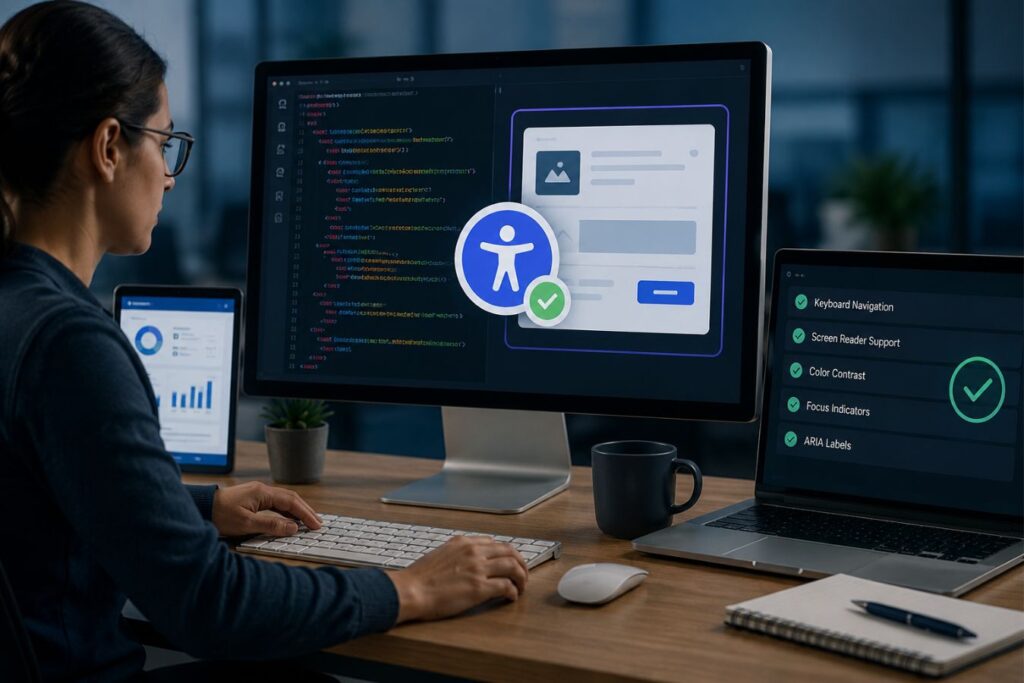
True digital accessibility must be baked directly into your application’s source code from day one. It requires your development team to write immaculate, semantic markup.
When we build decoupled architectures using Next.js and robust backend frameworks, we engineer compliance into the very foundation of the code.
Here are the non-negotiable technical requirements for inclusive development:
- Strict Semantic HTML: Stop using
<div>tags for buttons. If it is a button, use a<button> - ARIA Landmarks: ARIA (Accessible Rich Internet Applications) attributes provide extra context to assistive tech. If a dynamic loading spinner appears on the screen, ARIA live regions tell the screen reader to announce the change immediately.
- Form Labeling Architecture: Placeholders are not labels. Every single input field in your SaaS platform must have a programmatically associated
<> - Zero-Trap Navigation: A user must be able to press the “Tab” key to move forward through your application and “Shift+Tab” to move backward. They must never get “trapped” inside a modal window or a dropdown menu.
The real risk comes from this mindset:
“We’ll fix accessibility at the end.”
Because by the time your developers are scrambling to adjust colors, restructure DOM order, rewrite components, and retrofit keyboard navigation, the UX debt is already massive and expensive.
Modern compliance demands a design-first approach, where accessibility isn’t a checklist but a structural principle. Every pixel, component, and interaction must be intentional. That means:
- Designers owning color contrast and typographic hierarchy before handoff
- Developers building semantic structures, not decorative div soup
- Product managers prioritizing accessibility as a core feature, not an optional sprint
- QA teams running manual, real-user accessibility tests not just automated scans
When accessibility begins with design rather than code, you eliminate rework, avoid ADA and WCAG violations, and create a product that feels premium, polished, and future-proof.
Expanding Market Share Through Empathy
When you reframe WCAG compliance from a “legal burden” to a “competitive advantage,” your entire market strategy changes. You unlock massive revenue streams that your competitors are actively ignoring.
Enterprise companies, educational institutions, and government agencies literally cannot buy software that isn’t accessible.
By prioritizing inclusive design, you instantly position your SaaS platform as the safest, most mature option in the boardroom.
Mini Case Snapshot: The EdTech Procurement Win
- The Bottleneck: An educational software company was losing major university contracts. Their platform used highly interactive, drag-and-drop features that were completely inaccessible to visually impaired students.
- The Inclusive Fix: We re-engineered their interface, maintaining the beautiful drag-and-drop visuals for mouse users, while adding a seamless, hidden keyboard-only alternative menu for screen readers.
- The ROI: The platform passed the university’s strict WCAG 2.1 AA audit with zero errors. They instantly secured a massive, multi-campus contract because their competitors failed the exact same audit.
Mini Case Snapshot: The Healthcare Dashboard
- The Bottleneck: A B2B medical analytics platform was suffering from high user churn. Older physicians found the light-gray typography on white backgrounds impossible to read during long shifts.
- The Inclusive Fix: We redesigned the platform’s entire color system to exceed WCAG AAA contrast standards. We also implemented a custom, high-contrast dark mode toggle.
- The ROI: Support tickets regarding “system confusion” dropped by 70%. The platform’s overall user retention skyrocketed because the software stopped physically exhausting its primary users.
Final Thoughts: Protecting Your Brand’s Future
The digital landscape is maturing. The days of launching half-built, inaccessible MVPs and hoping for the best are permanently over.
Building a WCAG-compliant platform is a profound statement about your brand’s values. It tells your users, your investors, and your enterprise clients that you care about operational excellence and human empathy.
Do not wait for a procurement failure or a legal demand letter to take accessibility seriously. Audit your platform today.
Start by unplugging your mouse and trying to navigate your core product using only your keyboard. If you cannot complete a primary task, your software is a liability.
Frequently Asked Questions (FAQs)
1. What level of WCAG compliance do we actually need to achieve?
For the vast majority of enterprise SaaS platforms and digital products, the global legal standard is WCAG 2.1 Level AA. Level A is the bare minimum and often insufficient for legal protection, while Level AAA is highly strict and typically only required for specialized government or medical software. Targeting a robust Level AA compliance ensures you meet the procurement requirements of almost all corporate and educational institutions.
2. Can we just use an automated accessibility overlay or plugin to fix our site?
No. Automated overlays (often called “accessibility widgets”) are widely criticized by accessibility advocates and legal experts. They only catch about 20-30% of actual WCAG violations and often interfere with the user’s native screen reader software, making the experience worse. True compliance requires manual code remediation, semantic HTML, and rigorous human testing.
3. Does fixing accessibility issues require completely redesigning our software?
Not necessarily. While severe contrast issues might require updating your brand’s color palette, much of WCAG compliance happens invisibly in the backend code. Adding proper ARIA labels, fixing keyboard focus states, and organizing semantic <H>