Motion That Converts: Using 2D Micro-Animations to Explain Complex SaaS
The B2B Communication Crisis: Complexity Kills Conversions
Selling enterprise software is fundamentally different from selling consumer goods. Your product is likely a complex ecosystem of APIs, data dashboards, and automated workflows. If an executive prospect lands on your website and cannot immediately understand how your software works, they will leave.
In the modern digital economy, confusion is the ultimate conversion killer. B2B buyers simply do not have the time or patience to read through massive walls of technical text just to understand your value proposition.
This is where traditional static web design completely fails. When you try to explain a dynamic, multi-step software process using only static images and dense paragraphs, you trigger immediate cognitive overload.
💡 Expert Insight: The Friction of Static Interfaces
A static screenshot of a complex dashboard tells the user what your software looks like, but it fails to explain what your software actually does. To bridge this gap, you must introduce intentional, strategic motion.
Today, we are unpacking “Motion That Converts.” We will explore exactly why top-tier SaaS brands are replacing heavy text with lightweight 2D micro-animations.
By the end of this guide, you will understand how to effortlessly explain complex technical concepts in seconds, instantly building market trust and accelerating your sales cycle.
Eradicating Cognitive Overload Through Visual Storytelling
Cognitive load refers to the amount of mental effort required to process new information. When an enterprise client evaluates your SaaS platform, their cognitive load is already incredibly high. They are calculating ROI, assessing integration risks, and trying to understand your core features simultaneously.
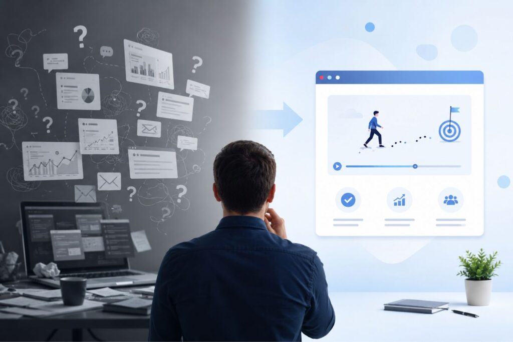
If your landing page forces them to read a six-paragraph explanation of your proprietary algorithm, their brain experiences severe friction. Friction leads to frustration, and frustration leads to a bounced session.
Strategic 2D micro-animation solves this problem by utilizing the brain’s natural hardwiring.
- Instant Processing: The human brain processes visual information tens of thousands of times faster than written text.
- Guided Focus: Motion acts as an invisible guide, naturally drawing the user’s eye exactly where you want it to go, step-by-step.
- Effortless Comprehension: An animated sequence breaks down a complex, multi-step process into bite-sized, easily digestible visual moments.
Over the past 9+ years of engineering digital experiences, we have found that introducing simple, loopable motion is the single fastest way to reduce user friction.
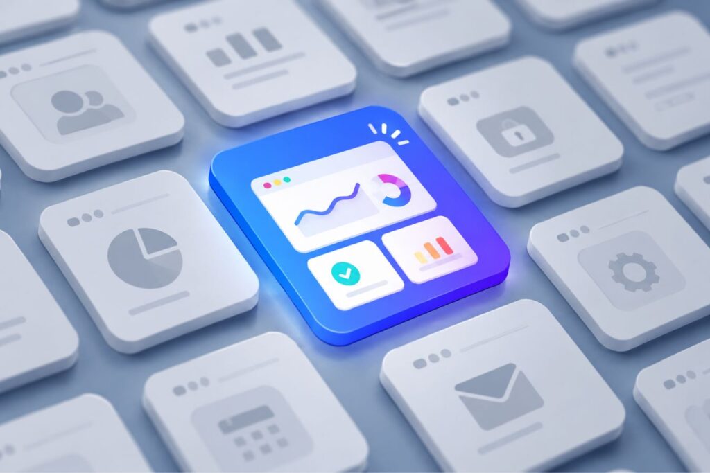
What is a Micro-Animation? (And What It Isn’t)
When we talk about introducing motion, we are not suggesting you place a two-minute, audio-heavy explainer video at the top of your website. Enterprise decision-makers rarely click “Play” on long videos while sitting in an open-office environment or a boardroom.
We are specifically advocating for 2D Micro-Animations. These are short, silent, seamlessly looping vector animations embedded directly into the layout of your website. They act like highly intelligent, moving illustrations that play automatically as the user scrolls.
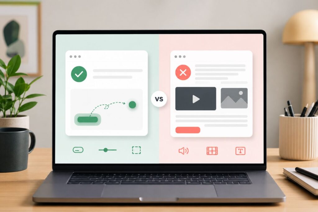
To understand the strategic advantage of this format, let’s compare it against traditional SaaS communication methods:
| The Medium | The User Experience | The Business Outcome |
| Dense Text Blocks | Exhausting. Requires high mental effort and focused reading. | High bounce rates; prospects abandon the page before understanding the product. |
| Traditional Explainer Video | Intrusive. Requires the user to commit time and turn on audio. | Low engagement; busy executives rarely click “Play” on unknown software. |
| 2D Micro-Animation | Frictionless. Plays silently and automatically, integrating perfectly with the text. | Instant comprehension; the user grasps the core concept in under 3 seconds. |
Micro-animations respect your client’s time. They deliver the “Aha!” moment instantly, without asking the user to do any heavy lifting.
Designing for Clarity: The Minimalist Motion Aesthetic
Just like your core brand identity, your animations must be engineered for absolute clarity. A common mistake SaaS startups make is designing animations that are overly complex, utilizing chaotic character movements or too many colors.
When an animation is too busy, it becomes just another form of visual clutter. To build trust with corporate buyers, your motion graphics must strictly adhere to a minimalist, premium aesthetic.
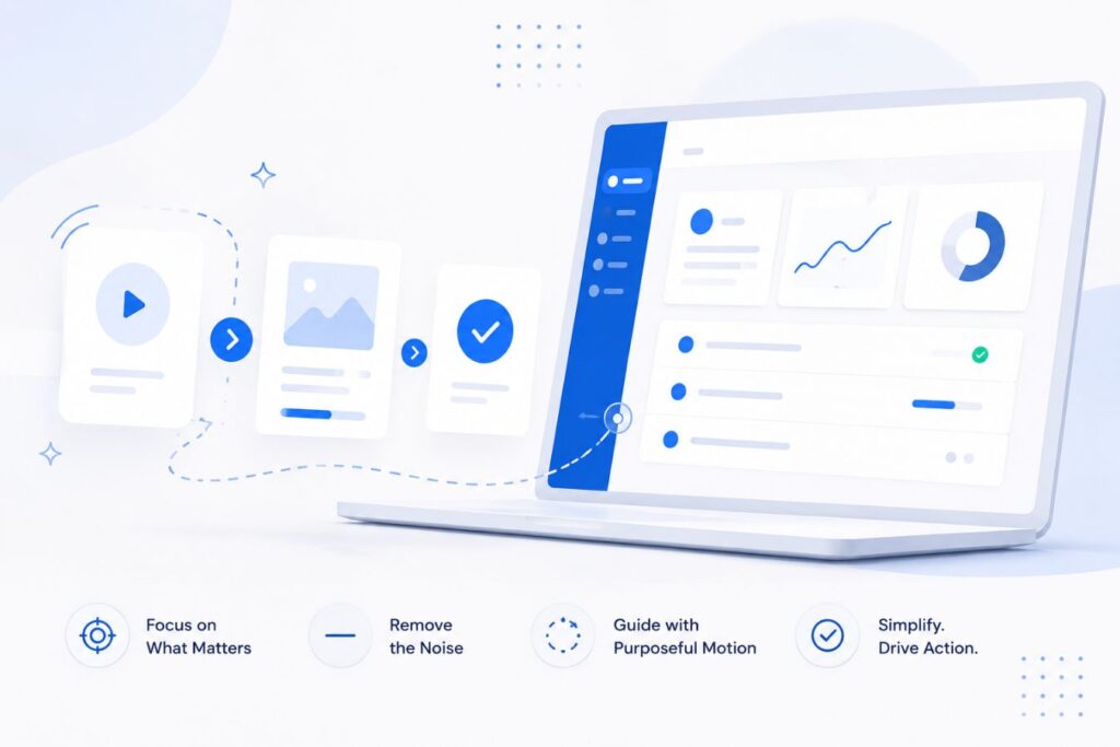
Here are the three foundational rules for designing high-converting SaaS micro-animations:
- 1. Abstract the Interface: Do not animate exact screenshots of your software, as the tiny text will become unreadable. Instead, create a simplified, abstract vector representation of your UI that highlights only the most critical buttons and data flows.
- 2. Leverage Intentional Space: Surround your animations with generous white space. This provides a visual breathing room, allowing the motion to stand out as the undeniable focal point of the section.
- 3. Utilize a Restrained Palette: Maintain corporate authority by sticking to your core brand colors. For example, utilizing a crisp white background with strategic, deep purple animated accents immediately communicates premium quality and focus.
When motion is applied with this level of disciplined restraint, it stops being a decoration and becomes a powerful sales tool.
Where to Inject Motion in the User Journey
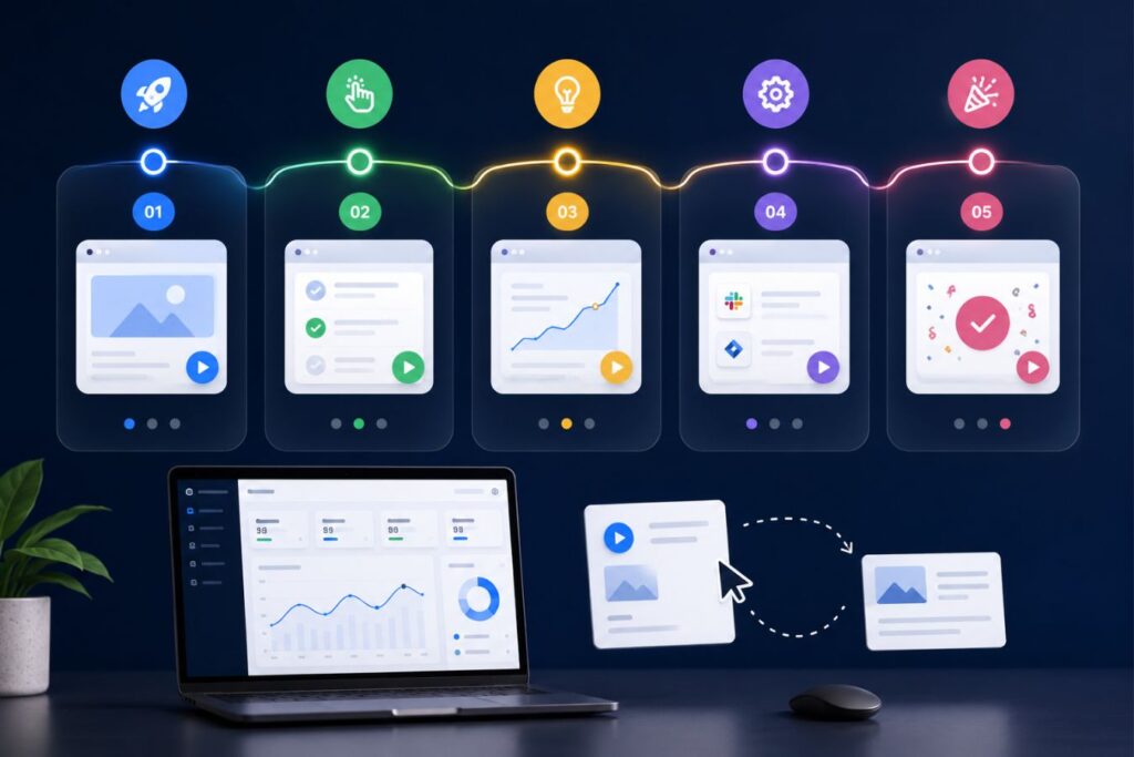
To maximize your ROI, micro-animations should be deployed strategically at the exact moments your user is most likely to experience confusion. You must map out the cognitive bottlenecks in your sales funnel and replace them with clarifying motion.
The Motion Ecosystem
- The Hero Section (The Hook): Replace the static laptop mockup at the top of your site with a 4-second looping animation showing data seamlessly flowing from point A to point B. Show them the exact result you deliver immediately.
- The Feature Grid (The Breakdown): Instead of using static SVG icons for your feature list, use micro-animations that trigger when the user hovers over them. A static “Security” padlock is boring; an animated padlock that snaps shut feels secure.
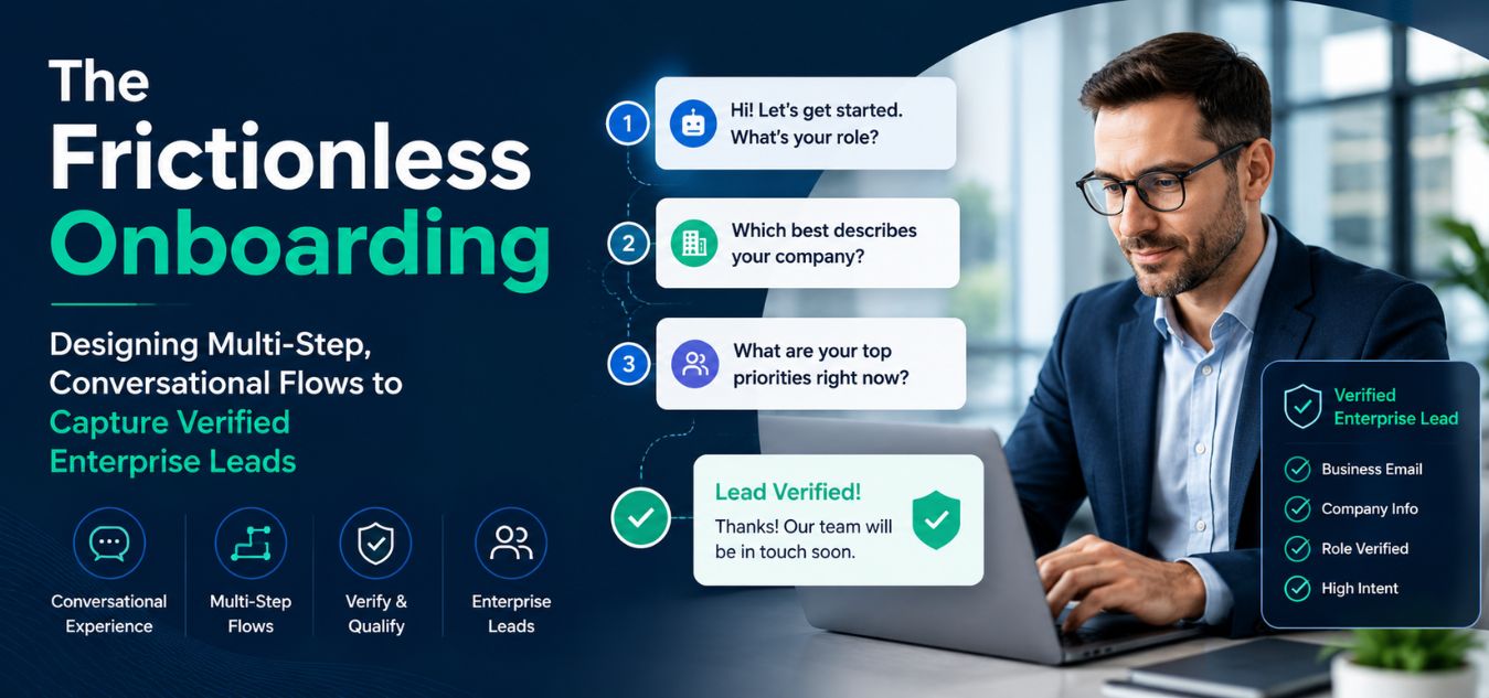
- The Onboarding Flow (The Retention Saver): Once the user buys your software, use brief animations inside the application to show them how to use complex tools, drastically reducing the burden on your customer support team.
By injecting motion at these critical touchpoints, you ensure a frictionless experience from the first marketing click to daily operational usage.
To visualize the direct impact on your conversion funnel, look at how strategic motion solves traditional SaaS bottlenecks:
| The Digital Touchpoint | The Static Bottleneck (High Friction) | The Motion Solution (Frictionless) |
| Top-Fold Hero Section | A generic software screenshot that completely fails to explain the core value proposition. | A 4-second looping abstract animation that instantly proves how the software processes data. |
| Feature & Pricing Grids | Boring text lists paired with lifeless icons that fail to hold the reader’s attention. | Hover-triggered micro-animations that make exploring features feel highly interactive and rewarding. |
| Post-Sale Onboarding | Dense, text-heavy manual pages that frustrate new executives trying to learn the system. | Brief, in-app animated guides demonstrating exactly where to click to execute complex tasks. |
Mini Case Snapshots: How Motion Drives Revenue
The decision to invest in custom 2D animation must be driven by data, not just aesthetics. When you successfully eliminate confusion from your website, the financial impact is immediate and measurable.
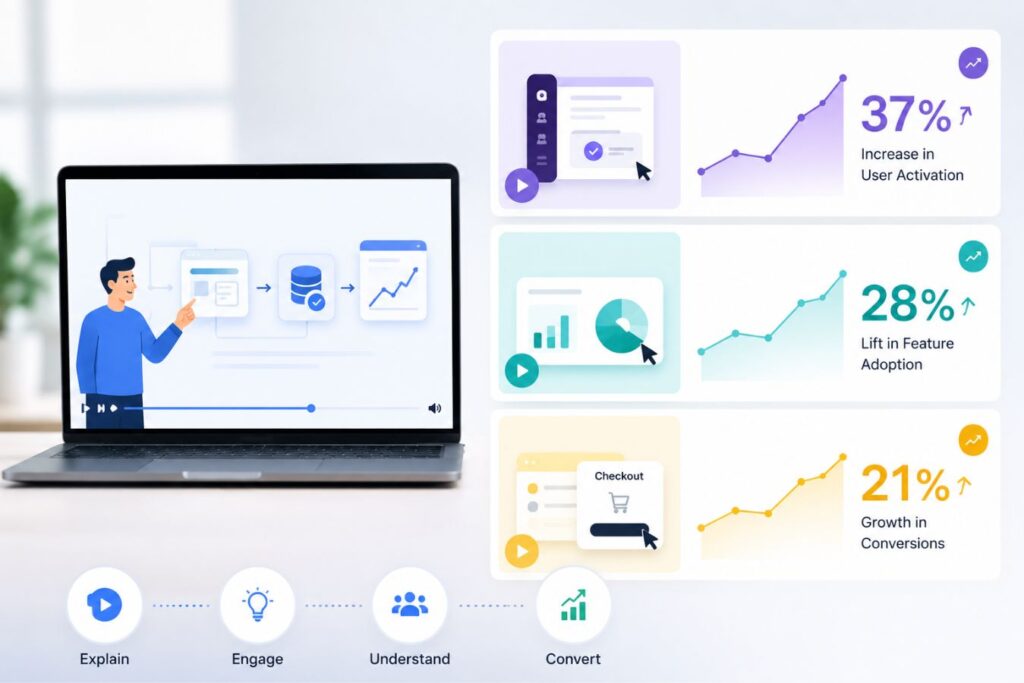
Consider these real-world scenarios where strategic motion directly solved a B2B revenue bottleneck:
Mini Case Snapshot: The API Integration Platform
- The Bottleneck: A complex developer tool was losing enterprise leads because non-technical executives couldn’t understand how their internal systems would connect to the new API.
- The Motion Fix: We replaced two pages of technical documentation with a single, looping 2D animation showing three distinct data servers effortlessly syncing together in real-time.
- The ROI: Time-on-page increased by 140%, and demo requests from C-level executives doubled within the first month because the value proposition was instantly clear.
Mini Case Snapshot: The Automated HR Dashboard
- The Bottleneck: An HR software company was overwhelmed with customer support tickets from new users who couldn’t figure out how to generate custom payroll reports.
- The Motion Fix: We integrated simple, 3-second animated tooltips directly into the software’s user interface, visually demonstrating exactly where to click and drag to build a report.
- The ROI: “How-to” support tickets dropped by 65%, freeing up the technical team and significantly increasing overall user retention.
The Performance Mandate: Keeping Motion Lightweight
A beautiful animation is completely useless if it destroys your website’s loading speed. In the modern tech landscape, speed is an absolute necessity. If your website takes five seconds to load a heavy video file, your user will bounce before the animation even starts playing.
Traditional video formats like MP4 or GIF are incredibly heavy, pixelated, and slow. To maintain elite technical performance, enterprise brands must utilize JSON-based animation frameworks, such as Lottie.
- The Lottie Advantage: Lottie files are essentially lines of code (JSON) that render vector animations in real-time. They are infinitely scalable and absolutely perfectly crisp on any retina display.
- Microscopic File Sizes: A complex 2D animation exported as an MP4 might be 5 Megabytes. That exact same animation exported as a Lottie file is often under 50 Kilobytes literally 100 times smaller.
- Full-Stack Synergy: When we pair these microscopic animation files with a highly optimized, decoupled Next.js architecture, the visual layouts render instantly, delivering a frictionless, zero-lag experience.
You must never sacrifice backend performance for visual flair. With the right engineering, you can have both.
Standing Out in a Sea of SaaS Sameness
Take a moment to look at your top three competitors. Chances are, their websites all look exactly the same. They likely use the same generic isometric illustrations, the same stock photos of people pointing at laptops, and the same dense blocks of descriptive text.
This creates a massive “sea of sameness” in the B2B SaaS industry. Enterprise buyers are completely numb to this standard template.
Stop forcing your clients to read. Start forcing them to watch.
When a prospect lands on your site and is immediately greeted by crisp, purposeful motion, you create a powerful pattern interrupt. Your brand instantly feels more alive, more modern, and more technologically advanced than the static competitors they just evaluated.
This subtle psychological shift establishes you as the undeniable premium option in your market space.
Final Thoughts: The Cost of Inaction
In an era where attention spans are measured in milliseconds, you cannot afford to let complex, static text act as the primary salesperson for your enterprise software. If your product is difficult to explain, you must evolve your communication strategy.
Strategic 2D micro-animations are not a luxury feature; they are a critical asset for eliminating cognitive overload and securing market trust. By investing in clean, minimalist motion, you streamline the buying process and actively accelerate your business growth.
If your current web presence is struggling to clearly articulate your value proposition, an animation audit is the necessary first step. We specialize in distilling complex software into effortless visual narratives.
Frequently Asked Questions (FAQs)
1. Won’t animations slow down my website and hurt my SEO rankings?
If you use outdated formats like GIFs or embedded MP4 videos, yes, it will significantly damage your site speed and SEO. However, professional digital agencies use code-based animations (like Lottie files). These vector animations are microscopic in file size, load instantly, and have zero negative impact on your Google Core Web Vitals.
2. We sell highly technical backend infrastructure. Is motion graphics too “playful” for our corporate audience?
Motion is only “playful” if it is designed that way. For highly technical enterprise brands, we engineer strict, minimalist animations using abstract geometry and muted corporate color palettes (like deep purple and white). This style communicates extreme precision and operational mastery, appealing perfectly to C-level executives and CTOs.
3. How long does it take to produce a custom suite of micro-animations for our platform?
For a standard SaaS landing page, creating a cohesive set of 4 to 6 custom micro-animations typically takes between 3 to 5 weeks. This timeline includes deep-dive strategy sessions to understand your software’s complex logic, storyboard creation, vector asset design, precise motion engineering, and final developer handoff.