The Typography Trust Factor: Why Clean Sans-Serifs Dominate B2B Rebrands
The Silent Power of First Impressions
When an enterprise decision maker lands on your website, they do not read your marketing copy first. They feel it. Before their brain can process a single word of your value proposition, they make a subconscious, split-second judgment about your company’s credibility. This rapid, critical assessment is dictated almost entirely by two invisible forces: your typography and your use of space.
💡 Expert Insight: The Typography Trust Factor
Visual clutter destroys credibility. A messy font paired with a cramped layout instantly signals operational chaos and amateurism. Conversely, crisp, highly legible typography surrounded by intentional space projects ultimate authority, technological mastery, and quiet competence.
Today, we are unpacking “The Typography Trust Factor.” We will break down exactly why top-tier B2B brands are aggressively transitioning to geometric sans-serifs and minimalist layouts.
By the end of this guide, you will understand how to weaponize fonts and white space to actively reduce cognitive friction and accelerate your sales cycle. Here is exactly what we will cover:
- The Psychology of Shape: How clean, geometric fonts engineer instant visual trust.
- The Architecture of Space: Why white space is your most valuable digital and financial asset.
- The Conversion Metric: How stripping away typographic noise directly correlates to higher enterprise conversion rates.
To understand the immediate financial impact of your font choices, look at how an executive buyer subconsciously reacts to your visual presentation before they even begin reading:
| Visual Presentation | The Immediate Psychological Trigger | The B2B Sales Outcome |
| Cluttered & Cramped Fonts | High cognitive friction; reading your site feels like exhausting, manual work. | The user bounces immediately, assuming your software or service is equally chaotic. |
| Crisp Sans-Serifs & White Space | Frictionless clarity; the information feels premium, digestible, and effortless. | Instant credibility, prolonged session times, and a significantly accelerated sales cycle. |
The Geometric Sans-Serif: Engineering Visual Trust
In the high-stakes B2B market, you are not just selling a software product or a service. You are selling absolute reliability.
Geometric sans-serif fonts like Inter, Poppins, or custom corporate typefaces are built on strict, uncompromising mathematical proportions. They utilize perfect circles and perfectly straight lines.
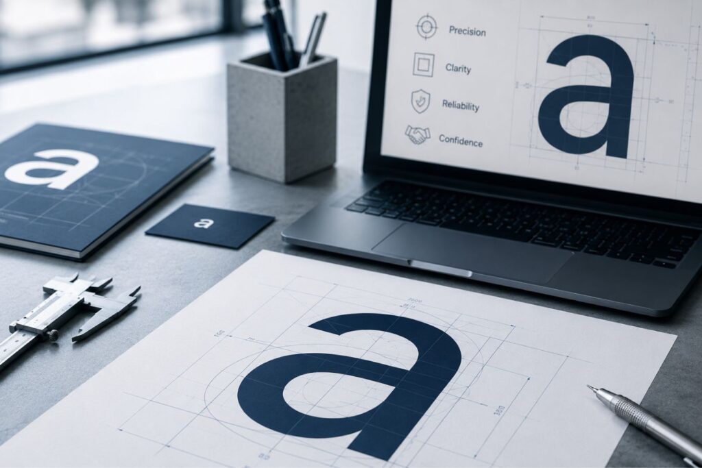
This structural perfection subconsciously communicates extreme precision, stability, and technological mastery to the viewer.
- Frictionless Legibility: Geometric fonts lack decorative “feet” (serifs) and varying stroke widths, making them incredibly easy for the human eye to track across a screen.
- Modern Neutrality: They do not carry the historical baggage of traditional fonts, allowing your actual message to take center stage without visual distraction.
- Ultimate Scalability: Because they are mathematically structured, they remain razor-sharp and readable whether viewed on a massive 4K monitor or a tiny smartwatch.
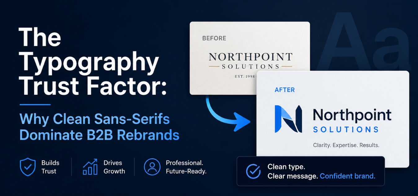
The Fall of the Legacy Serif in the Digital Era
For decades, traditional serif fonts (like Times New Roman or Garamond) were the ultimate symbol of corporate establishment, legal authority, and financial trust.
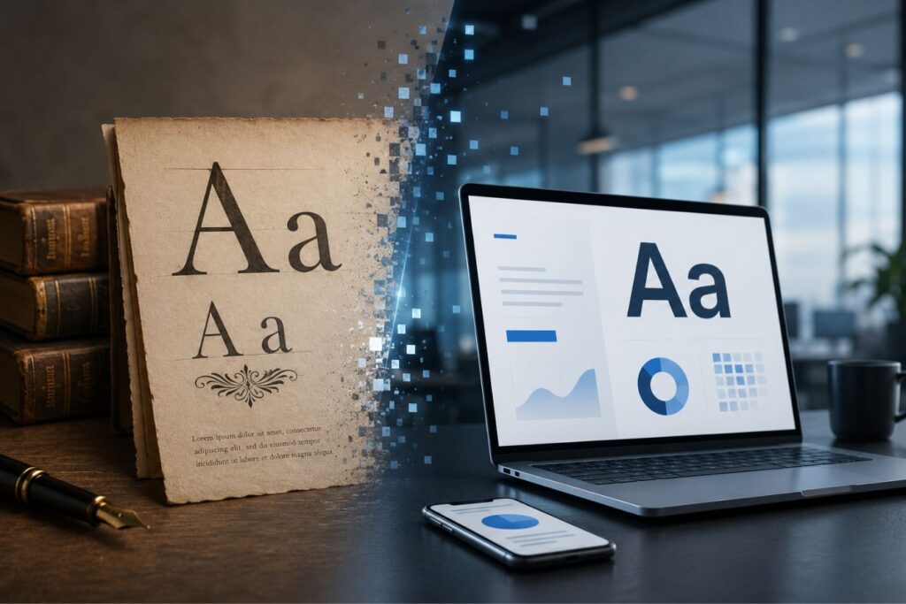
However, the digital revolution fundamentally changed how humans consume information. Reading on a high-density glowing screen is physically different than reading ink on paper.
When complex serif fonts are scaled down for mobile responsive designs or packed into data-heavy SaaS dashboards, their intricate details become blurred. This creates immediate eye strain.
To understand why modern tech and B2B brands have universally abandoned complex typography, look at how the two styles perform in digital environments:
| Typographic Choice | The Digital Performance | The User’s Perception |
| Legacy Serif Fonts | Loses crispness on mobile screens; feels heavy in complex UI dashboards. | Outdated, slow, traditional, and potentially resistant to modern innovation. |
| Geometric Sans-Serif | Scales flawlessly; maintains high contrast and readability at any size. | Innovative, efficient, highly professional, and built for the digital future. |
White Space is Not Empty Space
One of the most common and expensive mistakes founders make is viewing white space as wasted digital real estate. Driven by a desire to maximize value, they cram every blank pixel with extra features, dense text, and unnecessary icons.
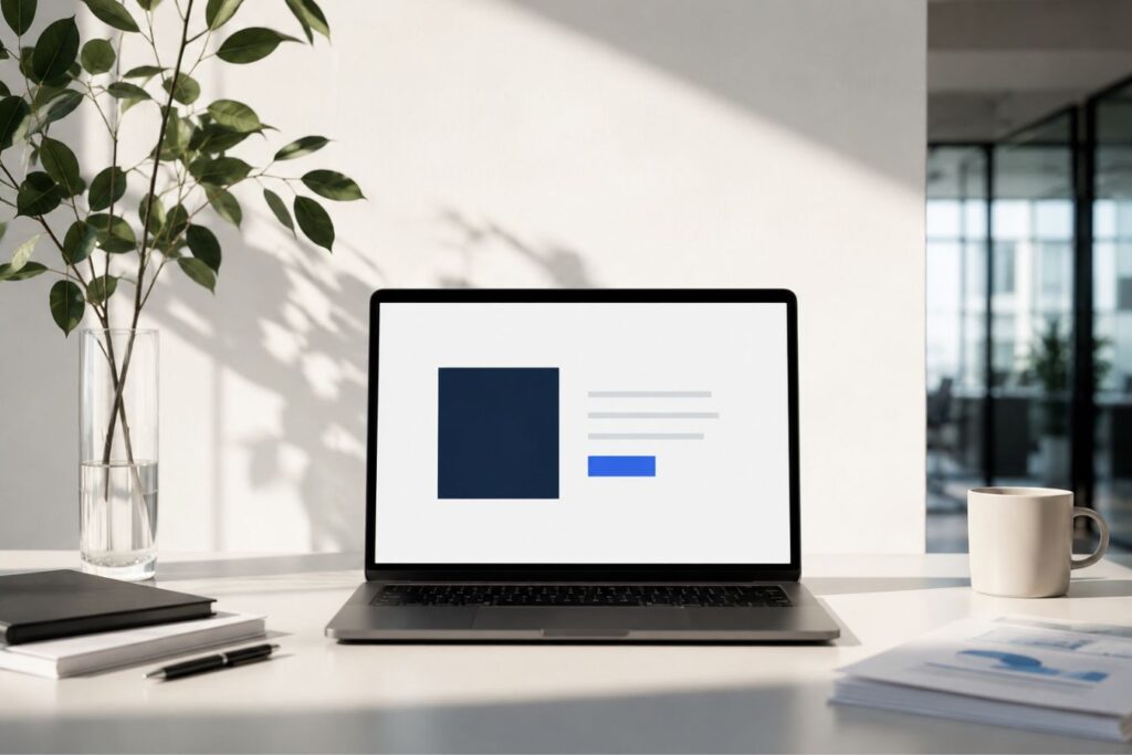
This is a critical design failure. White space (also known as negative space) is never empty; it is the active, structural framework of premium UI design. Think of it as a visual lung: it gives your typography the room it needs to breathe, and it gives your user the mental space they need to make a purchasing decision.
To understand how high-level agencies approach layout, look at how the perception of “empty space” changes as a brand matures:
[ ❌ The "Before" Mindset: Pixel Paranoia ]
 "We have empty space on the right side of the dashboard. Let's fill it with another feature widget, a secondary menu, and three more lines of text so the user gets more value."
 └─ Result: The user is paralyzed by visual noise. Cognitive load spikes, the interface feels cheap, and the core call-to-action is completely buried.

                ⬇️ The Strategic Pivot ⬇️

 [ ✅ The "After" Mindset: Structural Restraint ]
 "We have empty space on the right side of the dashboard. Let's fiercely protect it. That negative space will act as a spotlight, forcing the user's eye directly to the primary CTA."
 └─ Result: Frictionless navigation. The user feels a subconscious sense of calm, instantly understands the hierarchy, and conversion rates increase.
When you stop trying to fill the screen and start engineering your layout with intention, white space becomes a highly functional tool. Here is exactly how it elevates your B2B platform:
- Directing Absolute Focus: When you surround a bold, geometric headline with generous white space, you act as a visual director. You effortlessly guide the user’s eye straight to your singular, high-value message without them even realizing it.
- Grouping Complex Information: Strategic spacing naturally clusters related content together (a principle of Gestalt psychology). This helps enterprise users process massive amounts of complex data intuitively, completely eliminating the need for ugly borders or confining boxes.
- Engineering Digital Luxury: Premium brands understand a fundamental economic truth: scarcity equals value. Abundant white space instantly makes a digital product feel highly exclusive, undeniably expensive, and masterfully refined.
Cognitive Load and the B2B Conversion Funnel

Cognitive load refers to the amount of mental effort your user must exert to navigate and understand your website. When cognitive load spikes, conversion rates plummet.
Cramped text, conflicting font weights, and a lack of white space create severe cognitive friction. When reading your website feels like hard work, busy executives simply abandon the page and click over to a cleaner competitor.
Over our 9+ years of engineering digital experiences, we have consistently proven that typographic clarity is a direct conversion driver.
The Anatomy of a High-Trust Page
- The H1 Hook: A massive, ultra-bold geometric headline. It contains a maximum of eight words and communicates your exact value proposition instantly.
- The Typographic Scale: A strict mathematical ratio between your headings and body text. This creates a predictable rhythm that guides the eye naturally down the page.
- The 60-Character Rule: Body paragraphs are never wider than 60-70 characters per line. Anything wider causes eye fatigue as the user scans back and forth.
- The Breathing Room: A minimum of 120 pixels of vertical white space between major sections, acting as a visual palate cleanser.
Mini Case Snapshots: The ROI of Typographic Clarity
Typographic rebrands are not just aesthetic exercises; they are strategic business maneuvers designed to eliminate friction.
Here is how optimizing typography and space actively transforms business outcomes in the real world:
Mini Case Snapshot: The Cluttered SaaS Dashboard
- The Bottleneck: An enterprise analytics platform suffered from high user churn. Their dashboard used three different fonts and zero white space, overwhelming users with a wall of data.
- The Typographic Fix: We unified the entire platform under a single geometric sans-serif family (Inter). We increased line height by 150% and doubled the padding around data tables.
- The ROI: User session times doubled. Support tickets related to “finding data” dropped by 45% because the interface finally allowed the numbers to breathe.
Mini Case Snapshot: The Legacy Tech Consultancy
- The Bottleneck: A 20-year-old IT firm was struggling to land modern tech startups as clients. Their website used outdated serif fonts and dense, edge-to-edge paragraphs.
- The Typographic Fix: We executed a complete brand refresh, swapping their legacy serif for a sharp, modern geometric font. We introduced massive amounts of white space to isolate their core service offerings.
- The ROI: The firm’s perceived market value skyrocketed. They successfully raised their retainer fees by 30% without facing client pushback, securing three major startup contracts in the first quarter.
Establishing Strict Visual Hierarchy
A beautiful, modern font is completely useless if everything on the page is the exact same size. Visual hierarchy is how you tell your user what is most important, second most important, and least important.
You establish this hierarchy by manipulating three typographic variables: size, weight, and color contrast.
When executed perfectly, visual hierarchy allows an executive to skim your entire webpage in five seconds and still absorb your exact narrative arc.
- The Power of Contrast: Pair an ultra-bold, oversized headline with a lightweight, muted gray subheadline. This extreme contrast creates immediate visual interest.
- Consistency is Key: Define your typographic styles once and never deviate. Your H2 headings must be the exact same size, weight, and color on every single page of your platform.
- Responsive Scaling: Typography must be fluid. A headline that looks beautifully commanding on a desktop must automatically scale down to avoid breaking words apart on a mobile screen.
Final Thoughts: Stop Screaming, Start Communicating
In a crowded, noisy digital marketplace, the loudest brand rarely wins the enterprise contract. The brand that offers the most clarity wins.
When your competitors are screaming for attention with messy graphics, heavy paragraphs, and chaotic layouts, your clean, geometric typography becomes the ultimate pattern interrupt. It forces the market to stop, breathe, and pay attention to what you have to say.
At Creative Riz, we do not just pick fonts; we engineer digital authority. We strip away the visual clutter that is currently suffocating your core message.
If your current brand identity feels heavy, outdated, or difficult to read, you are actively losing high-ticket clients to cleaner competitors. It is time to embrace the minimalist advantage.
Frequently Asked Questions (FAQs)
1. Do we have to use a geometric sans-serif, or can we still use a serif font for B2B?
While geometric sans-serifs dominate modern UI for their legibility, serifs are not entirely forbidden. If you are a high-end financial firm or a luxury brand, a high-contrast, modern serif can be used effectively for large headlines only. However, body copy and complex dashboard data should almost always remain a clean sans-serif to prevent eye strain.
2. How many different fonts should we use on our website?
For maximum corporate trust and absolute consistency, we highly recommend using a maximum of two font families. The most effective approach is often using just one highly versatile geometric font family (like Roboto or Montserrat) and utilizing its different weights (Bold for headings, Regular for body text) to create contrast without causing visual chaos.
3. Does increasing white space mean our website visitors will have to scroll more?
Yes, and that is a good thing! Modern users are completely accustomed to scrolling; it is a natural, frictionless habit on both mobile and desktop. Trying to cram all your information “above the fold” ruins your typography, spikes cognitive load, and causes users to leave your site immediately. Scrolling encourages engagement; clutter encourages bouncing.