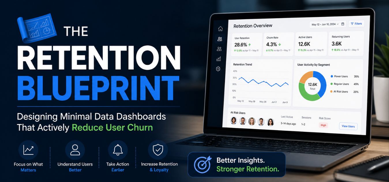
The Retention Blueprint: Designing Minimal Data Dashboards That Actively Reduce User Churn
The Retention Blueprint: Why “More Data” is Costing You Subscribers
Users rarely cancel software subscriptions because your platform lacks advanced features. They cancel because logging in feels like a second job. When a user is hit with a massive wall of raw numbers and complex charts, cognitive overload kicks in immediately. Instead of feeling empowered to make decisions, they feel anxious, confused, and frustrated.
💡 Expert Insight: The “Data Equals Value” Myth
Many founders mistakenly believe that packing a dashboard with every possible metric proves the software’s worth. In reality, visual clutter destroys user momentum. Forcing your users to decipher raw data is the leading cause of “dashboard churn” in the B2B and SaaS space.
Today, we are sharing our definitive Retention Blueprint. By the end of this guide, you will understand exactly how to turn complex data into a seamless, high-retention user experience.
Here is exactly what we will break down in this guide:
- The Psychology of Overwhelm: How to identify the invisible cognitive friction that forces users to close your app.
- The Minimalist Shift: How to strip away visual noise and design clean, corporate interfaces that command authority.
- Actionable ROI Frameworks: Our proven methods for organizing data so it actively hooks users and drives daily engagement.
To understand why this shift is critical, look at how the exact same data can either drive users away or secure their long-term loyalty:
| Dashboard Strategy | The User Experience | The Business Outcome |
| The Data Dump (Flawed) | Paralyzed by a wall of numbers; forced to figure out what matters. | High frustration, plummeting daily active usage, and inevitable subscription churn. |
| The Retention Blueprint | Greeted by a clean interface highlighting 3-4 actionable KPIs. | Instant clarity, feelings of empowerment, and deep, long-term product loyalty. |
The True Cost of Cognitive Overload

Let’s talk about why your users are genuinely abandoning your platform. When a dashboard is cluttered with twelve different pie charts and dense tables, the brain has to process too much at once.
This mental friction exhausts the user before they even accomplish their primary workflow. In the digital design industry, we call this cognitive overload.
Every unnecessary border, excessive drop shadow, and unorganized metric drains the user’s mental energy. If your software feels like a daily chore to navigate, they will eventually look for a simpler competitor.
The 3 Stages of Dashboard Churn
- Stage 1: Excitement: The user signs up, eager to see their analytics and optimize their business.
- Stage 2: Overwhelm: They log in and are instantly paralyzed by a cluttered, directionless interface.
- Stage 3: Abandonment: They stop logging in to avoid the stress, ultimately canceling their subscription.
The ROI of Minimalist Dashboards: Turning Clean Architecture into Sustained Revenue

Minimalism in enterprise software is never just an aesthetic choice. It is a highly strategic, ROI-focused business decision designed to maximize your Customer Lifetime Value (CLV). Clean, corporate aesthetics do more than look good they directly communicate stability, authority, and effortless ease of use.
Stop designing for “more features” and start designing for absolute clarity.
When you ruthlessly remove the clutter, the data that actually matters becomes instantly visible. Here is how a frictionless, minimalist architecture directly impacts your bottom line:
- Accelerated Decision-Making: Users can log in, find their key metrics in seconds, make a confident decision, and log out feeling accomplished.
- Deep Product Loyalty: By eliminating cognitive overload, you build trust and slash subscription churn rates dramatically.
- Operational Efficiency: A streamlined interface intuitively guides the user, which actively reduces support tickets and lowers onboarding times.
To understand why minimalism is a financial asset, look at how design choices directly translate to business outcomes:
| Architectural Approach | The User Experience | The Business Impact (ROI) |
| Cluttered & Complex | High cognitive load, slow navigation, and constant frustration. | High support costs, extended onboarding, and increased churn. |
| Minimal & Strategic | Effortless clarity, instant metric visibility, and high confidence. | Maximized CLV, reduced support tickets, and secured long-term revenue. |
Over the past 9+ years of engineering digital experiences, we have seen this direct correlation firsthand: a streamlined interface is the ultimate tool to secure long-term revenue.
Pillar 1: Progressive Disclosure

You do not need to show the user every single piece of data on the home screen. The absolute secret to a high-retention dashboard is a psychological concept called progressive disclosure.
This means revealing complex or secondary information only when the user specifically asks for it. Start by displaying only the top three most critical Key Performance Indicators (KPIs).
If the user wants to see the deep, historical context behind those numbers, let them click to expand a dedicated module.
This keeps the primary interface incredibly clean while still offering deep functionality for your power users.
- Level 1 (The Dashboard): Show the high-level summary (e.g., “Monthly Revenue: $10,000”).
- Level 2 (The Detail Page): Show the specific breakdown (e.g., Revenue separated by product category).
- Level 3 (The Raw Data): Offer a simple, one-click ability to export the complete CSV file.
Pillar 2: Corporate, High-Contrast Typography

Typography is the silent engine of effective data visualization. Using the wrong font physically strains the human eye, while clean, geometric typefaces instantly command authority. A highly legible layout immediately signals to the user that your software is a premium, trustworthy asset.
- The Geometric Advantage: Rely on modern, sans-serif typefaces engineered specifically for high-speed numerical legibility.
- Breathing Room: Align numbers flawlessly and surround them with generous white space to prevent visual exhaustion.
- Strict Visual Hierarchy: Ensure your most critical metric is the absolute largest element on the screen, capturing the user’s focus the exact second they log in.
Pillar 3: Action-Oriented Data Design
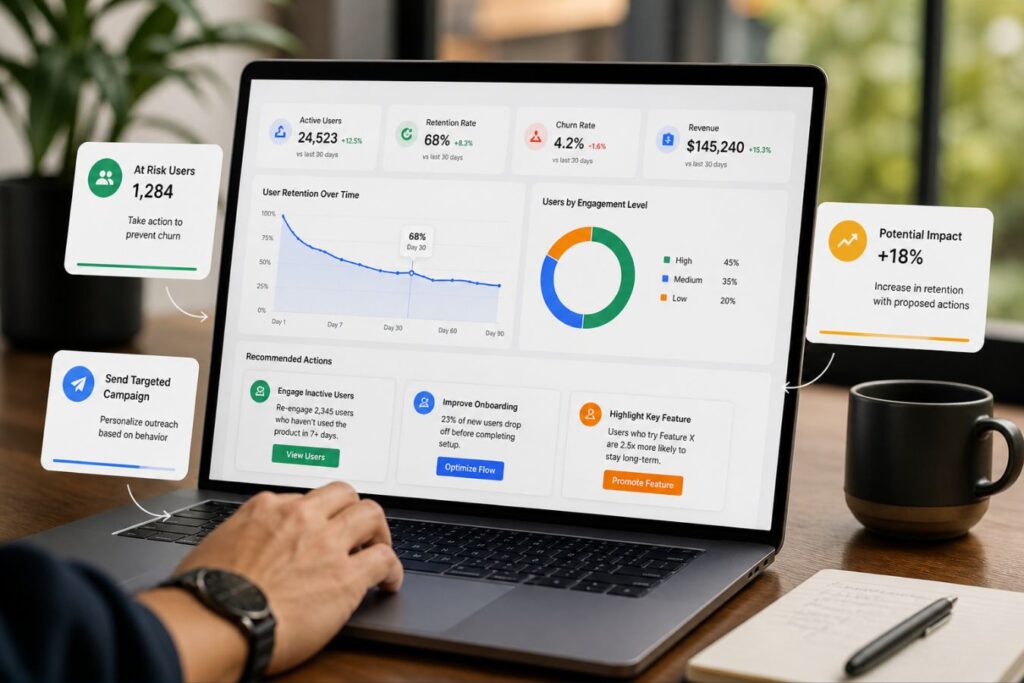
Numbers displayed on a screen are completely meaningless if the user doesn’t immediately understand their impact. A high-retention dashboard doesn’t just present raw data, it provides instant clarity and context. It tells the user at a glance whether their metrics are a cause for celebration or concern.
- The “Good or Bad” Rule: Never display a standalone metric like “4,500 Visitors.” Always pair core numbers with simple, color-coded trend indicators (e.g., a green arrow showing “+15% this week”) for instant relief.
- Zero Mental Math: If your user has to pull out a calculator to understand their ROI, your design has fundamentally failed. Do the complex calculations for them.
- Drive the Next Step: Frame the data, highlight the historical trend, and intuitively suggest the next logical action the user should take to feel successful and prevent churn.
Comparing the Approaches: Cluttered vs. Minimal
To truly grasp the commercial impact of this blueprint, let’s look at a side-by-side comparison. This table illustrates how specific design choices alter the user’s emotional state and retention likelihood.
Small shifts in UI layout yield massive differences in software adoption and daily active usage.
| Design Element | Cluttered Dashboard (High Churn) | Minimal Dashboard (High Retention) |
| Metric Display | 15+ competing metrics crammed onto one chaotic screen. | 3 to 5 core KPIs surrounded by generous white space. |
| Color Palette | Neon colors and harsh gradients that cause severe eye strain. | Muted, corporate tones with bright colors used strictly for alerts. |
| Data Context | Raw numbers presented with no baseline or historical comparison. | Clear trend indicators (e.g., “Up 5% from last month”). |
| Navigation | Complex sidebars with deeply nested menus and hidden features. | Flat, intuitive navigation focused purely on primary workflows. |
Real-World Application: The Creative Riz Approach
Theory and UX best practices are great, but flawless execution is what saves a failing product. When partnering with global tech companies, our agency focuses purely on measurable, bottom-line results.
Design must always serve a functional, commercial purpose to justify the financial investment. Consider a recent scenario where an enterprise client struggled with massive user drop-off after the first week.
Their backend analytics platform was incredibly powerful, but the UI was an overwhelming maze of generic charts.
Our team stepped in to completely redesign and engineer their primary user interface.
- What We Did: We stripped away the excessive visual noise, established a strict visual hierarchy, and implemented progressive disclosure.
- The Result: A highly engaged, confident user base and a massive 40% reduction in first-month churn.
- The Lesson: Human-centered, minimal design directly translates to retained software revenue.
The Technical Foundation of Minimal Dashboards
Visual minimalism means absolutely nothing if your platform takes ten seconds to load. A beautiful, clutter-free dashboard that lags instantly reintroduces the exact severe friction you tried to eliminate. To truly prevent churn, seamless, secure full-stack development must serve as the invisible backbone of your user experience.
When your frontend design and backend architecture operate in perfect synergy, your software doesn’t just look premium, it feels premium.
- The Millisecond Mandate: Code must be strictly optimized to deliver massive data payloads to the frontend in mere milliseconds, keeping the user in a state of frictionless flow.
- Eradicating Bottlenecks: Unresolved database bottlenecks, like N+1 queries or bloated API responses, will silently sabotage the best user interface ever designed.
- Reinforcing Authority: A hyper-responsive, lightning-fast dashboard subconsciously reinforces the high-value, corporate trust established by your visual aesthetics.
To understand how backend engineering directly dictates the success of your visual design, consider this comparison:
| The Architectural Approach | The User Experience | The Retention Reality |
| The Superficial Redesign | The dashboard looks clean, but the user is forced to stare at a loading spinner for five seconds. | Frustration returns immediately; the redesign fails to prevent subscription cancellations. |
| Full-Stack Synergy | The interface is minimal, and the optimized backend fetches complex data instantaneously. | The software feels effortless and premium, securing deep user loyalty and long-term ROI. |
When technical speed meets visual minimalism, your software transitions from a basic tool into an indispensable asset.
Designing for “Zero-Click” Value
The ultimate goal of a retention-focused dashboard is delivering absolute “Zero-Click” value. The exact second your web application loads, the user should have their most pressing question answered without ever touching their mouse. If your customer has to dig through a dropdown menu just to find their daily sales total, you have already introduced friction.
To understand how this concept directly drives daily software adoption, look at the psychological difference between a standard interface and a Zero-Click interface:
[ ❌ The High-Friction User Journey ]
 Login ➔ Open Sidebar Menu ➔ Click 'Reports' ➔ Filter by 'Today' ➔ See $5,400
 └─ Result: Mental fatigue. The user starts logging in less frequently.

                ⬇️ The Architectural Shift ⬇️

 [ ✅ The Zero-Click User Journey ]
 Login ➔ See "$5,400 Today" prominently displayed in the top-fold.
 └─ Result: Instant dopamine and relief. Software reliance is established.
By engineering your application to prioritize immediate gratification, you seamlessly integrate your software into the user’s daily routine. Here is exactly how to execute the Zero-Click mandate:
- The Mobile Imperative: This concept is fiercely critical for mobile-responsive design, as smartphone users have zero patience for buried data. Always stack your primary KPIs vertically so they are the absolute first pixels rendered on a mobile screen.
- The One-Question Rule: Identify the single most critical question your user asks when they open your application (e.g., “Are my servers healthy?” or “Did we make money today?”). Design the entire top-fold specifically to answer that exact question.
- Creating Habitual Reliance: When you deliver immediate value without requiring physical effort, you remove the “chore” aspect of data management. You subconsciously train the user to rely on your platform every single morning.
Sustaining a Frictionless Environment

A great dashboard is not a static asset that you design once and forget about. It requires continuous iteration based on real-world user behavior and platform growth.
As you introduce new features to your software, you must fiercely protect the minimal integrity of the home screen.
- Regular Audits: Periodically review heatmap data to see which metrics users actually look at and which they ignore.
- Feature Pruning: Do not be afraid to remove outdated charts or migrate them to secondary reporting tabs.
- Direct Feedback: Ask your most loyal users what data they wish they could see the moment they log in.
Final Thoughts: Less is Always More
In the modern digital economy, your users’ time and attention are your most valuable resources. Do not squander that trust by forcing them to decipher a poorly designed, cluttered interface.
The Retention Blueprint is about respecting their time and delivering absolute visual clarity. When you invest in a minimal, corporate, and polished dashboard, you are buying long-term user loyalty.
You are removing the mental friction that leads to churn and replacing it with unshakeable confidence.You are building a digital asset that will scale effortlessly as your enterprise grows.
If your software is currently leaking users, a professional UX evaluation is the critical first step. We specialize in crafting high impact, frictionless interfaces for ambitious brands across the globe.
Contact the Creative Riz team today to start engineering a high-retention experience for your users.
Frequently Asked Questions (FAQs)
1. Does a minimal dashboard mean removing important features from my software?
No. Minimalism in UI/UX is about visual hierarchy and intelligent organization, not feature deletion. It simply means hiding secondary features behind logical menus and using progressive disclosure so the user is only presented with what they need at that specific moment.
2. How do I know exactly which metrics to put on the main dashboard screen?
You must conduct user research to identify the primary goal of your platform. Ask your most active users which 3 to 5 numbers they check every single morning to gauge their success. Those core metrics belong on the home screen; everything else should be accessible via secondary tabs.
3. Can a dashboard redesign really lower my software’s churn rate that quickly?
Absolutely. When users log in and immediately understand their data without feeling overwhelmed, their perceived value of your software skyrockets. A frictionless, clean experience directly prevents the mental exhaustion and frustration that leads to sudden subscription cancellations.