
Invisible Luxury: Using Mathematical Grid Structures and Extreme Whitespace to Design High-Ticket B2B Dashboards That Reduce Cognitive Load
The Cost of Cluttered Data
Imagine closing a six-figure enterprise contract. Your client is thrilled by your sales pitch and logs into your software for the very first time.
Instead of feeling empowered, they are immediately hit with a wall of chaotic data. Dozens of charts, cramped tables, and flashing notifications compete for their attention.
They immediately feel overwhelmed, confused, and frustrated. This is the exact moment enterprise churn begins.
💡 Executive Insight: The Danger of “Feature Vomit”
The biggest mistake B2B software companies make is trying to show everything at once. Executive buyers do not want more data; they want clarity. If your dashboard requires a training manual to navigate, you have failed the fundamental test of premium UI/UX design.
Today, we are unpacking the concept of “Invisible Luxury” in digital product design. We will explore how to strip away the noise and engineer interfaces that feel effortlessly intuitive.
By the end of this comprehensive guide, you will understand how to use strict mathematics and negative space to elevate your software’s perceived value.
Why Executive Buyers Crave Invisible Luxury
Cognitive load refers to the amount of mental processing power required to use your software. When cognitive load is high, users make mistakes, feel fatigued, and ultimately abandon the platform.

In the high-stakes B2B market, your users are busy professionals. They are managing universities, financial portfolios, or massive logistics networks.
They do not have the patience to decode a poorly designed interface. True digital luxury is completely invisible; it removes friction so seamlessly that the user never even notices the interface.
Here is how cognitive load directly impacts enterprise revenue:
| The UI/UX Flaw | The Psychological Impact | The Business Consequence |
| Cramped Data Tables | The eye cannot track rows, causing intense mental strain. | Increased data entry errors and a surge in support tickets. |
| Too Many Primary Colors | The user does not know what is important versus what is secondary. | Slower decision-making and extreme workflow frustration. |
| Inconsistent Spacing | The brain senses chaos and a lack of structural integrity. | Immediate loss of brand trust and professional authority. |
Over our 9+ years of engineering digital experiences at Creative Riz, we have proven that premium clients are willing to pay significantly more for a tool that simply “feels right.”
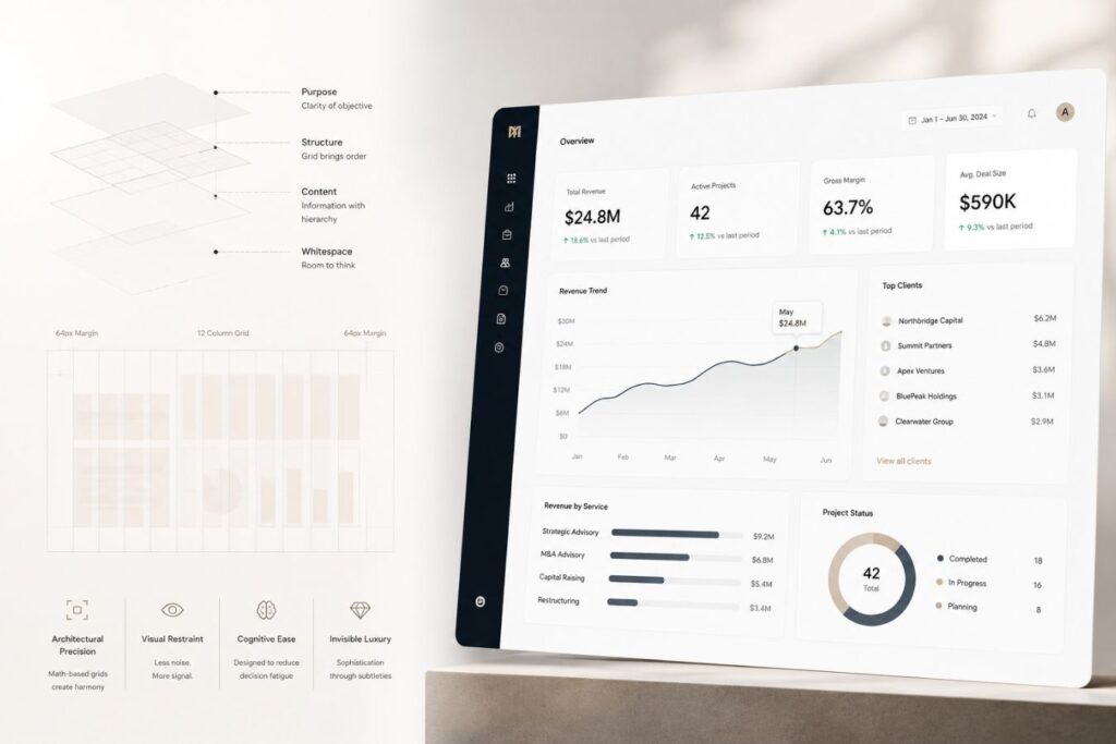
Architecting the Mathematical Grid
You cannot build a luxury interface by guessing where elements should go. Premium design is not just art; it is strict, unforgiving mathematics.
A mathematical grid structure divides your dashboard into a predictable system of columns and rows. It provides a rigid skeleton upon which all data is placed.
When every single button, card, and chart perfectly aligns to a mathematical baseline, the human brain instantly registers harmony and order.
The Rules of the 8-Point Grid System
- The Base Unit: We base every single measurement on multiples of 8 (8px, 16px, 24px, 32px). This ensures perfectly scalable proportions across all screen sizes.
- The 12-Column Layout: The screen is divided into 12 invisible vertical columns. A main chart might span 8 columns, while the sidebar spans 4. The math is always absolute.
- Modular Components: Buttons, form fields, and dropdowns are mathematically scaled so they fit perfectly within the grid, creating a sense of rigid structural integrity.
- The F-Pattern Rhythm: We align the heaviest, most critical data points along the top and left sides of the grid, perfectly matching the natural eye-line of Western readers.
By adhering to a strict mathematical grid, you eliminate visual chaos. Your dashboard stops looking like a messy startup experiment and starts looking like an institutional-grade platform.
Extreme Whitespace as the Ultimate Flex
Amateur designers are terrified of empty space. When they see a blank area on a dashboard, their immediate instinct is to fill it with another chart, another button, or a block of explanatory text.

But in premium B2B design, empty space known as negative space or whitespace is your most powerful architectural asset. Whitespace acts as oxygen for your data. It gives the executive’s eyes a place to rest and reset between absorbing complex analytical insights.
Scenario in Action: The 8:00 AM Executive Login
Put yourself in the shoes of a Chief Operations Officer for a moment. You have a high-stakes board meeting in exactly five minutes, and you need to pull one critical metric: yesterday’s total logistics volume. You log into your company’s new SaaS dashboard. But instead of clarity, you are hit with a suffocating wall of 15 blinking charts, a cramped 100-row spreadsheet, and three different navigation menus competing for your attention. Your heart rate spikes. You cannot find the single number you need.
You log out, frustrated, and call your data analyst to just email you the number instead.
That panic? That friction? That is the exact moment an enterprise client decides to cancel their software subscription.
Here is exactly how extreme whitespace elevates your dashboard design:
- Improves Data Legibility: By significantly increasing the line-height and padding inside your data tables, you transform a cramped, unreadable grid into a clean, effortless experience where complex numbers are easy to scan.
- Forces Ruthless Prioritization: When you mandate the use of extreme whitespace, you physically cannot fit everything on one screen. It forces you to make hard design decisions and display only the most critical, value-driven metrics.
- Creates Absolute Visual Hierarchy: Surrounding a single, crucial Call-To-Action (CTA) button with massive empty space removes all competing noise. It immediately draws the user’s eye, driving necessary conversions effortlessly.
Think of luxury physical retail stores like Apple or high-end designer boutiques. They use massive empty floor plans to make their products feel exclusive, important, and highly valuable. Your software interface must do the exact same thing digitally.
Designing for Dark Mode: The Premium Standard
In the modern enterprise ecosystem, Dark Mode is no longer an optional novelty. It is a mandatory requirement for high-ticket software.
Professionals stare at dashboards for eight hours a day. Blinding white interfaces cause severe eye strain, while properly executed dark themes dramatically reduce physical fatigue.
However, designing a premium dark mode is incredibly difficult. You cannot simply invert your colors to black and white.
How we engineer luxurious dark themes for enterprise platforms:
| The Design Element | The Amateur Mistake | The Premium Engineering Standard |
| The Background | Using pure, harsh black (#000000). | Utilizing deep, rich charcoal or subtle, dark purple undertones to soften the screen. |
| The Typography | Using pure white (#FFFFFF) text on a black background, causing visual “halos.” | Using soft, muted light grays for paragraphs to reduce harsh contrast and eye strain. |
| Brand Accents | Blinding neon primary colors that clash with the dark background. | Leveraging sophisticated, glowing accents like deep, vibrant purple to highlight active states smoothly. |
A meticulously crafted dark theme, especially one utilizing modern purple shades, instantly signals technical sophistication. It makes your SaaS product feel like an elite, exclusive environment.

Using Mathematical Grid Structures to Support Dark Interfaces
Dark mode becomes significantly more effective when combined with a mathematical grid system.
Structured layouts create predictable visual patterns that help users locate information quickly. Since the human brain naturally seeks organization, consistent spacing and alignment reduce the effort required to interpret data.
For example:
| Design Element | Grid-Based Approach |
| Dashboard cards | Aligned within fixed columns |
| KPI sections | Consistent spacing intervals |
| Navigation menus | Uniform positioning |
| Charts and reports | Standardized widths and margins |
| Data tables | Consistent row and column structure |
When every element follows a logical spatial framework, users spend less mental energy understanding the interface and more energy analyzing the information itself.
The Role of Whitespace in Dark Mode Design
Whitespace becomes even more valuable in dark environments.
Many designers feel tempted to fill dark dashboards with additional charts, widgets, and controls. This often produces a crowded interface that overwhelms users.
Premium dashboards take the opposite approach.
Generous spacing between elements allows users to process information in smaller, manageable groups. The negative space acts as a visual separator that reduces cognitive burden and improves comprehension.
Effective whitespace can:
- Improve scanning speed
- Increase content clarity
- Reduce decision fatigue
- Create visual elegance
- Guide attention toward key metrics
In luxury dashboard design, what is removed is often just as important as what is added.
Why Aesthetics Require Elite Architecture
You cannot decouple UI/UX design from frontend engineering. If your dashboard looks beautiful but takes four seconds to load, the illusion of luxury is instantly shattered.
Mathematical grids must be rendered with absolute precision. If your underlying codebase is fragile, your perfect grid will collapse under the weight of real-world database queries.
To guarantee that your premium design survives in production, you must build upon decoupled, high-performance architectures.
How modern Full-Stack development protects your UI/UX investment:
- Next.js Component Rendering: By building the grid using isolated Next.js React components, we ensure that every piece of the dashboard loads instantaneously and perfectly aligned.
- Zero Layout Shift (CLS): A decoupled frontend mathematically calculates the space for your charts before the data even arrives. This ensures the page never violently “jumps” while loading.
- Laravel API Speed: To keep the minimalist dashboard feeling snappy, the underlying Laravel backend must be hyper-optimized. It must serve precise JSON payloads in milliseconds, completely eradicating N+1 query bottlenecks.
True invisible luxury requires perfect harmony between the designer’s grid and the engineer’s server configuration.
Case Study Snapshots: The ROI of Invisible Luxury
Theoretical design principles are fascinating, but executive buyers want to know how extreme whitespace translates to enterprise revenue.
When you remove friction and reduce cognitive load, user adoption skyrockets. This directly impacts your company’s bottom line by drastically reducing churn.
Here is how mathematical grids and minimalist design solve real-world B2B bottlenecks:
Case Study Snapshot: The Institutional Educational Portal
- The Bottleneck: A university merit list and laptop enrollment system featured a cluttered, outdated database view. Administrators were overwhelmed, leading to massive data processing delays during peak enrollment seasons.
- The Solution: We deployed a complete UI/UX overhaul based on an 8-point mathematical grid. We introduced extreme whitespace, grouped related actions, and applied a soothing, modern dark theme.
- The ROI: The cognitive load was shattered. The time required for administrators to process a single student application dropped by 40%, completely eliminating the historical enrollment bottleneck and ensuring flawless data accuracy.
Case Study Snapshot: The Logistics & Financial Dashboard
- The Bottleneck: A high-ticket logistics API platform was losing premium enterprise clients to a competitor. Clients complained the analytics dashboard felt “cheap” and was impossible to read quickly.
- The Solution: We stripped away 60% of the on-screen data. We utilized a rigid 12-column grid to organize the remaining metrics and implemented deep purple accents to highlight critical supply-chain alerts against a dark background.
- The ROI: The perceived value of the software doubled overnight. Client retention stabilized, and the sales team began successfully closing enterprise contracts 20% faster, purely because the software finally looked as expensive as its price tag.
Executing the Minimalist Audit
Transitioning from a cluttered, legacy dashboard to a mathematically precise interface requires ruthless discipline. You cannot execute this transition by simply deleting buttons randomly.
Have you ever stared at your own software portal and realized you actually do not know where the user’s eye is supposed to land first?
To achieve true digital luxury, you must audit your software through the uncompromising lens of your actual users. Every single pixel on the screen must justify its existence. If it does not serve an immediate, critical purpose, it must be removed.

Are you ready to stop guessing and start engineering your interface? Here is the core framework to execute a minimalist UI audit:
- The Analytics Review: Use heatmapping tools to track exactly where your users actually click and navigate.
- The Padding Expansion: Take your current data tables and aggressively increase the vertical padding between rows.
- The Color Purge: Strip your dashboard down entirely to grayscale to neutralize visual competition.
- The Typography Hierarchy: Implement strict mathematical scaling for all of your fonts.
When was the last time you navigated your own platform’s data tables did you feel a sense of frictionless calm, or immediate eye strain?
| The Audit Step | The Legacy Flaw | The Minimalist Execution |
| The Analytics Review | Cluttering the screen with legacy features that nobody actually uses. | Delete any dashboard element that receives under 5% heatmap engagement. |
| The Padding Expansion | Cramping data rows together just to fit more information on a single screen. | Double the vertical padding to instantly create breathable, scannable data. |
| The Color Purge | Using multiple bright colors that aggressively compete for the user’s attention. | Strip to grayscale, reintroducing your brand’s sophisticated purple only for active buttons. |
| The Typography Hierarchy | Eyeballing font sizes based on what subjectively “looks good” in the moment. | Implement strict mathematical scaling for visually distinct, unbreakable heading rules. |
By systematically stripping away the noise, you reveal the true power and utility of your software.
Final Thoughts: The Privilege of Simplicity
Simplicity is not the absence of design; it is the ultimate expression of it.
It takes an immense amount of engineering skill and creative confidence to look at a complex B2B software platform and decide to show less data on the screen.
But in a market overflowing with bloated, frustrating, and chaotic digital tools, clarity is your ultimate competitive advantage.
When you utilize mathematical grids and extreme whitespace, you are respecting your user’s time and mental energy. You are providing them with a frictionless environment where they can do their best work.
Stop overwhelming your clients. Strip away the noise, embrace the grid, and let the invisible luxury of your architecture speak for itself.
Frequently Asked Questions (FAQs)
1. Will using extreme whitespace force my users to scroll too much?
This is a common fear, but scrolling is a highly natural, frictionless action for modern users. Clicking through hidden menus or squinting at cramped tables is much more frustrating than simply swiping down a beautifully spaced page. By using whitespace to break data into easily digestible “chunks,” you keep the user engaged as they scroll, rather than overwhelming them all at once.
2. How do we transition our legacy software to a new grid without confusing existing users?
A UI/UX transition for an active SaaS platform must be handled iteratively. We recommend a phased rollout. First, we unify the typography and spacing rules. Next, we overhaul the navigation menus. Finally, we restructure the core data tables. By slowly introducing the mathematical grid and whitespace, users adapt to the cleaner interface naturally without experiencing a jarring “system shock.”
3. Does a dark theme actually save battery life, or is it just an aesthetic choice?
It is both. For devices with OLED or AMOLED screens, a dark theme physically turns off the pixels in the black or dark-gray areas of the screen, which significantly reduces battery consumption. More importantly for desktop B2B users, a properly engineered dark theme with low-contrast text drastically reduces digital eye strain, making it a critical ergonomic feature for professionals using your software all day.