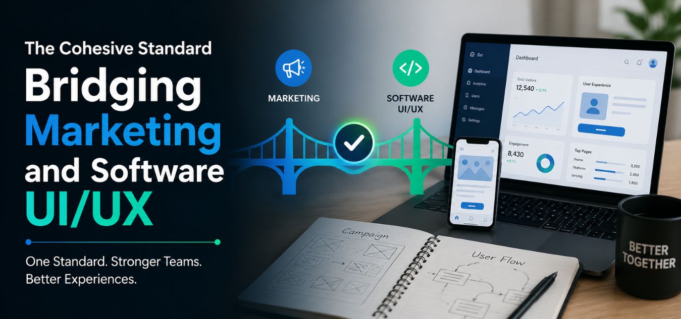
The Cohesive Standard: Why a Disjointed Software Interface Actively Destroys the Trust Built by Your Premium Marketing Collateral
The `Bait and Switch` Phenomenon
Imagine a high-ticket enterprise client clicking on your beautifully designed Meta ad. They land on a lightning-fast, hyper-minimalist marketing website that exudes corporate authority.
They are impressed. They sign a $50,000 annual contract.
Then, they are handed their login credentials. They open your software dashboard, and it looks like a clunky, outdated spreadsheet from 2012.
💡 Executive Insight: The Instant Loss of Authority
The moment your client sees a disjointed software interface, cognitive dissonance sets in. They immediately feel like they have been subjected to a “bait and switch.” This sudden drop in aesthetic quality destroys the trust your marketing team worked so hard to build.
Today, we are unpacking the financial and psychological cost of digital fragmentation. We will explore how to align your internal software UI with your external marketing collateral.
By the end of this guide, you will understand how to engineer a cohesive digital ecosystem that protects your brand valuation and drives long-term customer retention.
Why Visual Consistency is a Revenue Driver
In the B2B space, your clients are not just buying a software tool; they are buying operational confidence. They expect your entire brand experience to be seamless.
Over nearly a decade of engineering comprehensive digital ecosystems, we have seen companies pour their entire budget into public-facing websites. They treat the actual software interface as an afterthought.
This is a massive operational liability. Your marketing website only wins the client; your software interface is what keeps them paying month after month.
The Churn Cycle of Disjointed UI
- The Promise: Premium marketing collateral sets a high expectation of seamless efficiency and modern minimalism.
- The Reality: A cluttered, confusing software interface drastically increases the user’s cognitive load.
- The Friction: Users struggle to navigate hidden menus and heavy chart animations, leading to workflow frustration.
- The Result: Support tickets skyrocket, executive buyers feel buyer’s remorse, and enterprise churn becomes inevitable.
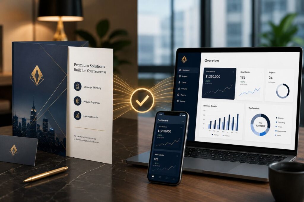
When your software interface does not match the luxury of your brand, your clients will eventually migrate to a competitor who understands the value of a cohesive experience.
The Connection Between Trust and Revenue
Customers make purchasing decisions based largely on confidence. Every interaction with a brand either strengthens or weakens that confidence.
When a software interface maintains consistent colors, typography, iconography, spacing, and interaction patterns, users feel they are dealing with a professional and reliable organization. The experience becomes predictable, which reduces uncertainty and makes users more comfortable completing important actions such as:
- Starting a free trial
- Upgrading to a paid plan
- Entering payment information
- Submitting business data
- Signing long-term contracts
In contrast, a disjointed interface creates doubt. Users begin questioning whether the company is as professional as its marketing suggests. Even small inconsistencies can create friction that affects buying decisions.
How Consistency Impacts the Customer Journey
The customer journey does not begin when someone logs into your software. It starts with the first advertisement, social media post, email campaign, or landing page they encounter.
The visual experience should remain aligned throughout every stage.
| Customer Touchpoint | User Expectation | Impact of Consistency |
|---|---|---|
| Advertisements | Professional brand image | Builds initial trust |
| Landing Pages | Clear value proposition | Encourages conversions |
| Product Onboarding | Familiar visual experience | Reduces learning curve |
| Dashboard Experience | Reliable functionality | Increases engagement |
| Billing and Checkout | Secure environment | Improves purchase confidence |
| Customer Support Portal | Unified brand experience | Strengthens loyalty |
When these touchpoints feel connected, customers experience a smooth transition from prospect to paying user. This continuity helps remove hesitation and supports higher conversion rates.
Identifying the Disconnect in Your Architecture
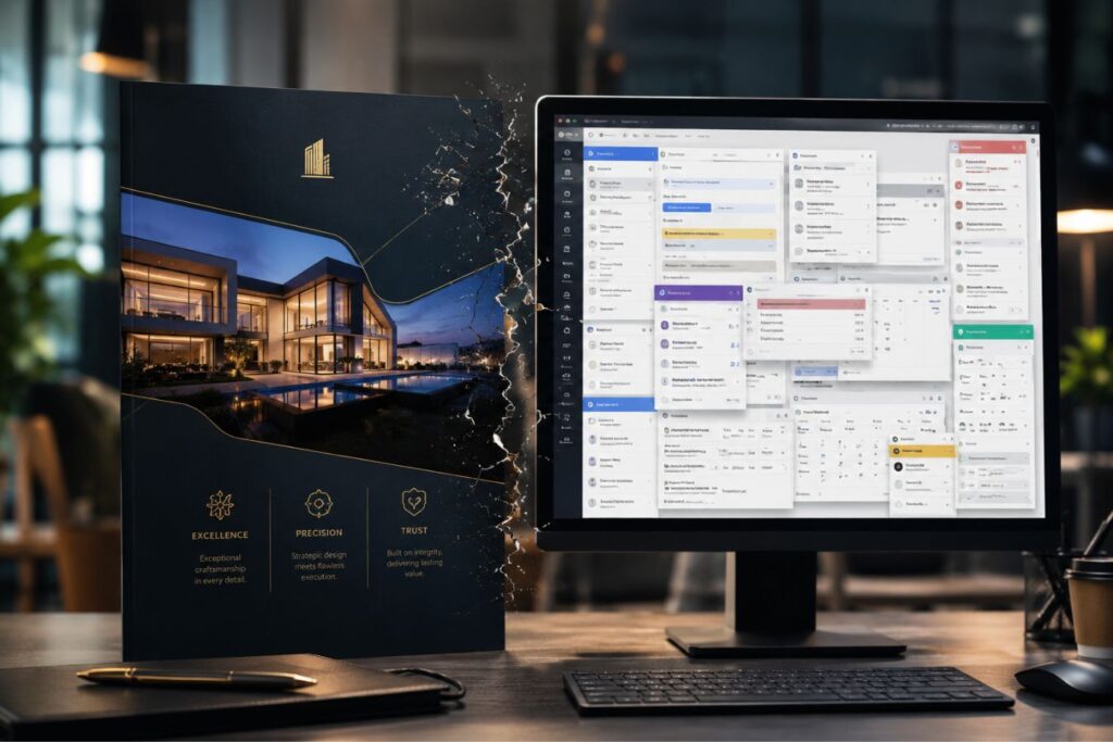
Bridging the gap begins with a ruthless audit of your current digital assets. You must compare your marketing website side-by-side with your software application.
If there is a visual jarring effect when transitioning between the two, you have a structural problem.
Here is how a disjointed identity typically manifests in enterprise platforms:
| The Brand Element | The Marketing Website (The Promise) | The Software Dashboard (The Reality) |
| Typography | Premium, custom variable fonts that load instantly. | Generic system fonts that look misaligned and unprofessional. |
| Color Palette | Purpose-driven, minimalist hues with generous negative space. | A chaotic mix of harsh primary colors that cause immediate eye strain. |
| Micro-Interactions | Smooth, 2D motion graphics that guide the user’s eye. | Clunky, slow-loading pages with abrupt and jarring transitions. |
| Component Logic | Sleek, custom-designed buttons and input fields. | Default browser input fields that look completely unbranded. |
A fragmented brand experience signals internal disorganization to your clients. It silently tells them that your marketing team and your engineering team do not talk to each other.
How Architecture Enables Aesthetics
You cannot achieve a cohesive brand standard if your development team is constantly fighting against outdated legacy technology. Monolithic systems often force developers into using rigid, pre-built templates for backend dashboards.

This technological limitation makes it mathematically impossible to match the bespoke, custom design of your modern marketing site. To achieve total visual alignment and secure enterprise trust, you must leverage decoupled architectures.
Brand Cohesion Audit: The Visual Whiplash
The Scenario: A high-ticket B2B company launches a stunning marketing site featuring rounded custom buttons, bespoke typography, and a sleek dark-mode aesthetic. However, the moment a new client logs into the software portal, the dashboard reveals sharp square buttons, default browser fonts, and a harsh, blinding white background.
The Question: Why does the software look like it belongs to a completely different company?
The Explanation: The company is restricted by a monolithic legacy architecture. While their marketing site is custom-built, their software dashboard is trapped inside a rigid backend template that developers cannot visually modify without breaking the database logic.
Here is exactly how modern Full-Stack engineering guarantees flawless design consistency across your entire ecosystem:
- Component Reusability: By utilizing Next.js, we construct a single, master library of React components. The exact same premium button component used on your public marketing site is seamlessly injected into your private software dashboard.
- API-Driven Data Delivery: A headless Laravel backend serves raw data cleanly without dictating how it should look. This grants the frontend design team absolute, pixel-perfect styling freedom without ever breaking server logic.
- Global CSS Synchronization: We define your brand’s exact color codes, typography hierarchy, and spacing rules centrally. If your corporate brand colors update, the change instantly synchronizes across both your website and your software simultaneously.
True digital luxury is never just painted onto a screen as an afterthought. It is mathematically engineered into the very core of your technology stack.
Bridging the Gap with “Invisible Luxury”
When redesigning a software interface to match premium marketing collateral, the goal is never to add more design. The goal is to remove friction.
At Creative Riz, we specialize in a polished, corporate, and minimal aesthetic.
We utilize mathematical grid structures and extreme whitespace to design high-ticket B2B dashboards that aggressively reduce cognitive load.
The three pillars of a cohesive UI/UX transformation:
- The F-Pattern Layout: We map critical data along the natural eye-line of the user. This ensures they find what they need instantly, matching the frictionless flow of your sales pages.
- Zero-Trap States: Every complex software workflow must include highly visible “Back” buttons and clear breadcrumbs, making navigation feel intuitive and safe.
- Purpose-Driven Data: We strip away vanity metrics. Instead of overwhelming the user with ten chaotic charts, we present three hyper-focused, beautifully rendered data points.
When your software interface feels as smooth and professional as your ad campaigns, user adoption skyrockets.
Case Study Snapshots: The ROI of Cohesion
Theoretical design discussions only matter if they move the needle on enterprise revenue. Aligning your digital identity is one of the most profitable investments a company can make.
Here is how bridging the gap between marketing and software directly solves massive operational bottlenecks:
Case Study Snapshot: The Regional Educational SaaS
- The Bottleneck: A platform managing university merit lists and quotas in Pakistan had a brilliant sales website, but a highly complex, disjointed administrative dashboard. University staff found it impossible to navigate, leading to severe data entry errors.
- The Solution: We deployed a complete UI/UX audit. We stripped away the clunky legacy interface and replaced it with a sleek, minimalist Next.js dashboard that perfectly mirrored their premium brand identity.
- The ROI: Cognitive ease was restored. Training time for new university administrators was cut by 60%, and support requests regarding navigation dropped to near zero, saving the company thousands in operational overhead.
Case Study Snapshot: The Fintech Analytics Portal
- The Bottleneck: A financial agency was losing enterprise clients after month three. The clients loved the initial pitch, but hated the harsh, unbranded, and cluttered software interface they were forced to use daily.
- The Solution: We engineered a cohesive design system. We implemented the same custom typography and soft, purpose-driven color palettes from their marketing site directly into their Laravel-backed user portal.
- The ROI: The perceived value of the software instantly matched the high-ticket price tag. Client retention increased by 45%, simply because the software finally felt like a luxury product.
How to Execute a Brand Unification Audit

You do not need to tear down your entire application overnight. Bridging the gap requires a strategic, phased rollout that protects your active user base.
The most successful enterprise brands treat UI/UX as an ongoing, iterative discipline rather than a one-time project.
Here is the exact step-by-step framework to unify your marketing and software interfaces.
- Phase 1: The Design System Genesis: Stop designing one-off pages. Build a comprehensive UI kit in Figma that dictates the exact rules for every button, input field, and modal across your entire company.
- Phase 2: The Typography Synchronization: Audit your CSS font rendering. Ensure your software interface utilizes the exact same optimized WOFF2 font files as your marketing site to establish immediate visual continuity.
- Phase 3: The Component Migration: Slowly replace native browser elements in your software with your custom-branded React or Vue components. Start with the most frequently used elements, like navigation bars and primary call-to-action buttons.
- Phase 4: The Feedback Loop: Deploy the cohesive updates to a small segment of your enterprise users. Monitor their behavior using heatmaps to ensure the new, premium aesthetic has actually improved their workflow speed.
By standardizing your visual language, you ensure that every digital touchpoint aggressively reinforces your brand’s authority.
Final Thoughts: The Single Source of Truth
Your digital brand is only as strong as its weakest interface.
You can run the most highly optimized Meta awareness campaigns in the world, but if your core product looks and feels like a disjointed afterthought, you are burning your marketing budget.
Enterprise buyers in highly competitive markets from North America to the rapidly scaling tech sectors of Pakistan demand excellence at every single stage of the customer journey.
They expect the software they use every day to reflect the exact same polish, speed, and corporate maturity as the website that convinced them to buy.
Stop treating your marketing site and your software application as two different companies. Bridge the gap, unify your design system, and transform your entire digital presence into a singular, undeniable revenue engine.
Frequently Asked Questions (FAQs)
1. Does updating our software UI require us to rebuild our entire backend database?
Absolutely not. If you are operating on a modern, decoupled architecture, your frontend design is entirely separate from your backend database logic. We can completely overhaul your UI/UX, implement premium aesthetics, and optimize your Next.js components without ever touching or risking your secure Laravel database.
2. How do we ensure future developers don’t break the new, cohesive design?
The key to maintaining a cohesive standard is building a centralized “Design System.” We do not just hand you a folder of images; we engineer a coded component library. Whenever a future developer needs a button or a data table, they must pull it directly from this strict, pre-styled library, mathematically guaranteeing that your brand remains perfectly consistent over time.
3. How long does a standard UI/UX unification audit take?
For most enterprise B2B platforms, a comprehensive UI/UX audit and the creation of a foundational design system takes between 2 to 4 weeks. During this time, we map out every visual inconsistency between your marketing collateral and your software, providing a precise, phased architectural roadmap to bridge the gap without disrupting your active users.
About the Author