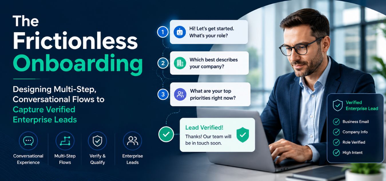
The Frictionless Onboarding: Designing Multi-Step, Conversational Flows to Capture Verified Enterprise Leads
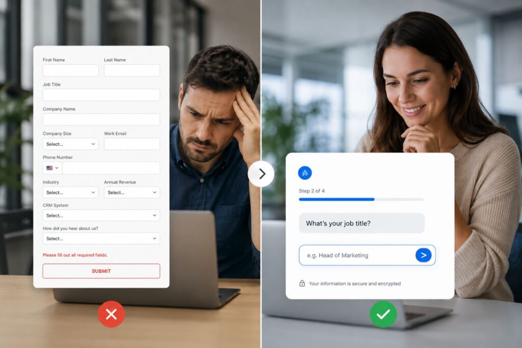
The Form Fatigue Epidemic
Every ambitious B2B software company eventually discovers a massive leak in its customer acquisition funnel. You spend thousands of dollars on brilliant Meta ads and SEO optimization to drive targeted executives directly to your platform.
Then, you force them to stare at a terrifying, static 10-field registration form.
💡 Executive Insight: The Calculation of Effort
Modern enterprise buyers suffer from intense decision fatigue. When confronted with a massive wall of required text fields, their brain instantly calculates the cognitive effort required to complete it. If the perceived effort outweighs their immediate curiosity, they will bounce.
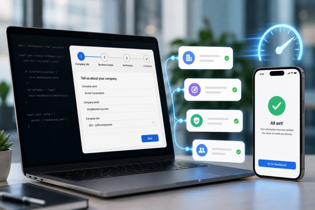
Today, we are completely dismantling the outdated, static web form.
We will explore the architecture of “Frictionless Onboarding” and how conversational UI drastically increases high-ticket lead capture.
By the end of this engineering guide, you will understand how to build an onboarding experience that feels like a luxury digital concierge.
Eliminating Cognitive Load with Micro-Commitments
When a user lands on a standard registration page, they subconsciously measure the effort required to proceed.

A long, scrolling form triggers immediate psychological resistance.This friction is the number one killer of enterprise SaaS conversions, directly spiking your Customer Acquisition Cost (CAC).
How a conversational UI systematically neutralizes psychological resistance:
- The Sliced Payload: Instead of asking for ten pieces of data at once, the interface asks one simple, isolated question per screen.
- The “Foot-in-the-Door” Technique: You ask the easiest, lowest-friction question first (e.g., “What is your primary goal?”). Once they answer, they are subconsciously committed to finishing.
- The Endowed Progress Effect: By displaying a dynamic progress bar that starts at 20% rather than 0%, you give the user a psychological head start, compelling them to cross the finish line.
When you remove the visual weight of the data collection process, complex enterprise onboarding suddenly feels effortless.
What Are Micro-Commitments?
Micro-commitments are small interactions that require minimal effort from the user. Each interaction feels simple, quick, and low-risk.
Examples include:
- Selecting a business type
- Choosing a company size
- Picking a preferred service category
- Providing a work email
- Confirming a phone number
- Scheduling a consultation
Rather than overwhelming users with ten questions simultaneously, the system presents one question at a time, guiding them naturally toward completion.
This approach mirrors a real conversation, where people answer one question before moving to the next.
Why Micro-Commitments Improve Completion Rates
Human attention is limited. When users see a large form, they instinctively estimate how much work is required.
A lengthy onboarding form often triggers thoughts such as:
- “This will take too long.”
- “I don’t have time right now.”
- “I’ll come back later.”
Unfortunately, many never return.
Conversational onboarding changes this perception. Because each step appears small and achievable, users focus only on the current action instead of the entire process.
This significantly reduces perceived effort while increasing the likelihood of form completion.
Reducing Decision Fatigue
Decision fatigue occurs when users are required to make too many choices simultaneously.
Enterprise onboarding often asks prospects to provide:
- Business information
- Budget expectations
- Team size
- Industry details
- Project requirements
- Contact information
Presenting all these requests on a single screen can quickly overwhelm users. Micro-commitment flows solve this problem by distributing decisions across multiple screens or conversational messages.
Instead of processing everything at once, users focus on one decision at a time, reducing mental strain and increasing clarity.
Visual Design: The Aesthetics of One Question at a Time
You cannot build a frictionless flow using default browser styles and generic templates. Your user interface must project undeniable digital luxury and massive institutional trust.
Over our 9+ years of engineering digital experiences, we have found that extreme focus is the key to elite onboarding.
The aesthetic rules for high-fidelity conversational flows:
- The Singular Focus: The screen should contain nothing but the current question, a large, beautiful input field, and a subtle progression mechanic.
- Typographic Authority: Use large, mathematically aligned typography so the user instantly understands what is being asked without squinting or leaning in.
- Extreme Whitespace: Strip away the navigation bar, the footer, and all surrounding marketing clutter. The user’s retina needs absolute calm to focus on the data entry.
When you treat your data collection with this level of visual respect, users provide more accurate, thoughtful responses.
The Legacy Form vs. Conversational UI
To understand why this specific architectural shift accelerates enterprise growth, we must contrast it directly with legacy pipelines.
The differences in completion rates, data quality, and user friction are immense.
| The Onboarding Metric | The Legacy Static Form | The Conversational Multi-Step UI |
| Cognitive Load | Massive. Overwhelming interface triggers immediate fatigue. | Minimal. Sliced data requests prevent visual burnout. |
| Average Completion Rate | Typically hovers around 15% to 25% for B2B. | Often exceeds 65% due to escalating micro-commitments. |
| Lead Data Quality | High risk of fake names, rushed data, and burner emails. | Highly accurate. Users feel guided and respected. |
| Mobile Experience | Frustrating. Constant zooming and tedious scrolling required. | Flawless. Native, app-like transitions perfectly fit mobile screens. |
By trimming the fat from your visual pipeline, you drastically lower user friction while maximizing the productivity of your sales team.
Why Traditional Lead Forms Create Friction
Many enterprise websites unintentionally lose qualified leads because their forms ask for too much information upfront. Prospects often arrive with limited time and attention. When they encounter a lengthy form, they may hesitate, postpone the process, or leave altogether.
Common problems with legacy forms include:
- Information overload from too many fields.
- Lack of personalization.
- Poor mobile experience.
- High abandonment rates.
- No sense of progress or engagement.
- Difficulty identifying which questions discourage conversions.
When users are unsure how long a form will take, they often perceive the effort required as greater than the value offered. This creates unnecessary friction during one of the most important stages of the customer journey.
The Conversational Advantage
Conversational UI transforms data collection into a guided experience. Rather than displaying every question at once, information is gathered gradually through a sequence of logical interactions.
Each answer helps determine the next question, creating a more personalized journey that feels tailored to the prospect’s specific needs.
For example, instead of asking for company size, industry, project budget, timeline, and contact details all at once, the system might begin with a simple question:
“What type of solution are you looking for?”
Based on the response, subsequent questions become more relevant and meaningful.
This approach offers several benefits:
- Reduces cognitive load.
- Creates a more engaging experience.
- Improves completion rates.
- Increases perceived personalization.
- Helps qualify leads more accurately.
- Builds trust through progressive interaction.
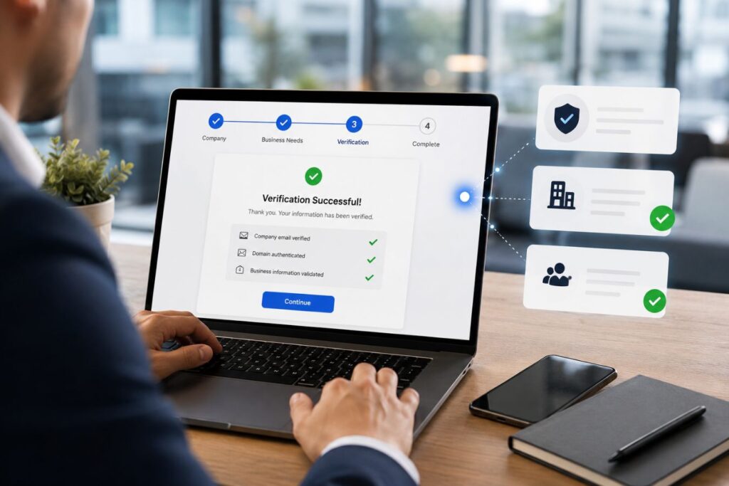
Engineering Immediate Validation and Feedback
A premium B2B onboarding flow never punishes the user for making a mistake. Forcing an executive to click “Submit” only to be hit with an aggressive, massive red error box is a guaranteed way to lose a high-ticket lead. True digital luxury requires you to anticipate their actions and validate their data instantly, field by field, in real-time.
Why wait until the end of the journey to correct a typo when you can guide them flawlessly from the first keystroke?
Here are the crucial technical micro-interactions required to build a luxurious, frictionless feel:
- The Auto-Advance Protocol: When a user selects a multiple-choice radio button, automatically slide them to the next screen. Never force them to manually tap a “Next” button if the system already has the answer.
- Inline Validation Checkmarks: Use a subtle, animated green checkmark that appears the exact millisecond a valid corporate email or phone number is recognized. This provides immediate, satisfying psychological validation.
- Smart Keyboard Triggers: On mobile devices, ensure the correct native keyboard triggers automatically for each specific input field. Bring up the numeric keypad for phone numbers and the standard alphabetical board for names.
Are your current web forms actively fighting against your mobile users, or are they silently anticipating their exact needs?
| The Interaction Phase | The Legacy Approach (High Friction) | The Premium Micro-Interaction (Zero Friction) |
| Error Handling | Waiting until “Submit” to show a wall of red text. | Real-time, inline validation as the user types. |
| Progression | Forcing users to scroll down to find a hidden “Next” button. | Auto-advancing the screen the moment a choice is made. |
| Mobile Input | Making users manually switch to the numbers keyboard. | Auto-triggering the numeric keypad for phone fields. |
If your registration process feels clunky and exhausting, what will that executive subconsciously assume about the quality of your actual software?
Small, frictionless moments do more than just save time. They silently communicate to the buyer that your entire backend infrastructure is sophisticated, highly optimized, and undeniably reliable.
Powering Instant Transitions with Next.js
A beautifully designed multi-step form is completely ruined if the browser has to reload a web page between every single question. The transitions between steps must happen in zero milliseconds.
This requires deploying a decoupled, highly optimized frontend architecture.
How modern Full-Stack engineering protects the onboarding experience:
- Pre-Fetched Logic: By utilizing Next.js, we pre-load the entire onboarding logic into the initial JavaScript payload, ensuring subsequent steps are already waiting in the background.
- Zero Layout Shift: When the user hits “Next,” the UI simply slides the new component into view instantly, guaranteeing flawless layout stability without violent page jumps.
- Edge-Cached Animations: We integrate lightweight, edge-delivered Lottie animations to celebrate milestones (like verifying an account) without blocking the main rendering thread.
When your frontend architecture is perfectly optimized, the web-based onboarding process feels exactly like a downloaded iOS application.
Supporting Verified Enterprise Lead Collection
Capturing verified enterprise leads often requires additional validation steps such as:
- Business email verification
- Company domain checks
- CRM enrichment
- Role validation
- Industry qualification
- Geographic verification
These processes can introduce delays if implemented poorly.
Next.js helps manage these operations through asynchronous requests and background processing. Verification tasks can occur behind the scenes while users continue progressing through the onboarding flow.
This approach minimizes waiting while still ensuring high-quality lead data enters the sales pipeline.
The Invisible API Security Layer
Gathering user data is entirely pointless if that data is inaccurate. B2B startups waste thousands of operational hours chasing disconnected phone numbers and disposable “burner” email addresses.

However, a premium conversational UI allows you to embed powerful API security validations entirely behind the scenes, protecting your CRM without ever disrupting the user’s aesthetic flow.
Real-World Impact: The Sales Team Morale
Imagine your top sales executive preparing for a high-stakes follow-up call, only to discover the lead provided a fake number. Multiply that by 50 leads a week. Not only are you burning marketing budget on fake clicks, but you are actively destroying the morale of your sales team. When your onboarding flow invisibly verifies every single piece of data before it hits the CRM, your team stops acting like data entry clerks and starts acting like high-ticket closers.
Here is exactly how to verify enterprise leads invisibly without causing user friction:
- Disposable Email Blocking: Integrate a hyper-fast API check during the email step. If a user types a temporary address (like
@yopmail.com), the UI gently prompts them to use their official corporate email instead, ensuring you capture their true business identity. - Address Autocomplete: Do not force busy executives to manually type their city, state, and zip code. Use a places API so that typing just three letters auto-completes the entire global address flawlessly, eliminating keyboard fatigue.
- Seamless OTP Verification: Incorporate a One-Time Password (OTP) request directly into the conversational flow. By verifying their mobile number mid-conversation, you guarantee 100% accurate sales routing.
To understand the operational advantage, look at the difference in data quality:
| The Verification Protocol | The Legacy Form Result | The API-Verified Result |
| Email Capture | High volume of personal (Gmail) or disposable addresses. | 100% Corporate: Guarantees routing to legitimate business domains. |
| Location Data | Prone to typos, misspelled cities, and wrong zip codes. | Standardized & Flawless: Data is perfectly formatted for your logistics or CRM backend. |
| Phone Numbers | High rate of “fake” entries (e.g., 555-5555). | 100% Active: Real-time OTP confirms the device is currently in the user’s hand. |
By silently enforcing data integrity through the power of edge APIs, you ensure your sales team only spends their valuable time speaking to verified, high-intent prospects.
Case Study Snapshots: The ROI of Frictionless Flows
Theoretical UI discussions only matter if they move the needle on enterprise revenue. Upgrading your core onboarding components is one of the most profitable investments a SaaS company can make.
Here is how transitioning to conversational flows solves massive operational bottlenecks:
Case Study Snapshot: The FinTech SaaS Platform
- The Bottleneck: A financial software tool was losing 80% of its incoming leads on a massive registration page that asked for company size, tax IDs, and API needs all at once.
- The Solution: We sliced the form into a 5-step conversational Next.js flow, utilizing heavy whitespace and a visual progress bar. We intentionally asked the easiest questions first.
- The ROI: Lead capture increased by 310% in just 14 days. Because the flow felt premium and respectful of their time, high-value enterprise clients stopped abandoning the process.
Case Study Snapshot: The Global Logistics App
- The Bottleneck: Mobile users were abandoning the onboarding process because typing out long warehouse addresses on a smartphone was tedious and prone to frustrating typos.
- The Solution: We integrated an auto-complete API directly into the first step. The user typed three letters, tapped their verified address, and the UI auto-advanced to the next screen instantly.
- The ROI: The mobile drop-off rate plummeted from 65% down to 12%. The client secured thousands of newly verified logistics accounts simply by removing keyboard friction.
Final Thoughts: The First Impression is Everything
Stop treating your client onboarding process like an administrative afterthought. It is the very first intimate interaction a high-ticket buyer has with the internal mechanics of your software.
If your registration process feels clunky, cheap, and exhausting, they will subconsciously assume your entire software platform operates the exact same way.
Embrace the power of the conversational user interface.
Slice your heavy data requests into beautiful, isolated moments of psychological micro-commitment.
Protect the user’s focus with extreme whitespace, validate their inputs instantly, and ensure every transition happens in milliseconds.
When you engineer absolute digital luxury, capturing verified enterprise leads becomes effortless.
Frequently Asked Questions (FAQs)
1. If we break our form into 5 steps, won’t users get annoyed by having to click “Next” so many times?
Data shows the exact opposite is true. While clicking “Next” requires a minor physical action, it dramatically reduces cognitive load. Users vastly prefer answering five simple questions across five clean screens over staring at one massive, overwhelming page of text boxes, provided the transitions between steps are instantaneous.
2. Can we still use multi-step onboarding if we only need three pieces of information (Name, Email, Phone)?
Yes, but the approach shifts. For ultra-short data collection, a clean, well-designed single step is often sufficient. However, if you want to qualify the lead, you can add two frictionless multiple-choice questions (e.g., “What is your budget?”) before asking for the email. This leverages the “Endowed Progress Effect” and actually increases the likelihood they will provide their contact details.
3. Will adding API validations (like email checking) slow down the onboarding experience?
Not if engineered correctly. Using modern full-stack frameworks like Next.js paired with rapid edge functions, validation APIs process data in under 50 milliseconds. This happens entirely in the background while the user is typing, ensuring the UI remains perfectly fluid and never blocks their momentum.