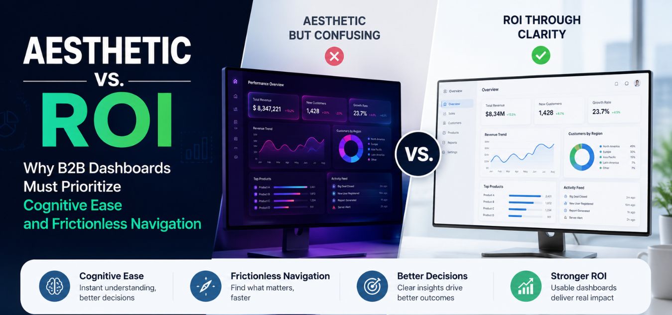
Aesthetic vs. ROI: Why B2B Dashboards Must Prioritize Cognitive Ease and Frictionless Navigation
The `Dribbble Trap` in Enterprise Design
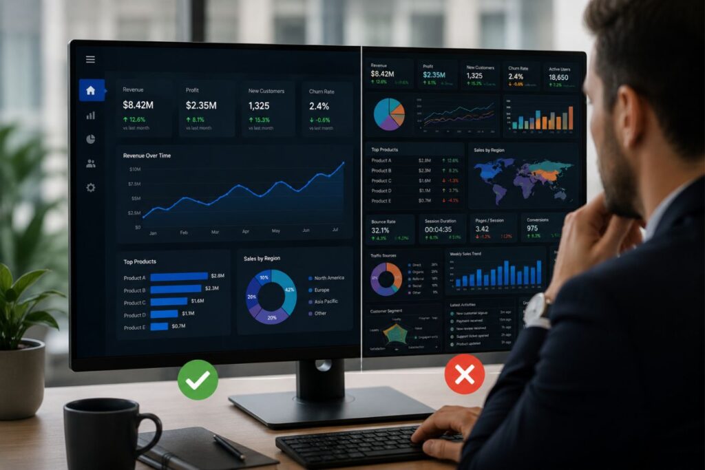
There is a growing, expensive problem in the B2B SaaS space. Founders are approving dashboard designs that look like sci-fi movie interfaces, prioritizing raw visual complexity over actual usability.
We call this the “Dribbble Trap.” It happens when a platform is designed to win design awards and get social media likes, rather than helping enterprise users complete their daily tasks.
When your users are trying to run a business, complex visual aesthetics do not impress them. Unnecessary gradients, heavy shadows, and hidden menus actually cause immense frustration and visual fatigue.
💡 Executive Insight: The Cost of Complexity In the enterprise software market, your users are typically logging in to do a job. Every extra second they spend trying to figure out your complex navigation is friction. If your software physically exhausts your users, they will inevitably churn to a simpler competitor.
Today, we are unpacking the critical difference between designing for aesthetics and designing for ROI. We will explore why cognitive ease is your ultimate competitive advantage.
By the end of this guide, you will understand how to build a B2B dashboard that drives user retention, increases feature adoption, and directly impacts your bottom line.
Understanding Cognitive Load
To engineer a high-converting B2B dashboard, you must first understand the psychological reality of your user. They are not casually scrolling social media on their couch; they are stressed professionals operating under strict deadlines.
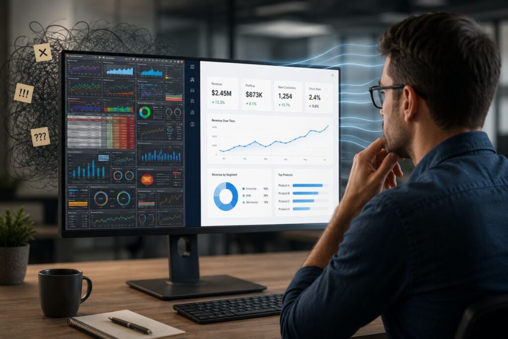
Their cognitive load the exact amount of mental processing power required to navigate your application is often already pushed to its absolute limit before they even log in.
To prevent your software from becoming a source of stress, you must understand how complexity breaks the user:
- The Context of Use: Your user is a busy CTO, a logistics manager, or an overwhelmed data entry specialist trying to solve an immediate, high-stakes problem.
- The Mental Tax: Every unnecessary shadow, gradient, or hidden menu you add forces their brain to process useless visual data, draining their limited mental energy.
- The Aesthetic Penalty: When you prioritize visual complexity over operational clarity, you push that cognitive load past the breaking point, causing extreme frustration.
Here is exactly how prioritizing excessive aesthetics actively destroys the B2B user experience and hurts your bottom line:
| The Design Element | The Aesthetic Goal | The Actual B2B ROI Impact |
| Hidden “Hamburger” Menus | Keeps the dashboard looking incredibly clean, spacious, and minimalist. | Users cannot find core features. Support tickets skyrocket and overall feature adoption drops. |
| Low-Contrast “Sleek” Text | Looks modern, futuristic, and highly stylized on a high-end monitor. | Causes rapid visual fatigue. Users make critical data entry errors and log out earlier in the day. |
| Complex Chart Animations | Creates a cinematic “wow” factor when the dashboard first loads. | Wastes 3 seconds every single time the user navigates, completely destroying operational efficiency. |
Why This Matters in Real Life
Imagine a regional manager trying to pull a critical quarterly report with their CEO actively waiting on a Zoom call. If they have to click through three nested, minimalist menus and wait for a slick chart animation to finish loading just to find the “Export CSV” button, their panic spikes. They do not care how beautiful your software is; they care that your interface is making a stressful situation worse. This exact moment of daily friction is why massive enterprise teams routinely abandon expensive, over-designed software to just go back to using simple Excel spreadsheets.
Over our 9+ years of engineering digital experiences, we have proven that true luxury in B2B design is completely invisible. It is the profound feeling of absolute, frictionless navigation.
Visual Complexity vs. Data Clarity
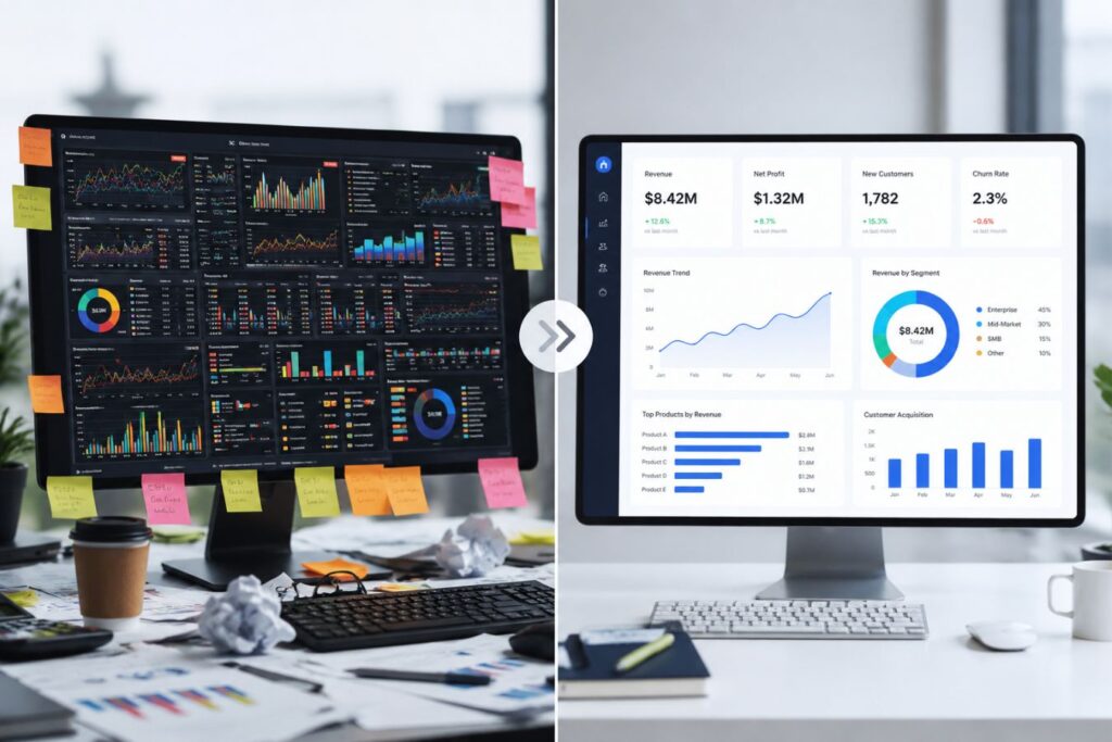
Simplifying your interface does not mean making it look cheap. The goal is to strip away the decorative noise so the actual data becomes the primary focus.
Every pixel on a B2B dashboard must earn its place. If a design element does not actively help the user make a decision or complete a task, it must be removed.
This requires a highly disciplined approach to color theory, typography, and spatial architecture.
Engineering Cognitive Ease
- Purpose-Driven Palettes: Stop using ten different bright colors. We restrict enterprise palettes to deep tech shades (like dark slate or minimal purples) and crisp whites, using bright accent colors only for critical alerts or primary buttons.
- The F-Pattern Layout: The human eye scans digital screens in an “F” shape. Place your most critical navigation on the left sidebar, and your highest-priority data at the top left of the main content area.
- Zero-Trap States: Users should never feel “stuck” inside a complex settings menu or a multi-step form. Always provide a clear, highly visible “Back” button or breadcrumb trail to return them to safety.
- Progressive Disclosure: Do not show the user 100 data points at once. Show them the 5 most important summary metrics, and allow them to click to “drill down” into the complex data only if they need it.
When you master these architectural rules, your software stops feeling like a puzzle and starts feeling like an extension of the user’s own mind.
Visual Hierarchy Matters More Than Decoration
Good dashboards guide the eye naturally. Users should instantly know:
- What is most important
- What requires attention
- What actions should be taken next
This is where visual hierarchy becomes critical. Strategic use of size, spacing, contrast, and positioning creates a smoother user experience than adding more visual effects.
A high-performing dashboard does not try to make every element stand out equally. Instead, it prioritizes information based on business importance.
Minimalism Does Not Mean Boring
Many companies confuse simplicity with lack of creativity. In reality, the best enterprise dashboards combine clarity with refined aesthetics.
Minimal design can still feel modern and premium when it includes:
- Balanced layouts
- Sophisticated typography
- Consistent spacing systems
- Subtle shadows and depth
- Controlled color usage
- Smooth but purposeful interactions
The goal is not to remove personality from the interface. The goal is to ensure design enhances usability instead of competing against it.
How Frictionless Navigation Drives Revenue
It can be difficult to convince a board of directors to invest in a UI/UX overhaul using purely aesthetic arguments. To secure enterprise budgets, you must translate design terminology directly into hard financial outcomes.
A confusing dashboard does not just result in unhappy users; it results in massive, bleeding operational costs for your own company.

When you prioritize cognitive ease over visual complexity, the financial return on investment is immediate, trackable, and highly measurable.
To understand the stakes, look at how bad design triggers negative emotions that directly destroy your revenue:
| The UX Failure | The User’s Emotion | The Financial Consequence |
| Hidden Features & Menus | 🤬 Extreme Frustration | High support ticket volume, bloating your customer service payroll. |
| Bloated, Slow Animations | ⏳ Severe Impatience | Abandoned free trials and skyrocketing Customer Acquisition Costs (CAC). |
| Cluttered Data Layouts | 🤯 Cognitive Overload | Users abandon the software for Excel, resulting in canceled enterprise contracts. |
Here is the direct ROI of implementing a conversion-centric, frictionless design:
- Lower Customer Acquisition Cost (CAC)
- Clarity Cue:
💡 Instant Epiphany - A frictionless free-trial experience means users instantly understand your product’s core value. They convert to paid tiers much faster, requiring far less manual intervention from your sales team.
- Clarity Cue:
- Drastically Reduced Churn
- Loyalty Cue:
🛡️ Fierce Loyalty - Software that is easy to use becomes a sticky, indispensable daily habit. When your platform actively reduces a user’s daily stress, they will fight their own procurement teams to keep your contract active.
- Loyalty Cue:
- Decreased Support Overhead
- Efficiency Cue:
🧘 Operational Relief - Every time a user cannot find a setting, it costs your company real money to answer their support ticket. Intuitive navigation acts as your invisible frontline customer support, saving thousands of dollars a month.
- Efficiency Cue:
To secure buy-in for your next redesign, use this translation matrix to speak the language of your executives:
| The UI/UX Upgrade | The Resulting Emotion Tag | The Boardroom Metric (The ROI) |
| Frictionless Onboarding Flow | 🎯 Immediate Confidence | Accelerated Sales Velocity: Faster time-to-value reduces the friction in the enterprise sales pipeline. |
| High-Contrast, Clear Data | 😌 Daily Cognitive Relief | Maximized LTV: High daily active usage directly increases the Customer Lifetime Value. |
Case Study Snapshots: Simplifying for Scale
Theoretical UI principles only matter if they survive contact with real enterprise users. Removing complexity is often the hardest challenge for a development team to accept.
Here is how replacing complex, visually bloated designs with frictionless architecture solves massive business bottlenecks:
Case Study Snapshot: The Logistics Tracking Dashboard
- The Bottleneck: A freight tracking platform used a massive, highly detailed 3D map as their central dashboard widget. It looked incredible, but users complained the app was slow and confusing.
- The UX Fix: We removed the heavy 3D map entirely. We replaced it with a clean, high-contrast, text-based data table showing exactly which shipments were delayed, using simple color-coded status badges.
- The ROI: Page load times dropped to under a second. The users—who just needed to know what was late—stopped calling support. Daily active usage time increased by 40% because the software finally respected their time.
Case Study Snapshot: The Financial CRM
- The Bottleneck: A custom CRM for financial advisors had a sprawling top-navigation menu with dropdowns inside of dropdowns. Advisors were getting lost and abandoning the tool for Excel.
- The UX Fix: We engineered a rigid, persistent left-hand sidebar menu. We used progressive disclosure, hiding complex compliance settings until the user specifically clicked an “Advanced Configuration” toggle.
- The ROI: The cognitive load was slashed in half. Without the overwhelming interface, the advisors successfully migrated their data, leading to a 100% successful enterprise rollout and a secure multi-year retainer.
Final Thoughts: Respecting the User’s Time
Building a successful B2B SaaS platform is not an art project. It is a highly strategic exercise in human psychology and business logic.
Every time you add a completely unnecessary visual flourish to your dashboard, you are stealing a fraction of a second from your user’s day. Over a year, those fractions add up to immense frustration.
The most premium, high-end software in the world does not scream for attention. It operates quietly, efficiently, and flawlessly in the background.
Audit your platform today. If your users have to think about how to use your dashboard, rather than simply using it, you are actively losing ROI.
Frequently Asked Questions (FAQs)
1. Does prioritizing “cognitive ease” mean our dashboard has to look boring?
Absolutely not. Cognitive ease is about removing distractions, not removing beauty. You can achieve a breathtaking, premium aesthetic through flawless typography, perfect alignment, and a highly disciplined color palette. A clean, minimal dashboard actually looks much more expensive and mature than a cluttered, over-designed one.
2. How do we know which features are causing cognitive friction for our users?
The best way to identify friction is through session recording tools (like Hotjar or Microsoft Clarity) and analyzing your customer support tickets. If you see users rapidly clicking around the screen without taking action (“rage clicking”), or if 30% of your support tickets are asking “How do I export my report?”, you have identified a massive failure in your navigational UX.
3. Should we hide less important features to keep the dashboard clean?
Yes, but you must do so strategically using “Progressive Disclosure.” Do not hide core, daily-use features behind complex menus. Instead, display the primary tools immediately, and group the secondary, complex settings behind a clearly labeled “Advanced Settings” or “More Options” button. This keeps the initial view clean while still allowing power users to access what they need.