
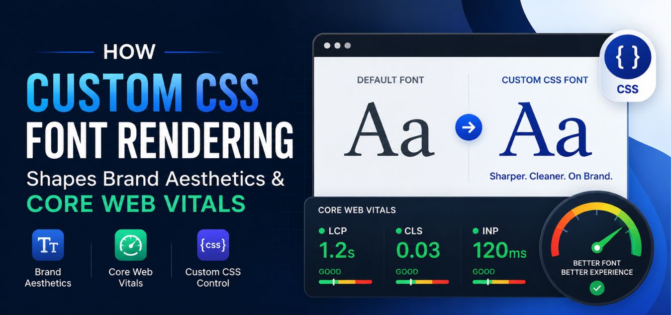
The Typography Hierarchy: How Custom CSS Font Rendering Impacts Premium Brand Aesthetics and Core Web Vitals
The Silent Language of Enterprise Design
Typography is the absolute foundation of your digital identity. Before a user even reads the first word on your website, they have already subconsciously judged your corporate authority based purely on the shape, weight, and spacing of your letters.
However, in the modern landscape of B2B SaaS and enterprise marketing, beautiful typography hides a massive technical liability.
If your custom fonts are heavy, unoptimized, and slow to render, they will actively destroy your Google search rankings.
💡 Executive Insight: The Font Performance Penalty
You do not have to choose between a premium visual identity and lightning-fast server response times. The highest-performing enterprise platforms utilize advanced CSS rendering techniques to deliver bespoke typography in milliseconds, satisfying both the human eye and the AI search crawler.
Today, we are bridging the gap between creative design and technical SEO. We will explore the strict intersection of high-fidelity typography and Core Web Vitals.
By the end of this comprehensive guide, you will understand how to engineer a digital presence that looks incredibly expensive while loading instantaneously.
Why Minimalist Aesthetics Command High-Ticket Trust
In the B2B space, your clients are making high-stakes financial decisions. When they evaluate your platform, they are looking for signals of operational maturity and meticulous attention to detail.

Amateur designers often rely on chaotic colors and heavy animations to capture attention. True luxury design is completely different.
Over our 9+ years of engineering digital experiences at Creative Riz, we have proven that absolute trust is built through clean, minimal, and corporate aesthetics. Typography is the primary vehicle for this minimalism.
To understand the psychological impact of font rendering, look at how the brain processes digital text:
| The Typography Trait | The Amateur Implementation | The Premium Brand Standard |
| Font Selection | Overused, generic system fonts or highly decorative, distracting typefaces. | Clean, geometric sans-serifs that exude modern corporate maturity. |
| Visual Hierarchy | Every headline is the same size; the eye does not know where to look first. | Strict, mathematically scaled heading structures (H1, H2, H3) that guide the reader effortlessly. |
| Negative Space | Text is cramped and crowded, causing immediate cognitive fatigue. | Generous line height and balanced letter spacing that allows the design to “breathe.” |
When your typography is architected correctly, your software stops looking like a startup experiment and immediately commands enterprise authority.
The Algorithmic Cost of Unoptimized Fonts
Google’s Core Web Vitals are strict financial indicators. If your website fails these technical metrics, your organic search visibility will plummet, driving up your customer acquisition costs.
Custom fonts are notoriously one of the biggest culprits behind failed Core Web Vitals scores.
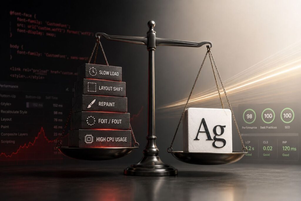
When a browser encounters a massive, unoptimized font file, it literally halts the rendering of the page. This creates a cascade of SEO penalties.
How Bad Typography Destroys SEO
- FOIT (Flash of Invisible Text): The browser hides all text while it waits for the custom font file to download. For several seconds, your user stares at a completely blank screen, causing massive bounce rates.
- FOUT (Flash of Unstyled Text): The browser shows a generic font first, and then aggressively “snaps” to your custom font once it loads. This visual jarring destroys the premium feel of the site.
- Cumulative Layout Shift (CLS): When the custom font finally loads, it often has different dimensions than the fallback font. This causes the entire layout of the page to jump violently, which Google heavily penalizes.
- Largest Contentful Paint (LCP): If your primary H1 headline is waiting on a 300KB font file to load, your LCP score will fail, actively signaling to search engines that your site is slow and unresponsive.
You cannot afford to let your creative assets sabotage your digital marketing pipeline.
When Beautiful Fonts Create Poor User Experiences
Visitors rarely identify font-loading issues directly. Instead, they experience symptoms such as:
- Text appearing late
- Content shifting unexpectedly
- Delayed page interactions
- Slower navigation between pages
- Reduced readability during loading
These small frustrations accumulate and influence user behavior. Research consistently shows that users are less likely to engage with websites that feel slow or unstable, regardless of how visually appealing the design may be.
For premium brands, this creates a contradiction. The very typography intended to communicate quality can end up damaging the perception of professionalism if performance suffers.
Engineering the Perfect CSS Font Stack
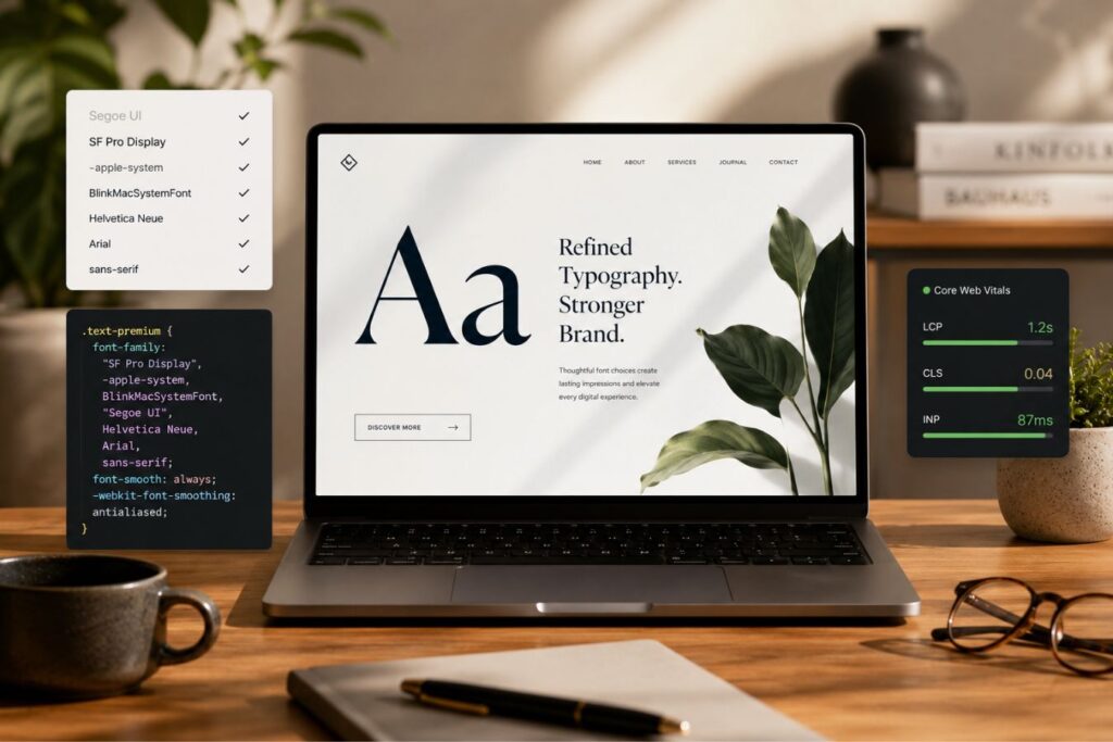
To achieve both visual excellence and perfect technical scores, you must treat your typography as code, not just art.
At Creative Riz, we do not just design beautiful interfaces; we meticulously engineer how those interfaces are delivered to the browser.
Securing sub-second load times requires a rigorous, multi-step CSS rendering strategy.
To build a high-ranking asset that actually converts, your architecture must follow these exact protocols:
| The Font Optimization | The Pain (The SEO Bottleneck) | The Fix (The Architectural Solution) |
| Format Modernization | Serving massive .ttf or .otf files that clog the network payload. | Convert all fonts exclusively to the highly compressed WOFF2 format, reducing file size by up to 70%. |
| Strategic Preloading | The browser discovers the font file too late in the rendering process. | Inject a <link rel="preload"> tag in the document <head> to force the browser to fetch the font immediately. |
| CSS Font-Display | Suffering from the dreaded FOIT (invisible text) penalty. | Utilize the font-display: swap; CSS property to ensure text is immediately visible while the custom font loads. |
| Variable Fonts | Loading six different files just to get bold, italic, and light font weights. | Implement a single “Variable Font” file that mathematically renders infinite weights from one hyper-efficient request. |
By treating your font SEO with the same ruthless precision as your backend security, you guarantee that your bespoke aesthetics dominate the search results.
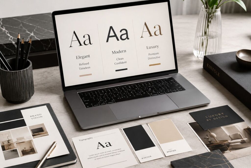
Selecting Fonts That Reflect Brand Positioning
Typography is one of the strongest visual signals of brand personality. Before building a font stack, it is important to understand the message the brand wants to communicate.
Different font categories create different emotional responses:
- Serif fonts often communicate trust, authority, and sophistication.
- Sans-serif fonts typically convey modernity, clarity, and innovation.
- Display fonts create uniqueness and visual impact.
- Monospaced fonts are commonly associated with technology and engineering.
Premium brands often select typefaces that feel distinctive while remaining highly readable. The font should complement the company’s overall visual language rather than compete with it.
Building Smart Fallback Strategies
Many designers focus heavily on their primary font but overlook fallback options. This mistake can create a noticeably different appearance when the primary font fails to load.
A smart fallback strategy includes fonts with similar:
- Character proportions
- X-height
- Letter spacing
- Stroke weight
- Overall visual personality
For example, if a custom sans-serif font serves as the primary typeface, fallback fonts should also be modern sans-serif options that preserve a similar visual rhythm. This minimizes noticeable changes during font loading and reduces layout instability.
Delivering Typography at the Edge
If your website relies on heavy WordPress plugins to load custom fonts, you are already losing the SEO race. Legacy monolithic platforms execute code far too late in the page load cycle, causing unavoidable visual delays and poor performance.
To achieve true enterprise scalability, you must decouple your architecture. By separating your backend logic (like Laravel) from your frontend delivery (like Next.js), you gain absolute, pixel-perfect control over how and when your typography is rendered.
Here is exactly how modern Full-Stack development solves the typography hierarchy:
- Automatic Font Optimization: Next.js features a built-in
next/fontmodule that automatically downloads and locally hosts your fonts at build time. This completely eliminates slow, external network requests to third-party servers. - Mathematical Zero Layout Shift: The framework automatically calculates the exact dimensions of your custom font and generates a perfectly sized, temporary fallback. This mathematically guarantees a perfect Zero CLS (Cumulative Layout Shift) score.
- Localized Edge Delivery: By caching optimized font files at the CDN edge, users in targeted regions like Pakistan download the typography from a server physically located near them, rather than waiting for a response from across the globe.
Core Insight: Decoupling your frontend architecture transforms your premium typography from a slow SEO liability into an instantaneous, high-ranking asset.

When premium visual design is paired with elite Next.js engineering, your brand becomes an unstoppable force in organic search.
Case Study Snapshots: The ROI of Typography Optimization
Theoretical design principles sound great in a boardroom, but real-world execution is where market share is won.
Here is how resolving the tension between custom aesthetics and Core Web Vitals directly solves enterprise conversion bottlenecks:
Case Study Snapshot: The Fintech SaaS Dashboard
- The Bottleneck: A financial platform used a heavy, custom corporate font. Users on slower networks experienced a 4-second delay where the financial data was completely invisible (FOIT), leading to severe user frustration.
- The Fix: We audited the CSS delivery, converted the assets to WOFF2, and implemented strict
font-display: swapprotocols combined with a perfectly matched fallback font using Next.js.- The ROI: The dashboard data became visible in under 0.8 seconds. The perceived speed of the application skyrocketed, drastically reducing support tickets and eliminating early session abandonment.
Case Study Snapshot: The B2B Consulting Agency
- The Bottleneck: An agency’s beautifully designed blog was failing Google’s Core Web Vitals due to massive Cumulative Layout Shifts (CLS) every time their custom headline fonts loaded.
- The Fix: We engineered a custom variable font stack and utilized HTML preloading specifically for above-the-fold typography, preventing the layout from jumping.
- The ROI: By fixing the CLS penalty, their technical SEO score hit 100/100. Within two months, their high-intent articles successfully indexed and ranked on the first page of Google, driving high-ticket organic leads.
Final Thoughts: The Invisible Luxury
In the digital world, true luxury operates invisibly. Your enterprise clients should never have to think about your website’s performance, nor should they ever notice a jarring layout shift.
Premium typography is non-negotiable for establishing corporate authority. However, it must be deployed with absolute technical precision.
When you master the typography hierarchy balancing clean, minimal aesthetics with ruthless CSS optimization you create a frictionless digital experience.
Stop sacrificing your Core Web Vitals for the sake of a pretty font, and stop abandoning your brand identity just to pass a speed test. You can, and must, engineer both.
Frequently Asked Questions (FAQs)
1. Should I host my custom fonts locally or use Google Fonts?
For maximum performance and strict privacy compliance (like GDPR), it is always best to host your fonts locally on your own server. Relying on the Google Fonts API introduces an external DNS lookup and a third-party network request, which can add hundreds of milliseconds of latency to your server response time. Modern frameworks like Next.js automatically handle this local hosting for you during the build process.
2. What is the difference between WOFF and WOFF2 font formats?
WOFF (Web Open Font Format) was created specifically for web typography, providing better compression than standard TTF files. WOFF2 is the next generation of this format, offering an additional 30% reduction in file size over the original WOFF. Because WOFF2 is universally supported by all modern browsers, it is the absolute enterprise standard for delivering high-fidelity typography with zero latency.
3. Will font-display: swap cause my website to look ugly while loading?
If configured poorly, yes, it can cause a noticeable “flash” of a different font. However, elite frontend developers use specialized CSS tools (like size-adjust and ascent-override) to mathematically scale the temporary fallback font so it exactly matches the dimensions of your custom font. This ensures the text remains readable instantly, while completely preventing the page layout from jumping when the final font loads.
About the Author