
10 Best UX Case Studies Every Designer Should Know (2025)
UX Case Studies are stories about how designers make products easy and enjoyable to use. They show the project’s goals, challenges, and the steps taken to understand users’ needs. By explaining the design process and improvements, these case studies highlight how good design makes a positive impact on the user experience.
why studying the best UX case studies is important?
- Learning from Success and Failure: Case studies show real-world examples of what works and what doesn’t in design. They help us learn from successful designs and avoid common pitfalls.
- Practical Application of Theory: They bridge theory and practice by demonstrating how UX principles like usability and accessibility are applied in actual products.
- Inspiration for Innovation: By exploring innovative UX solutions, designers can find new ideas and approaches to create user-friendly experiences.
- Insight into User Behavior: Case studies often include user research insights, helping designers understand how different users interact with products and what they expect.
- Setting Benchmarks: They provide benchmarks for evaluating design success, helping set goals for user engagement and satisfaction.
- Professional Growth: For UX professionals, studying case studies enhances problem-solving skills and keeps them updated on industry trends.
10 Best UX Case Studies Every Designer Needs
Understanding how top companies design user experiences (UX) is crucial for any designer aiming to improve their skills. By examining the best UX case studies, designers can learn valuable lessons and apply these insights to their projects. In this article, we’ll explore 10 of the best UX case studies that every designer should know.
These case studies highlight innovative solutions, user-centric design principles, and the impact of great UX on user engagement and satisfaction.
1. Zoom: Revolutionizing Virtual Meetings

Overview
Zoom’s UX design focuses on providing a seamless and reliable virtual meeting experience. The platform’s ease of use, high-quality video and audio, and robust features have made it a leader in the virtual meeting space.
Key Takeaways
- Ease of Use: Simple interface that makes it easy to start and join meetings. Zoom’s design prioritizes ease of use, with a straightforward interface that allows users to start and join meetings with just a few clicks.
- High-Quality Video and Audio: Reliable and high-quality video and audio for an optimal meeting experience. Zoom’s commitment to quality ensures that users can communicate clearly and effectively, even in challenging conditions.
- Robust Features: Features like screen sharing, breakout rooms, and recording enhance the meeting experience. Zoom offers a range of powerful features that help users collaborate and engage more effectively during virtual meetings.
- Accessibility: The platform is designed to be accessible to all users, with features like closed captioning and keyboard shortcuts.
Detailed Analysis
Zoom stands out as a user-friendly platform designed to prioritize simplicity, accessibility, and seamless communication. Here’s a detailed look at what makes Zoom a top choice for virtual meetings:
1. Streamlined Design for Easy Navigation
- Zoom’s interface emphasizes clarity and simplicity, making it accessible for users of all skill levels.
- Key actions like starting, joining, and scheduling meetings are prominently displayed on the main screen, ensuring quick and hassle-free navigation.
- A clean and intuitive layout minimizes distractions, allowing users to focus on their meetings without unnecessary clutter.
2. High-Quality Video and Audio
- Zoom leverages advanced technology to deliver consistent and reliable video and audio quality.
- The platform’s emphasis on crystal-clear communication enhances engagement and productivity, even during extended sessions.
- Features like background noise suppression ensure conversations remain uninterrupted.
3. Collaboration-Driven Features
- Screen sharing: Enables participants to present documents, slides, or applications effortlessly.
- Virtual whiteboard: Facilitates brainstorming and collaborative note-taking in real-time.
- Breakout rooms: Allow participants to split into smaller groups, promoting focused discussions and teamwork.
- These tools ensure meetings are interactive and engaging, enhancing collaboration for all participants.
4. Advanced Hosting Tools for Efficiency
- Zoom empowers hosts with robust management options, including:
- Participant controls to mute, spotlight, or assign speaking rights.
- Meeting recording capabilities for future reference or documentation.
- Analytics tools to review attendance and engagement post-meeting.
- These features help streamline operations, ensuring meetings are productive and inclusive.
5. Accessible Across Devices
- Zoom’s mobile app mirrors the functionality of the desktop version, enabling users to participate in meetings from anywhere.
- The platform includes clear navigation and tooltips to guide new users, enhancing accessibility for all.
- Compatibility across devices ensures a seamless experience for both desktop and mobile users.
Impact
- Widespread Adoption: Zoom has become a staple for virtual meetings across various sectors. The platform’s ease of use, high-quality video and audio, and robust features have made it a popular choice for businesses, educators, and individuals.
- Enhanced Communication: High-quality video and audio ensure effective communication. Zoom’s commitment to quality ensures that users can communicate clearly and effectively, even in challenging conditions.
- Productivity and Collaboration: Features like screen sharing, breakout rooms, and recording enhance collaboration and productivity during meetings. These tools help users stay engaged and collaborate more effectively, resulting in more productive meetings and better outcomes.
2. Spotify: Personalizing Music Streaming

Overview
Spotify’s focus on personalization and ease of use has made it a leader in music streaming. This is another of the best UX case studies demonstrating the power of data-driven design.
Key Takeaways
- Personalized Experience: Spotify uses data and algorithms to create personalized playlists and recommendations.
- User-Friendly Interface: The app is designed to be intuitive and easy to navigate.
- Continuous Engagement: Features like Discover Weekly and Release Radar keep users engaged with new content.
- Social Integration: Users can share playlists and see what friends are listening to, enhancing the social aspect of music.
Detailed Analysis
Personalized Music Experience
- Spotify’s design is primarily focused on personalization, offering a unique listening experience tailored to each user.
- The app learns users’ music preferences and curates personalized playlists based on their tastes, ensuring a fresh and engaging experience every time.
Clean and Simple Interface
- The app features a user-friendly, intuitive interface with easy access to essential functions like playlists, albums, and the search bar.
- The minimalist design ensures users can quickly navigate and enjoy their music without distraction.
Discover New Music Effortlessly
- Spotify enables users to explore new music via curated playlists, genre-based browsing, and personalized recommendations, helping users find fresh content aligned with their interests.
- These features keep the listening experience dynamic and constantly evolving.
Seamless Cross-Device Integration
- The mobile app mirrors the desktop version, providing users with a consistent, uninterrupted experience across devices.
- Whether starting on a phone or computer, users can easily transition between devices and continue listening without missing a beat.
Social Integration for Enhanced Interaction
- Spotify integrates social features, allowing users to share their favorite tracks with friends and see what others are listening to.
- This fosters a sense of community and enriches the music discovery experience.
Advanced Personalized Recommendations
- Spotify employs sophisticated algorithms to analyze users’ listening habits and deliver tailored music suggestions.
- These smart recommendations keep the platform exciting, ensuring users are always discovering new content.
Impact
- High User Retention: Personalized playlists and recommendations keep users coming back.
- Global Popularity: Spotify’s user-friendly design has attracted millions of users worldwide.
- Enhanced Discovery: Users consistently discover new music, increasing their engagement with the platform.
3. Uber: Simplifying Transportation

Overview
Uber has revolutionized transportation with its user-friendly app. This ranks among the best UX case studies illustrating how simplifying complex processes can enhance user experience.
Key Takeaways
- Ease of Use: The app is designed to make booking a ride simple and quick.
- Real-Time Tracking: Users can track their ride in real-time, providing a sense of security and control.
- Payment Flexibility: Multiple payment options make the process convenient for users.
- Driver Feedback: Users can rate and review drivers, ensuring quality service.
Detailed Analysis
The Uber app is designed to make ride-hailing effortless with its intuitive interface and user-centric features, delivering convenience and reliability for millions of users.
Simplified Ride Booking
The app’s “Where to?” box on the home screen allows users to enter their destination in seconds. This straightforward design ensures anyone can book a ride with ease, even first-time users.
Real-Time Tracking and Notifications
Uber provides real-time tracking, showing your driver’s location and an accurate ETA. Notifications alert you when your ride is nearby, keeping you informed every step of the way.
Flexible Payment Options
The app offers a seamless payment experience, supporting multiple methods like:
- Credit or debit cards
- PayPal
- Cash (in select regions)
This flexibility makes the app accessible to a diverse user base worldwide.
Feedback to Improve Service
After completing a ride, users can rate their experience and provide feedback. This system helps Uber maintain high standards by continuously refining its services.
Safety and Trust at the Core
Uber prioritizes safety and trust, offering features like:
- Verified driver profiles with ratings and reviews
- Comprehensive background checks
- In-app emergency assistance for immediate help
These measures ensure peace of mind for riders and make Uber a trusted choice.
Why Choose Uber?
With its user-friendly design, focus on safety, and reliable functionality, Uber delivers a smooth and secure experience from booking to payment. It’s a leading choice in ride-sharing apps, redefining how the world travels.
Discover the convenience of Uber and enjoy stress-free commutes today!
Impact
- Global Adoption: Uber is used by millions of people worldwide for reliable transportation.
- Positive User Feedback: High ratings and positive reviews reflect the app’s effective UX design.
- Safety Assurance: Enhanced safety features build user trust and confidence.
4. Amazon: Enhancing E-commerce

Overview
Amazon’s UX design focuses on making online shopping easy and efficient. This is a prime example of the best UX case studies showcasing how a well-designed platform can drive sales and customer satisfaction.
Key Takeaways
- User-Centric Design: Amazon’s platform is designed to make shopping easy and enjoyable.
- Personalization: Personalized recommendations enhance the shopping experience.
- Efficient Checkout Process: A streamlined checkout process reduces friction and increases conversions.
- Customer Support: Robust support options ensure user satisfaction and loyalty.
Detailed Analysis
Amazon’s user-focused design ensures a seamless shopping experience, blending efficiency and convenience. Here’s what makes it stand out:
Powerful Search and Filters
Amazon’s robust search tool lets users quickly find products, with filters for price, brand, and ratings. This precision ensures users get the most relevant results with minimal effort.
Informative Product Pages
Each product page offers:
- High-quality images for detailed viewing.
- Comprehensive descriptions with key specifications.
- Customer reviews for authentic insights.
These features help users make confident, informed decisions.
Quick and Easy Checkout
Amazon simplifies the buying process with:
- One-click ordering for repeat purchases.
- Saved payment methods for faster checkouts.
- Real-time order updates and tracking for transparency.
Personalized Recommendations
Tailored suggestions based on browsing and purchase history help users discover products that suit their needs, enhancing the shopping experience.
Reliable Customer Support
Amazon supports its users with:
- Hassle-free returns for peace of mind.
- 24/7 customer service and detailed help pages.
These features ensure satisfaction even after a purchase, building loyalty and trust.
Amazon’s intuitive design and customer-first approach make shopping effortless, reaffirming its status as a leader in e-commerce.
Impact
- High Conversion Rates: Efficient design and personalized recommendations drive sales.
- Customer Loyalty: Positive user experiences contribute to high customer retention rates.
- Market Dominance: Amazon’s user-friendly platform has made it a leader in e-commerce.
5. Google Maps: Navigating the World

Overview
Google Maps provides a comprehensive navigation experience. This highlights one of the best UX case studies highlighting the importance of accurate and reliable information.
Key Takeaways
- Comprehensive Data: Google Maps offers detailed information on locations, routes, and traffic conditions.
- User Interaction: Features like turn-by-turn navigation and real-time updates enhance user experience.
- Continuous Improvement: Regular updates based on user feedback keep the app reliable and useful.
- Local Insights: Users can explore local businesses, reviews, and photos.
Detailed Analysis
Google Maps is a leading navigation app known for its accurate, reliable, and easy-to-use design. With a focus on simplicity and functionality, it provides users with a seamless experience.
Intuitive User Interface
The app’s clean interface features a prominent search bar, allowing users to quickly find locations. The map view is interactive, with zooming, panning, and various layers such as traffic and satellite views, providing a comprehensive look at any area.
Efficient Turn-by-Turn Navigation
Google Maps offers turn-by-turn navigation, providing:
- Clear directions with visual and voice guidance.
- Real-time traffic updates to help avoid delays.
- Alternative routes for quicker travel.
These features make it easy to navigate, whether driving, cycling, or walking.
Real-Time Public Transit Information
For urban commuters, Google Maps provides real-time public transportation updates, including:
- Bus, train, and subway schedules.
- Alerts for delays or disruptions.
- Alternative routes when needed.
This feature ensures efficient planning and adapts to any unexpected changes.
Continuous Updates for Improvement
Google Maps is constantly updated based on user feedback and technological advancements. Regular updates improve accuracy and add new features, keeping the app reliable and useful.
Why Google Maps Stands Out
Combining accuracy, simplicity, and powerful features, Google Maps remains a top choice for everyday navigation and planning. Its user-friendly design and commitment to continuous improvement make it an indispensable tool for millions worldwide.
Impact
- Widespread Usage: Google Maps is used by millions globally for everyday navigation.
- User Trust: Consistent accuracy and reliability have built strong user trust.
- Local Business Support: Users can discover and support local businesses through the platform.
6. Slack: Enhancing Workplace Communication
Overview
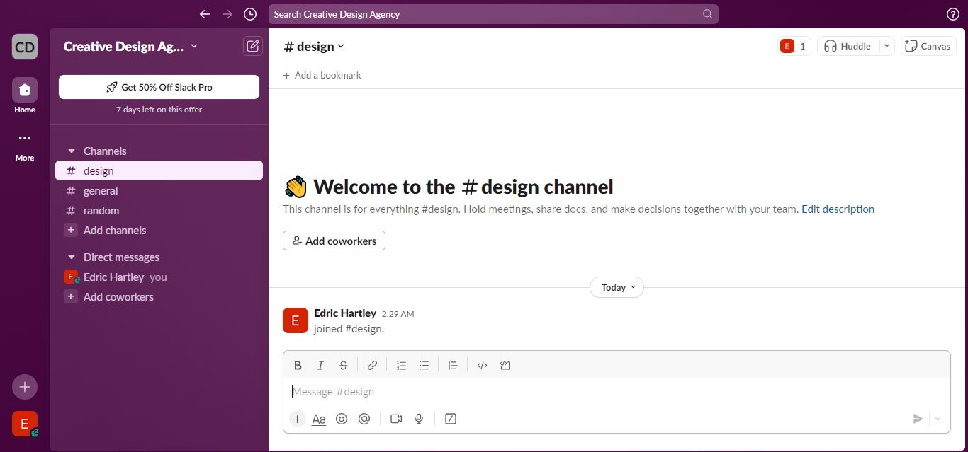
Slack redefined workplace communication by creating a platform that integrates various communication tools into one user-friendly interface. The platform’s focus on simplicity, integration, and user experience has made it a staple in modern workplaces.
Key Takeaways
- Centralized Communication: All communication channels are in one place, reducing the need for multiple tools.
- Integrations: Seamless integration with other workplace tools enhances productivity.
- User Experience: Focus on a clean, intuitive interface that is easy to navigate.
- Customization: Users can tailor Slack to their specific needs with custom channels and notifications.
Detailed Analysis
Slack stands out for its intuitive, user-friendly design that makes communication seamless. The platform’s sidebar organizes channels and direct messages, enabling quick navigation. Channels can be customized by team, project, or topic, keeping conversations focused and organized.
Boost Productivity with Integrations
Slack integrates with popular tools like Google Drive, Trello, and Zoom, centralizing workflows and reducing the need to switch between apps. These integrations streamline tasks, saving time and enhancing productivity.
Customization for Your Team’s Needs
With options to create custom channels, set tailored notifications, and automate tasks using bots, Slack adapts to your team’s specific needs. Its flexibility makes it a productivity powerhouse.
Simple, Mobile-Friendly Design
Slack’s clean interface and intuitive navigation ensure a seamless experience. The mobile app mirrors desktop functionality, keeping users connected and productive on the go.
Impact
- Increased Productivity: Centralized communication and integrations streamline workflows.
- Widespread Adoption: Slack is used by millions of teams worldwide, reflecting its effective UX design.
- Enhanced Collaboration: Improved communication and collaboration for remote and in-office teams.
7. Netflix: Personalized Streaming Experience

Overview
Netflix’s UX design focuses on providing a personalized and engaging streaming experience. This remains one of the best UX case studies demonstrating the power of data-driven personalization.
Key Takeaways
- Personalized Recommendations: Algorithms suggest content based on viewing habits.
- User-Friendly Interface: The platform is easy to navigate, with clear categories and thumbnails.
- Seamless Playback: Features like autoplay, subtitles, and multiple device support enhance the viewing experience.
- Content Discovery: Users can explore new shows and movies through curated lists and trailers.
Detailed Analysis
Netflix’s design focuses on personalization, using advanced algorithms to analyze viewing habits and recommend content tailored to individual preferences. This helps users discover shows and movies they’ll love, enhancing their overall experience.
Seamless Navigation
Netflix’s clean interface makes browsing simple, with clear categories, prominent thumbnails, and tools to explore by genre or search for specific titles. Features like detailed descriptions, trailers, and user reviews help users make informed choices.
Intuitive Playback Features
The video player offers essential controls like play/pause, skip, and subtitle options for a personalized experience. The “Continue Watching” feature allows users to resume content seamlessly across devices.
Mobile-Optimized Design
Netflix’s mobile app delivers the same functionality as the desktop version, with a sleek, responsive design perfect for on-the-go viewing.
Impact
- Global Popularity: Netflix’s user-friendly design and personalized recommendations have attracted millions of users worldwide.
- Increased User Engagement: Personalized content keeps users engaged and coming back for more.
- Enhanced Discoverability: Users consistently discover new content, increasing their engagement with the platform.
8. Instagram: Revolutionizing Social Media
Overview
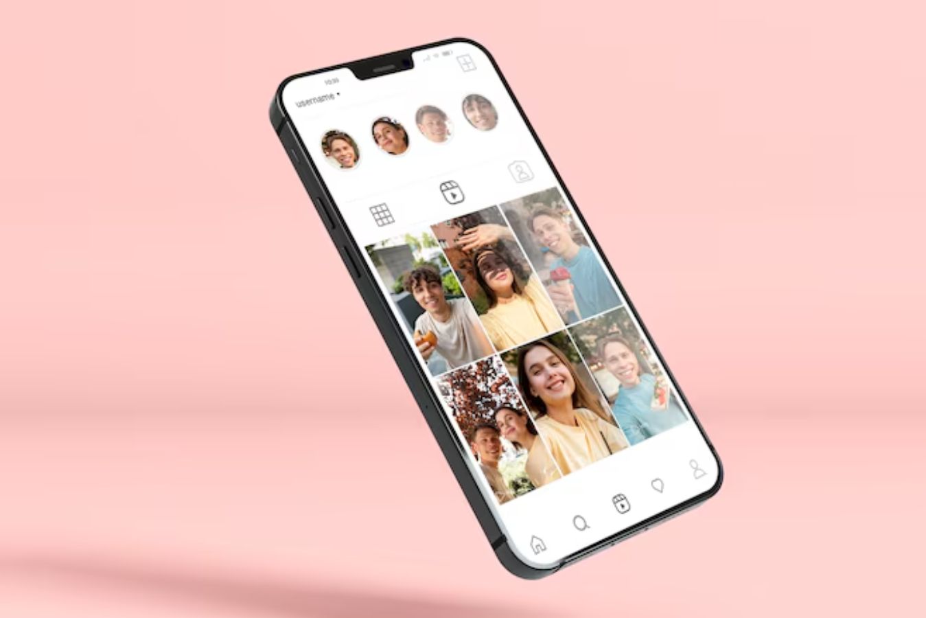
Instagram’s UX design has revolutionized social media by creating a visually-driven platform that prioritizes user engagement and ease of use. This exemplifies one of the best UX case studies showcasing how design can drive user interaction and growth.
Key Takeaways
- Visual Focus: Emphasizes visual content, making it easy for users to share and discover photos and videos.
- User Engagement: Features like Stories, IGTV, and Reels keep users engaged.
- Ease of Use: Simple and intuitive interface that is easy to navigate.
- Community Interaction: Users can interact through likes, comments, and direct messages, enhancing engagement.
Detailed Analysis
Instagram is a social media platform designed for visual storytelling and seamless user interaction. Its main feed showcases photos and videos from connections, making it easy to browse and engage. The grid layout aids quick content discovery, while the Explore tab introduces users to personalized recommendations.
Features to Inspire Creativity
Instagram keeps users engaged with diverse content-sharing options:
- Stories: Temporary updates for real-time moments.
- Reels: Short, entertaining videos.
- IGTV: Long-form video content.
These tools encourage creativity and enrich the user experience.
Clean, Intuitive Design
Instagram’s simple interface allows easy navigation to profiles, notifications, and settings. Built-in editing tools help users enhance their photos and videos for high-quality sharing.
Optimized for Mobile Users
With a responsive design, Instagram adapts to any screen size, enabling users to capture, edit, and share content directly from their devices.
Instagram combines a visually appealing layout, powerful features, and ease of use, making it an ideal platform for connecting, sharing, and discovering new content.
Impact
- High User Engagement: Features like Stories and Reels keep users actively engaged.
- Widespread Adoption: Instagram’s user-friendly design has attracted millions of users globally.
- Enhanced Visual Interaction: Visual content and user engagement drive the platform’s growth and popularity.
9. Trello: Organizing Projects Visually
Overview
Trello’s UX design focuses on providing a visual and intuitive way to manage projects. This is a leading example one of the best UX case studies showcasing how a visual approach can enhance productivity and collaboration.
Key Takeaways
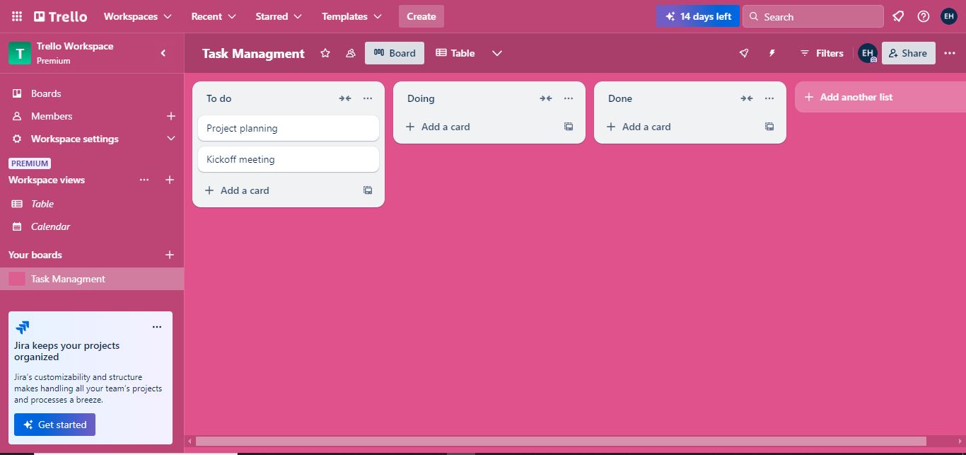
- Visual Layout: Uses a card and board system to organize tasks visually.
- Ease of Use: Drag-and-drop interface makes it easy to manage tasks.
- Customization: Users can customize boards and cards to fit their workflow.
- Collaboration Tools: Features like comments and attachments enhance team collaboration.
Detailed Analysis
Trello’s visual design, built around a card-and-board system, makes task management intuitive. Users can create cards for individual tasks, organize them on boards, and track progress at a glance, streamlining project workflows.
Intuitive and Flexible Interface
Trello’s drag-and-drop feature allows users to effortlessly move cards between lists, adapt workflows, and stay organized. Its simplicity makes it a versatile tool for individuals and teams.
Customizable Boards
Trello’s boards can be tailored to fit any project or workflow. With features like labels, due dates, and checklists, users can stay on top of tasks and deadlines with ease.
Collaboration Features
Invite team members, assign tasks, and collaborate via comments and attachments. Trello’s collaboration tools enhance communication and team productivity.
Accessible Anywhere
With a clean, user-friendly design and a feature-rich mobile app, Trello ensures seamless task management on both desktop and mobile devices.
Impact
- Team Productivity: Improved team productivity and efficiency. Trello’s visual layout and collaboration tools help teams stay organized and work together more effectively, resulting in better project management and higher productivity.
- Adoption Across Industries: Widely used across various industries for project management. Trello’s user-friendly design and powerful features have made it a popular choice for teams and individuals in a wide range of industries.
10. Airbnb: Redefining Travel Accommodation
Overview
Airbnb has transformed the way people find and book accommodations. Their focus on user experience has made them a leader in the travel industry. This is one of the best UX case studies showcasing how a user-centered approach can revolutionize an industry.
Key Takeaways
- User-Centered Design: Airbnb’s platform is designed with the user in mind, making it easy to search for and book accommodations.
- Seamless Experience: From searching for a place to staying there, Airbnb ensures a smooth and enjoyable experience.
- Continuous Improvement: Regular updates based on user feedback keep the platform relevant and useful.
- Community Engagement: Hosts and guests can interact through reviews and messaging, fostering a sense of community.
Detailed Analysis
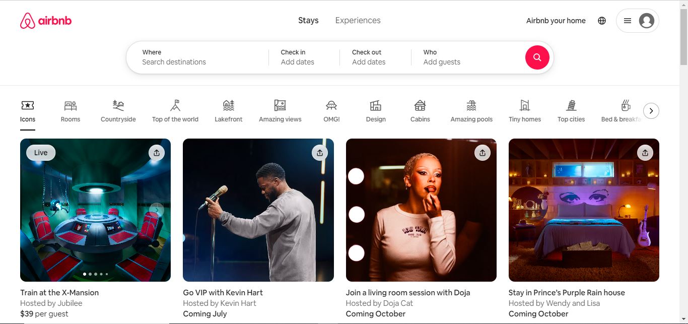
Airbnb is a prime example of exceptional design that prioritizes user convenience and satisfaction. Its intuitive interface ensures that users can navigate effortlessly, whether they’re planning a weekend getaway or a long-term stay.
Robust Search Functionality
Airbnb’s search system is designed to cater to diverse user needs. It allows filtering by key criteria such as:
- Location: From bustling cities to remote retreats.
- Price: Flexible ranges to fit every budget.
- Amenities: Including pools, pet-friendly spaces, and more.
These filters empower users to quickly find the perfect accommodation tailored to their preferences.
Streamlined Booking Process
The booking process is hassle-free, featuring:
- Clear, step-by-step guidance.
- Helpful prompts for completing reservations.
- Transparent payment options to avoid surprises.
This simplicity makes securing accommodations easy for first-time and repeat users alike.
Comprehensive Listings
Each listing is enriched with:
- High-quality photos to showcase the property.
- Detailed descriptions to highlight features and amenities.
- Guest reviews offering genuine feedback.
- Interactive maps for precise location details.
These elements help users make informed decisions confidently.
Mobile App Excellence
Airbnb’s mobile app mirrors the desktop experience, offering full functionality on the go. Users can:
- Search for accommodations.
- Communicate with hosts seamlessly.
- Manage bookings with ease.
This seamless multi-device experience is a cornerstone of Airbnb’s widespread adoption and user loyalty.
Commitment to Trust and Safety
Airbnb fosters a trustworthy environment by incorporating:
- Verified IDs to ensure host and guest authenticity.
- Secure payment systems for peace of mind.
- Detailed reviews to maintain transparency.
These features build user confidence and contribute to Airbnb’s reputation for reliability.
Impact
- Widespread Adoption: Millions of users worldwide rely on Airbnb for travel accommodations.
- High User Satisfaction: Positive user reviews and high ratings reflect the effectiveness of Airbnb’s UX design.
- Global Reach: Airbnb’s user-friendly platform has made it a global leader in travel accommodations.
UX Case Study Ideas: Inspiring Projects for Designers
Creating compelling UX case studies is essential for showcasing your expertise. These ideas not only demonstrate your problem-solving abilities but also resonate with potential clients or employers. Below, you’ll find detailed suggestions, followed by a table outlining the future impact of these ideas.
UX Case Study Ideas:
- Redesigning an E-commerce Checkout Process:
Highlight simplifying a multi-step checkout process, reducing cart abandonment rates, and improving conversion. - Improving Accessibility for a Mobile App:
Document the integration of accessibility features like voice assistance, larger fonts, or color contrast adjustments. - Building a Responsive Design for a SaaS Platform:
Showcase optimizing interfaces for mobile, tablet, and desktop users to enhance engagement. - Designing a Digital Onboarding Experience:
Analyze a step-by-step onboarding flow, focusing on increasing user retention and minimizing churn. - Creating a Dark Mode UI:
Explore the process of introducing a dark mode feature and its effect on usability and aesthetics.
| Case Study Idea | Future Impact |
|---|---|
| E-commerce Checkout Redesign | Higher revenue and lower cart abandonment. |
| Accessibility Improvements | Inclusivity leads to a broader user base. |
| Responsive SaaS Design | Increased usability and better customer satisfaction. |
| Digital Onboarding Experience | Boosted retention rates and reduced support queries. |
| Dark Mode Implementation | Enhanced user comfort, especially in low-light settings. |
These ideas are versatile and impactful, offering opportunities to demonstrate creativity and problem-solving. By documenting these case studies, you not only build your portfolio but also future-proof your UX expertise.
Conclusion
These best UX case studies showcase how a user-centric approach can transform products and services. By focusing on ease of use, personalization, and continuous improvement, these companies have created exceptional user experiences that drive engagement, satisfaction, and loyalty. For designers, studying these best UX case studies offers valuable insights into the principles and practices that make great UX design.
Frequently Asked Questions (FAQ)
what is the difference between UX portfolio and case study?
A UX portfolio showcases a collection of your best design work, highlighting versatility and overall expertise. A case study dives deeper into a specific project, detailing the problem, process, and solutions. Portfolios provide breadth, while case studies focus on depth. Both are essential for demonstrating your skills effectively.
What is the ratio of researcher to designer in UX?
The ideal researcher-to-designer ratio in UX varies by organization but is typically 1:5 to 1:10. This balance ensures thorough user research while maintaining design efficiency.
How do I get better at UX research?
To get better at UX research, study the best UX case studies to learn how successful projects solve user problems. Focus on mastering research methods like usability testing and interviews, analyzing user behavior, and creating detailed personas. Stay updated on trends and refine your skills with courses and practice.


1 Comment
zoritoler imol
September 12, 2024Deference to article author, some great information .