
Figma Hover Tooltip & Button Click | Step-by-Step Guide to Create Interactive UI
If you are designing an interactive UI design, you definitely need to know some useful tools of prototyping. Lets talk about hover tooltip first. Lets suppose you have a button or a frame from which you want to show some informative stuff on the same page then hover tooltip is a great fit. Another amazing prototyping tool we are talking about is button click. In your interactive UI design. You definitely need to have a button click option, in order to link one page to other.
I will try my best to explain these two features in some simple and easy steps. So lets start with it.
I am creating a landing page design and added navigation menu on top.
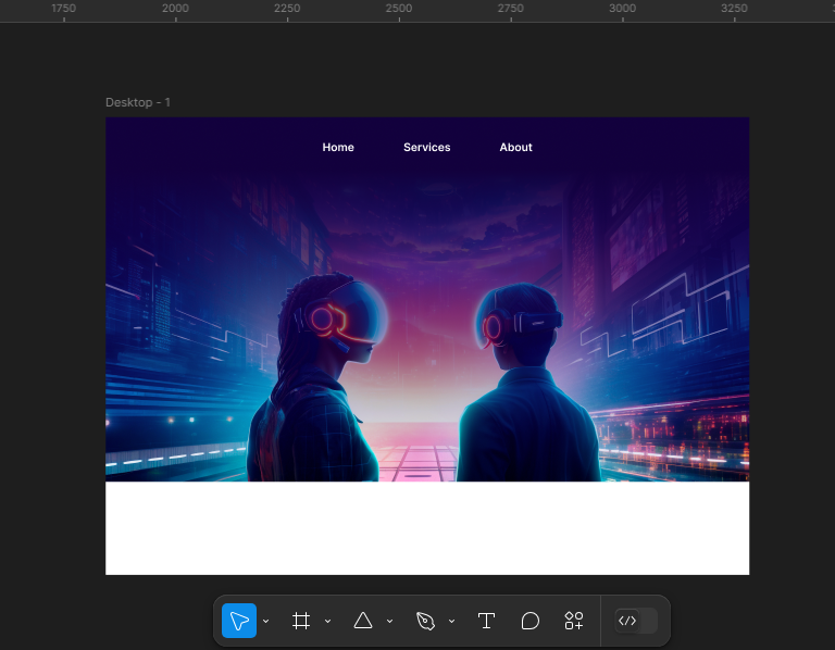
In this example, I’ll show you services button as a hover tooltip option.
Step No. 01:
Lets create services button outside the desktop main screen and make it a frame selection.
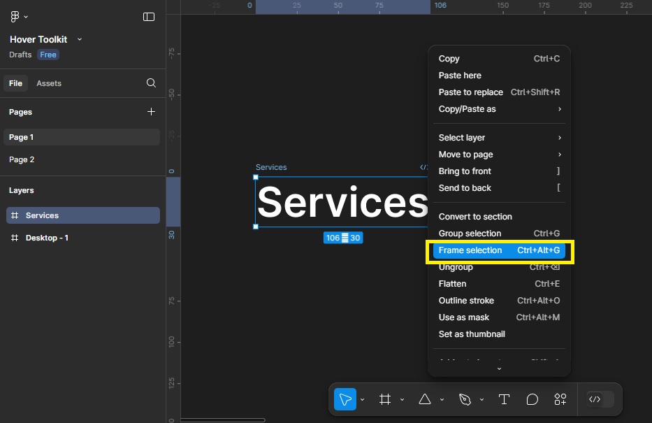
Step No. 02:
Now create another button of services and make a rectangle outside and give it bottom stroke. Its just for making design better, not mandatory. You can make your own design.
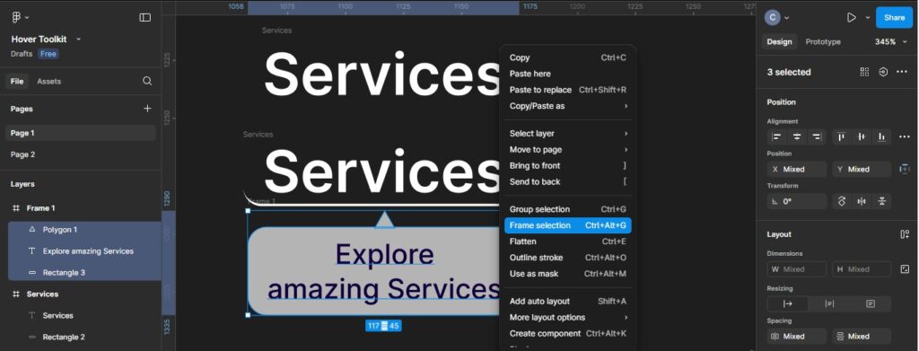
For creating tooltip, I have designed a shape like that. You can make a similar shape or design your own, Its just for reference.
Write the text you want to display as a tooltip and make it a Frame selection.
Step No.03:
Now Select All three frames and create Component.
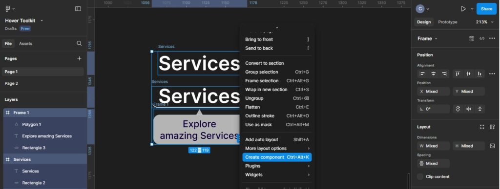
Step No.04:
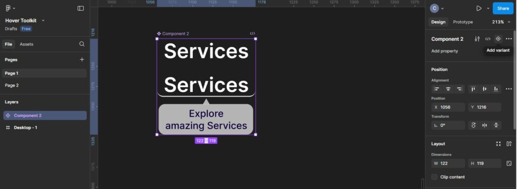
Now select the component and click on add varient option in the properties panel to create varient of same component. It’ll make hover effect on our component. We can use that component in our whole project, there will be no need to repeat the same process.
Step No.05:
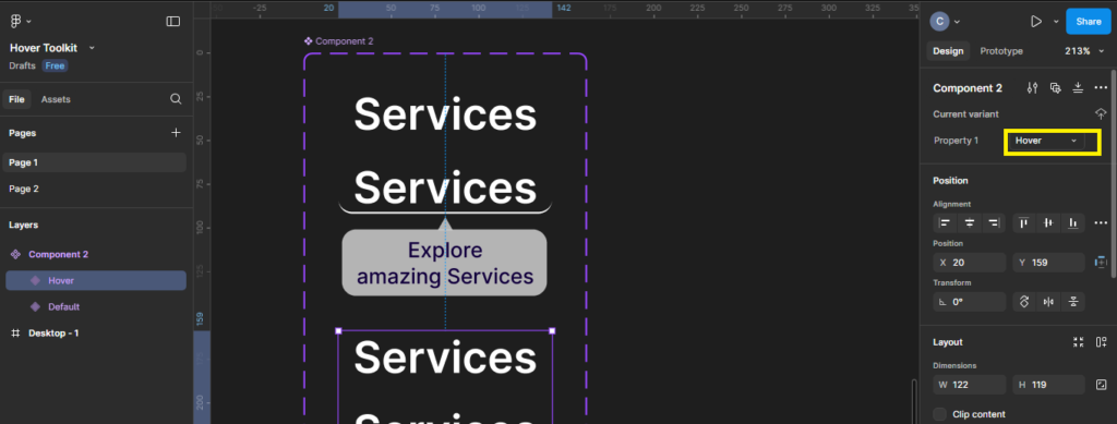
You can name the vairent as hover, or whatever you want to have.
Step No.06:
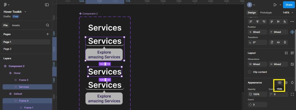
Now select the hover tooltips frame from component you have created and Services button in the varient option. Go to properties and hide them.
Step No.07:
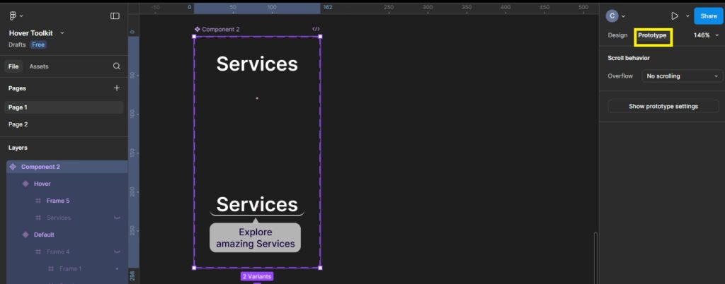
You are almost done. As you can see you have hover varient left with the services button component. Now go to prototype option.
Step No.08:
Select the vairent frames and aligned to top. This step will make your hover tooltip on same location as you have for the Services button.
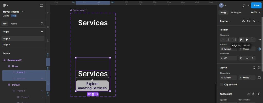
Step No.09:
Now select the component button and link to hover varient by dragging and droping the linking lead. You can follow the same prototyping properties I have created.
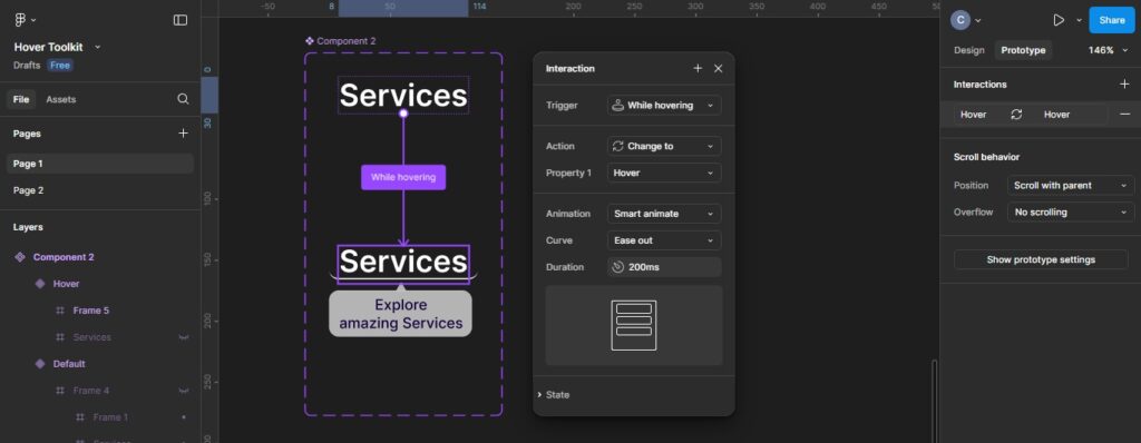
Step No.10:
In last step, go the Assets panel. Select the component you have created, drag and drop on the desired location on you screen and see the magic.

You can see how amazingly hover tooltip works by this play button.
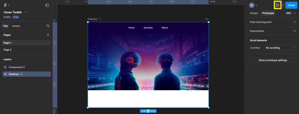
Here you have the final result.
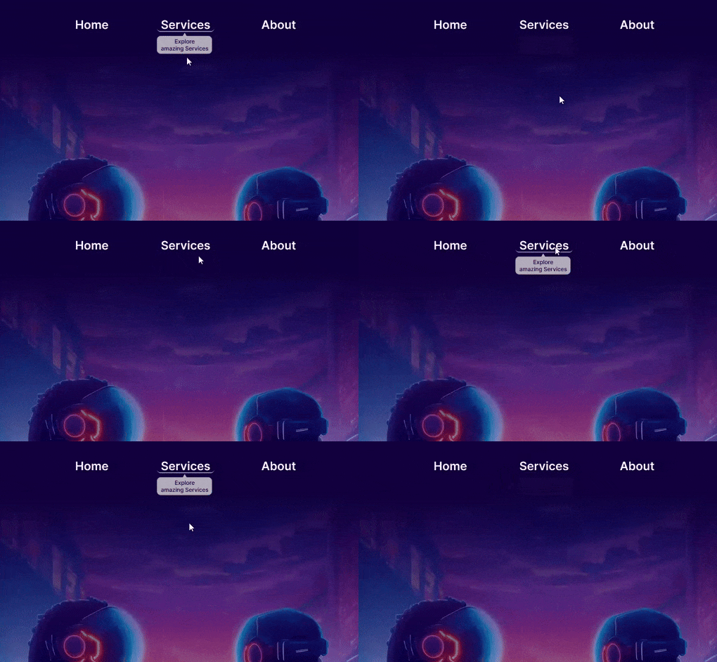
Now lets talk about how we can implement click button. We are going to consider About button to make it clickable and linked to About page.
Here we have some simple steps.
Lets create another screen from about page and select about button on home page. Now go to prototype option and link the about button to about page. You can copy the same properties which I have used in prototyping.
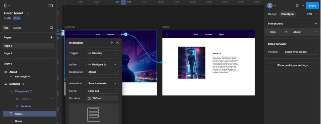
As you can see earlier we use trigger option of “while hovering” for hover tooltip. For now we use trigger option of “On Click” for clicking button effect.
So here you have the final output.

Final Thoughts
In this article I have shown some simple steps to hover tooltip and button click effect in figma. I hope you guys have got the clear idea. This will help you in your ongoing and upcoming projects. Creating component will be really helpful for your project. You just need to make the effort once for hover tooltip and the rest of the website will follow same. There is a lot more to learn and explore. Stay connected for more informative stuff.


