7 Expert Tips for Responsive Web Design Screen Sizes (2025)
What is Responsive Web Design, and Why Does It Matter?
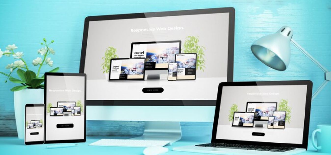
Responsive web design screen sizes ensure that your website adapts seamlessly to various devices and resolutions. But why is this so important in 2025? Let’s explore:
- Enhanced User Experience: A responsive design ensures that users can navigate your site effortlessly, whether on a smartphone, tablet, or desktop.
- Improved SEO Rankings: Search engines like Google prioritize mobile-friendly websites, making responsiveness essential for better rankings.
- Broader Audience Reach: With users accessing websites from an array of devices, responsive design ensures your site is accessible to all.
- Cost-Effectiveness: A single responsive design reduces the need for separate desktop and mobile versions, saving time and resources.
- Faster Load Times: Optimized responsive sites load faster, improving user retention and satisfaction.
- Future-Proofing: With new devices constantly emerging, a responsive design ensures compatibility without frequent redesigns.
- Competitive Advantage: A well-designed responsive website can set you apart in a crowded digital landscape.
7 Expert Tips for Responsive Web Design Screen Sizes (2025)
1. Start with Mobile-First Design

Why Mobile-First Matters
Mobile-first design prioritizes smaller screens before scaling up to larger ones. As of 2025, mobile devices account for more than 55% of global web traffic. By focusing on mobile-first, you ensure that your website delivers a seamless experience for the majority of users while avoiding design bottlenecks.
How to Implement Mobile-First Design
- Simplify Your Layout: Focus on essential content and core features, ensuring they are prominent on smaller screens.
- Prioritize Content Hierarchically: Ensure the most critical content is above the fold for easy accessibility.
- Test Across Devices: Use tools like Chrome DevTools, BrowserStack, or Responsively to emulate different screen sizes and resolutions.
Example:
<header> <h1>Welcome to Our Site</h1> <p>Your gateway to responsive design excellence.</p> </header> <nav> <ul> <li><a href="#">Home</a></li> <li><a href="#">Services</a></li> <li><a href="#">Contact</a></li> </ul> </nav>Pro Tip:
Use media queries to progressively enhance your design as the viewport expands, rather than trying to retrofit desktop layouts for smaller screens.
2. Master Flexible Grids and Layouts
The Power of Fluid Grids
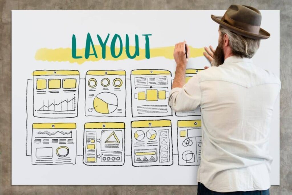
Flexible grids use percentage-based widths instead of fixed units, ensuring layouts adapt seamlessly to any screen size. This approach prevents content from spilling out or looking awkward on smaller or larger devices.
Key Practices for Flexible Layouts
- Leverage CSS Grid and Flexbox: Modern CSS layout modules make it easier to create adaptable designs. For example:
.container { display: grid; grid-template-columns: repeat(auto-fit, minmax(200px, 1fr)); gap: 16px; } .item { background-color: #f4f4f4; padding: 20px; border-radius: 8px; } - Avoid Fixed Widths: Replace
pxwith%oremto ensure flexibility. - Use Container Queries: Adjust designs based on the parent container’s size rather than the viewport size for more modular designs.
Example Layout:
<div class="container"> <div class="item">Item 1</div> <div class="item">Item 2</div> <div class="item">Item 3</div> </div>3. Leverage Scalable Typography

Why Scalable Fonts Are Essential
Typography impacts readability and overall user experience. Scalable fonts ensure that text remains legible across all devices, enhancing accessibility and aesthetics.
Best Practices for Responsive Typography
- Use Relative Units: Opt for
em,rem, or percentages instead ofpxfor font sizes. For example:body { font-size: 1rem; } h1 { font-size: 2.5rem; } p { font-size: 1rem; } - Implement Fluid Typography: Combine relative units with CSS clamp() for adaptive scaling:
h1 { font-size: clamp(1.5rem, 5vw, 3rem); } - Adjust Line Height and Spacing: Ensure adequate spacing for readability on smaller screens.
Example:
<h1>Responsive Typography Example</h1> <p>Scalable typography improves legibility across devices, making your content more accessible.</p>4. Optimize Images and Media

Responsive Media Matters
Images and videos significantly impact page load times and user experience. Optimizing media ensures your site is fast and visually appealing on all screen sizes.
Tips for Media Optimization
- Use Responsive Image Techniques:
<img src="small.jpg" srcset="medium.jpg 768w, large.jpg 1200w" sizes="(max-width: 768px) 100vw, 50vw" alt="Responsive Image"> - Adopt Next-Gen Formats: Use WebP and AVIF formats for better compression without quality loss.
- Set Max Widths: Prevent media from overflowing their containers:
img, video { max-width: 100%; height: auto; }
Example:
<figure> <img src="responsive.jpg" alt="Example of responsive media"> <figcaption>Responsive media enhances user experience.</figcaption> </figure>Pro Tip:
Effective image optimization plays a pivotal role in creating responsive web design screen sizes that cater to diverse devices seamlessly.
5. Utilize Breakpoints Effectively
What Are Breakpoints?
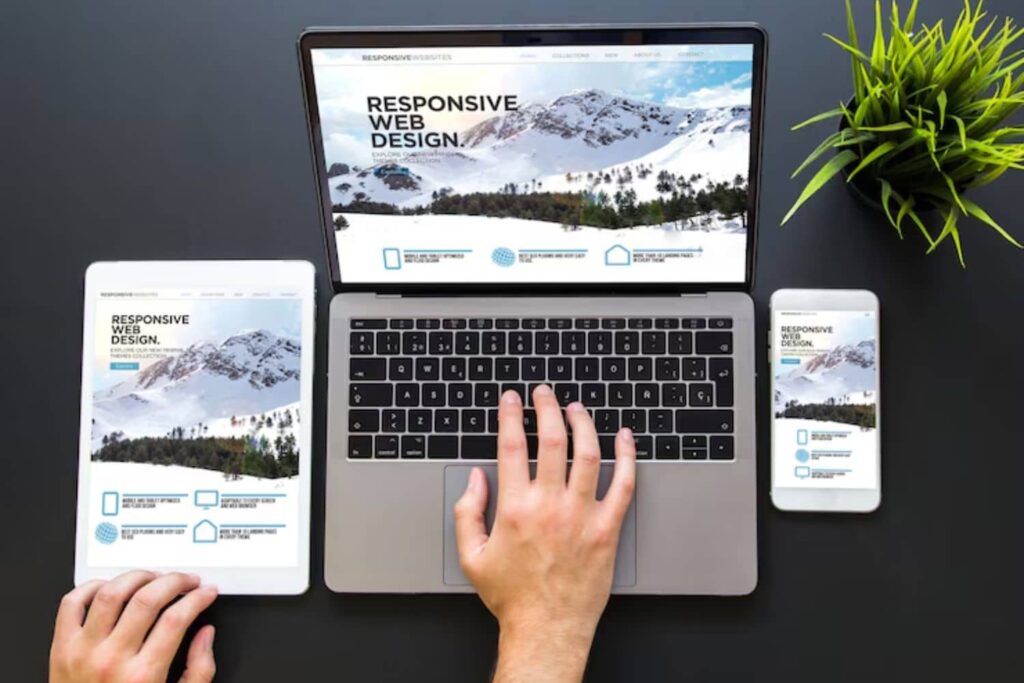
Breakpoints are specific screen widths where your design adjusts to enhance usability and visual appeal. They ensure your design caters to various devices without compromising functionality.
How to Choose Breakpoints
- Content-Driven Breakpoints: Base them on design needs rather than device dimensions.
- Common Breakpoint Ranges:
- Small screens: up to 576px
- Medium screens: 577px to 768px
- Large screens: 769px to 1200px
- Extra-large screens: 1201px and up
Example:
@media (max-width: 768px) { .menu { display: none; } } @media (min-width: 769px) { .menu { display: block; } }Pro Tip:
Thoughtful breakpoint selection ensures your responsive web design screen sizes adapt efficiently, maintaining user engagement across devices.
6. Focus on Performance and Speed

Why Speed Matters
Fast-loading websites rank higher in search engines and provide better user experiences. Responsiveness is incomplete without top-notch performance.
Performance Optimization Tips
- Use Lazy Loading:
<img src="image.jpg" loading="lazy" alt="Lazy Loaded Image"> - Minimize HTTP Requests: Combine CSS, JavaScript, and other assets to reduce load times.
- Enable Caching: Use caching tools like Cloudflare or your hosting provider’s settings.
- Leverage CDNs: Serve assets via Content Delivery Networks for faster delivery.
Example:
<script src="optimized.js" defer></script> <link rel="stylesheet" href="styles.min.css">7. Test and Iterate Regularly

The Importance of Continuous Testing
Responsive web design is an ongoing process. Regular testing helps you adapt to new devices and changing user behaviors, ensuring your website remains functional and visually appealing.
Testing Strategies
- Browser DevTools: Emulate different screen sizes and resolutions directly in your browser.
- Automated Testing Tools: Use tools like Selenium, Percy, or Lighthouse for comprehensive responsive testing.
- Gather Real-World Feedback: Monitor analytics and user behavior to identify and address issues proactively.
Pro Tip:
Maintain a test lab with a variety of devices, or use services like Sauce Labs to test across real devices remotely.
Device Screen Sizes and Breakpoints
To create a truly responsive design, understanding common screen sizes and breakpoints is critical. Below is a helpful table summarizing typical screen sizes and their recommended breakpoints:
| Device Type | Screen Width (px) | Breakpoint Range (px) | Description |
|---|---|---|---|
| Smartphones | 320 – 480 | 320 – 480 | Small screens, ideal for mobile-first design. |
| Tablets | 481 – 768 | 481 – 768 | Medium screens, portrait or landscape orientation. |
| Small Laptops | 769 – 1024 | 769 – 1024 | Large screens, common for lightweight laptops. |
| Desktops | 1025 – 1440 | 1025 – 1440 | Standard desktop screens, work and browsing friendly. |
| Large Monitors | 1441 and above | 1441+ | Extra-large screens, ideal for high-resolution setups. |
Standard Screen Size for Responsive Website
Understanding Responsive web design screen sizes is essential for creating websites that offer seamless experiences across all devices. Responsive design ensures that your website adapts fluidly to different screens, making it user-friendly and professional, whether viewed on desktops, tablets, or mobile phones. Below is an overview of standard screen sizes and why they matter for web development.
Key Screen Sizes in Responsive Web Design
- Desktop (1024px and above): The ideal size for complex layouts and high-resolution images.
- Tablet (768px to 1024px): Perfect for medium-sized touch-screen displays.
- Mobile (320px to 767px): Designed for smaller screens where functionality and readability are crucial.
Benefits of Considering Responsive Web Design Screen Sizes
- Improved Usability: Provides a consistent experience on all devices.
- SEO Boost: Mobile-friendly websites rank better in search engines.
- Increased Engagement: Ensures that users stay longer by offering intuitive navigation.
Standard Screen Sizes
| Device Type | Screen Size (in pixels) | Usage Example |
|---|---|---|
| Desktop | 1024px and above | Large screens, workstations |
| Tablet | 768px to 1024px | iPads, Android tablets |
| Mobile | 320px to 767px | Smartphones like iPhone, Samsung |
Practical Tips for Responsive Web Design Screen Sizes
- Use media queries to define breakpoints for specific devices.
- Test designs on multiple devices to ensure compatibility and performance.
- Opt for fluid grids and flexible layouts that adapt to varying screen widths.
Incorporating responsive web design screen sizes into your workflow ensures your website remains functional, accessible, and visually appealing on any device. This approach not only improves user satisfaction but also strengthens your site’s online visibility and credibility.
What size image is responsive web design?
Responsive web design ensures that websites look great and function well on devices of all sizes. Optimizing image sizes for responsiveness is critical to maintaining fast load times, clear visuals, and user satisfaction.
Key Points to Consider:
- Flexibility: Images should scale proportionally to adapt to different screen sizes without losing quality.
- Resolution: Use high-resolution images for retina displays (2x or 3x pixel density). For standard screens, maintain a resolution of 72 DPI.
- File Size: Compress images to reduce loading times while preserving quality.
Recommended Image Dimensions:
- Hero Images: 1920px width for desktops, 1280px for tablets, and 640px for mobile.
- Thumbnails: 150px to 300px for all screen sizes.
- Background Images: 1920px width for widescreen monitors; optimize for smaller devices using CSS.
Image Format Selection:
- JPG: For photos and colorful visuals.
- PNG: For images needing transparency.
- WebP: Modern, lightweight format with excellent quality.
- SVG: Perfect for logos and icons as they are resolution-independent.
Comparison for Responsive Image Sizes:
| Image Type | Desktop | Tablet | Mobile |
|---|---|---|---|
| Hero Image | 1920px | 1280px | 640px |
| Thumbnails | 300px | 250px | 150px |
| Background Image | 1920px | 1280px | 640px |
| Logo/Icon (SVG) | Scalable | Scalable | Scalable |
Tips for Better Responsiveness:
- Use
srcsetin HTML for delivering multiple image sizes based on device resolution. - Test performance using tools like Google PageSpeed Insights.
- Regularly audit images for optimization to improve SEO and user experience.
By following these guidelines, you’ll ensure your website is visually appealing and loads quickly, enhancing both user experience and search engine rankings.
Responsive Media Queries for All Devices
Responsive media queries are a fundamental tool for creating websites that look and function seamlessly across various devices. By using CSS media queries, developers can define styles tailored to specific screen sizes, orientations, and resolutions, ensuring an optimal user experience. Whether you’re building for desktops, tablets, or smartphones, responsive media queries enable your website to adapt fluidly.
Why Are Responsive Media Queries Important?
- Enhanced User Experience: Adapt designs for better readability and usability.
- SEO Benefits: Google prioritizes mobile-friendly websites.
- Future-Proof Design: Accommodates new devices with varying screen sizes.
- Improved Accessibility: Supports diverse user needs across devices.
Key Points for Implementing Media Queries:
- Use breakpoints to target specific screen widths (e.g.,
768pxfor tablets,1024pxfor desktops). - Combine with flexbox or grid layouts for better alignment.
- Test on real devices and emulators for accuracy.
- Minimize excessive styles to improve load speed.
Sample Media Query Code:
body { font-size: 16px; } @media (min-width: 768px) { body { font-size: 18px; } } @media (min-width: 1024px) { body { font-size: 20px; } } Responsive Breakpoints
| Device Type | Width (px) | Example Query |
|---|---|---|
| Smartphones | 320px – 767px | @media (max-width: 767px) |
| Tablets | 768px – 1023px | @media (min-width: 768px) |
| Desktops | 1024px and above | @media (min-width: 1024px) |
Understanding responsive web design screen sizes is crucial for achieving a professional, user-friendly, and SEO-optimized website. By implementing media queries effectively, your design will provide an excellent experience on all devices.
what are the responsive screen sizes for material UI?
Material UI (MUI) provides a robust grid system and responsive design features that make it easier to create layouts adaptable to various screen sizes. Responsive design ensures a seamless user experience across devices, including desktops, tablets, and smartphones. Let’s dive into the standard responsive screen sizes supported by MUI, their breakpoints, and how to use them effectively in your projects.
Standard Screen Sizes in Material UI
MUI defines its breakpoints based on screen width in pixels. These are the default responsive screen sizes:
- Extra Small (xs): Up to 600px. Common for smartphones.
- Small (sm): 600px to 960px. Suitable for tablets.
- Medium (md): 960px to 1280px. Targeted at small laptops and large tablets.
- Large (lg): 1280px to 1920px. Ideal for desktops.
- Extra Large (xl): 1920px and above. For large monitors or TVs.
How Material UI Manages Responsiveness
- Grid System: MUI’s grid uses these breakpoints to define column spans and layouts for different screen sizes.
- Hidden Components: Easily show or hide components based on breakpoints.
- CSS Media Queries: MUI provides built-in support for media queries tied to these breakpoints.
| Breakpoint | Range | Device |
|---|---|---|
| xs | 0–600px | Smartphones |
| sm | 600–960px | Tablets |
| md | 960–1280px | Laptops/Tablets |
| lg | 1280–1920px | Desktops |
| xl | 1920px and above | Large Monitors/TVs |
Tips for Implementing Responsive Design in MUI
- Use
theme.breakpointsfor custom styles. - Test layouts on real devices.
- Leverage the grid system to adjust column spans for each breakpoint.
This guide ensures your Material UI projects look great on any screen!
what image format is best for responsive design?
Choosing the right image format is essential for creating responsive designs that adapt seamlessly to various devices. Images play a crucial role in ensuring responsive web design screen sizes look great without compromising speed or quality. Here’s a breakdown of the most popular image formats and their suitability:
Key Formats for Responsive Design
- JPEG:
- Best for photos and colorful visuals.
- Compressed for faster loading but can lose quality with excessive compression.
- PNG:
- Perfect for graphics with transparency, like logos.
- Higher file sizes compared to JPEG, which may slow load times.
- SVG:
- Ideal for scalable vector graphics such as icons.
- Sharp at any screen size but limited to non-photo content.
- WebP:
- A modern format offering excellent compression and quality balance.
- Supports animation and transparency with widespread browser compatibility.
- GIF:
- Suitable for basic animations.
- Limited color depth and larger file sizes compared to alternatives.
Tips for Optimizing Images in Responsive Designs
- Use responsive image tags (
<img srcset>), allowing browsers to load the most suitable image size. - Compress images with tools like TinyPNG or Squoosh to improve page speed.
- Test images across various devices to ensure clarity and performance.
| Image Format | Best For | Pros | Cons |
|---|---|---|---|
| JPEG | Photos, banners | Small file size, vibrant colors | Loses quality with compression |
| PNG | Transparent graphics | High-quality, supports alpha | Larger file sizes |
| SVG | Icons, illustrations | Scalable, sharp at all sizes | Limited to vector graphics |
| WebP | All image types | High compression, versatile | Limited older browser support |
| GIF | Simple animations | Easy to create, widely supported | Limited color, large file sizes |
Selecting the right format ensures your design looks polished and performs well, regardless of screen size or device. WebP is a top choice for modern projects, but formats like SVG and PNG excel in specific use cases.
what is the difference between responsive, adaptive and reactive design?
Designing for the web or apps often involves choosing between responsive, adaptive, and reactive design approaches. While they all aim to optimize the user experience across devices, their methodologies and results differ significantly. Here’s a breakdown:
| Feature | Responsive Design | Adaptive Design | Reactive Design |
|---|---|---|---|
| Definition | Adjusts layout fluidly based on screen size using flexible grids and CSS. | Uses predefined layouts for specific screen sizes. | Adjusts in real-time to user behavior and environment. |
| Flexibility | Highly flexible and dynamic. | Limited to predefined breakpoints. | Reacts dynamically to user inputs and external data. |
| Implementation | Relies on media queries and flexible grid systems. | Requires multiple static layouts for different devices. | Involves user interaction, APIs, and real-time triggers. |
| Best Use Case | Websites requiring broad device compatibility. | Apps or sites targeting specific devices or screen sizes. | Smart applications, IoT systems, and dynamic environments. |
| Development Time | Moderate | Longer due to multiple layouts. | Complex and requires advanced programming. |
Key Differences
- Responsive Design: This approach is fluid and works seamlessly across devices. Designers use flexible grids and media queries, ensuring the content adjusts automatically.
- Adaptive Design: A more tailored approach, it employs multiple fixed layouts for various devices, such as smartphones, tablets, and desktops. This can result in a more polished experience but requires more effort to build.
- Reactive Design: This advanced method involves real-time responsiveness to user interactions or environmental factors, making it ideal for highly dynamic applications like IoT or AR experiences.
Understanding these differences is crucial to selecting the right approach for your project, ensuring an optimal user experience while aligning with your design goals.
What Size Should a Responsive Website Header Be?
A responsive website header is a crucial design element that significantly impacts user experience and website aesthetics. Choosing the right size ensures your header looks great across all devices, from desktops to smartphones.
Ideal Dimensions for a Responsive Header
- Desktop: 1024px – 1920px width, 120px – 300px height
- Tablet: 768px – 1024px width, 100px – 250px height
- Mobile: 320px – 768px width, 70px – 150px height
These dimensions align with best practices for Responsive Web Design Screen Sizes, ensuring your header is visually appealing and functional on all devices.
Key Factors to Consider:
- Content Prioritization: Include only essential elements like the logo, navigation menu, and call-to-action. Overcrowding can lead to poor readability.
- Scalability: Ensure your header adapts seamlessly to various screen sizes by using flexible CSS units like percentages or
eminstead of fixed pixels. - Typography and Logo Size: Keep text legible by using scalable fonts and resizing logos to fit without distortion.
- Design Consistency: Align header elements with the overall website style for a cohesive user experience.
Conclusion
Mastering responsive web design screen sizes is key to delivering a seamless user experience across all devices. By implementing these expert tips and staying updated with the latest trends, you can create websites that are not only visually appealing but also highly functional and user-centric. Stay adaptable, and your designs will stand the test of time.
Frequently Asked Questions (FAQs)
What is the best font size for the responsive design?
The best font size for responsive design is 16px for body text, ensuring readability on all devices. Adjust heading sizes proportionally for clear hierarchy. Use relative units like em or rem for scalability. Test across devices to maintain consistency and accessibility, optimizing the user experience.
what ratio is a responsive screen?
A responsive screen ratio adapts to different devices, ensuring content looks great on any screen size. Common ratios include 16:9 for desktops, 4:3 for tablets, and 9:16 for smartphones. A responsive design adjusts these ratios dynamically, offering optimal viewing experiences for users on all devices. Prioritize responsiveness for user satisfaction.


