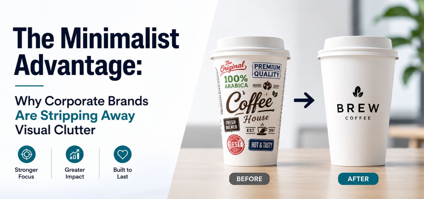
The Minimalist Advantage: Why Corporate Brands Are Stripping Away Visual Clutter
The Minimalist Advantage: Why Visual Clutter Kills Corporate Trust
A chaotic, cluttered brand identity screams insecurity to high-level corporate buyers. In the modern digital economy, enterprise clients simply do not have the time or patience to decipher messy branding or hunt for your core message.
They demand immediate clarity, absolute professionalism, and undeniable authority the exact second they interact with your company.
💡 Expert Insight: The Cost of Visual Friction Visual friction creates business friction. If your branding requires a decision-maker to mentally untangle competing colors, fonts, and graphics, you are actively losing high-ticket deals to competitors with cleaner, more confident identities.
Today, we are unpacking “The Minimalist Advantage.” We are exploring exactly why top-tier B2B brands are aggressively embracing clean, stripped-down visual ecosystems.
Here is exactly what we will break down in this guide:
- The Psychology of Restraint: How stripping away unnecessary design elements instantly elevates your market positioning.
- The Speed of Trust: Why a clean corporate aesthetic accelerates the B2B sales cycle.
- The Revenue Correlation: How removing visual noise directly translates to higher market trust and increased revenue.
To understand why this design shift is dominating the B2B landscape, look at how an enterprise client instantly judges your brand’s operational maturity based entirely on your visual identity:
| Brand Presentation | The Client’s Immediate Perception | The Business Outcome |
| Cluttered & Chaotic | Disorganized, amateurish, and desperate for attention. | Immediate loss of credibility and highly extended sales cycles. |
| Clean & Minimal | Confident, established, premium, and highly efficient. | Instant market trust, effortless communication, and secured revenue. |
By the end of this guide, you will understand exactly how to engineer a quiet, powerful brand identity that commands absolute respect in your industry.
The Psychology of Visual Trust in B2B Markets

Trust is the absolute, non-negotiable currency of high stakes corporate relationships. When an enterprise client views a website overloaded with competing colors, mixed fonts, and chaotic graphics, their brain experiences immediate cognitive friction.
This visual chaos subconsciously tells them that your internal business operations are just as disorganized and risky as your branding.
The Real-World Mental Model: The Luxury Boutique vs. The Discount Warehouse Imagine walking into a high-end designer boutique. There are only a few tailored items on display, surrounded by pristine, intentional space. The calm environment instantly communicates premium value, quality, and exclusivity without a single word being spoken.
Now, imagine stepping into a discount warehouse filled with neon signs, crowded aisles, and overwhelming noise. The visual clutter immediately signals a frantic race to the bottom on price. Your corporate branding triggers this exact same psychological response in the minds of your buyers.
To elevate your perceived market value overnight, you must pivot to a minimalist approach that projects quiet confidence and total operational mastery. Here is exactly how this psychological shift impacts your business:
- Pivoting from Price to Authority: By deploying intentional negative space and a stripped-down aesthetic, you stop competing on budget and start competing on undeniable expertise.
- Eradicating Cognitive Friction: Clean design removes the mental barriers that exhaust busy decision makers, allowing your core value proposition to connect instantly.
- Projecting Operational Mastery: A highly disciplined visual identity subconsciously assures enterprise clients that your internal processes are just as precise and well-managed.
The ROI of “Less is More”
Redesigning your corporate identity to be minimal is never just an artistic preference. it is a highly strategic, revenue driven business decision. When you ruthlessly remove unnecessary visual elements, your core marketing message transforms into an undeniable focal point.
By eliminating the noise, you clear a direct path for your enterprise clients to say “yes.” Here is exactly how a minimalist aesthetic functions as a financial asset:
- Accelerated Comprehension: Direct, unhindered communication drastically reduces the time it takes for a busy prospect to understand your exact value proposition.
- Frictionless Action: When users are no longer distracted by decorative fluff, they naturally and intuitively navigate straight toward your primary call-to-action.
- Proven Conversion Growth: Over our 9+ years in the digital design industry, we have consistently engineered minimal corporate rebrands that directly and immediately increase sales conversion rates.
To truly understand this shift, you have to look at how founders typically approach design versus how high-converting brands operate:
[ ❌ The "Before" Mindset: Complexity Equals Value ]
 "We need to show them everything we do at once. Pack the homepage with every feature, use five different colors so it pops, and make sure the logo is huge."
 └─ Result: The user is overwhelmed, cannot find the core offering, and bounces to a cleaner competitor in under five seconds.

                ⬇️ The Strategic Pivot ⬇️

 [ ✅ The "After" Mindset: Clarity Equals Conversion ]
 "We need to show them exactly what they need to see. Strip away the visual noise, use generous white space, and let one powerful headline do the heavy lifting."
└─ Result: The user instantly understands the value proposition, feels confident in the brand's authority, and immediately clicks the 'Request a Quote' button. Cluttered vs. Minimal: The Business Impact
To truly grasp the commercial impact of this approach, let’s look at a side-by-side comparison. This table illustrates how specific design choices alter the customer’s emotional state and buying behavior.
Small shifts in your visual identity yield massive differences in market perception.
| Brand Element | The Cluttered Approach (High Friction) | The Minimalist Advantage (High Trust) |
| Logo Design | Complex illustrations, 3D gradients, and multiple taglines. | Clean typography, flat vector shapes, and single-color scalability. |
| Color Palette | 5+ competing neon colors that cause eye strain. | 2-3 strategic, muted corporate tones with high contrast. |
| Messaging | Dense paragraphs of jargon-heavy text explaining every feature. | Short, punchy, benefit-driven headlines surrounded by space. |
| Market Perception | Cheap, desperate for attention, and highly disorganized. | Premium, established, confident, and highly trustworthy. |
Anatomy of a Trust-Building Corporate Identity
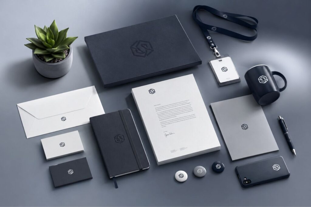
Building a minimalist corporate brand requires immense restraint and flawless execution. Because there are fewer elements to hide behind, the elements you do choose must be absolutely perfect.
A single misaligned pixel or poor font choice is instantly noticeable in a minimal layout. Here are the three foundational pillars of a high trust corporate identity:
- 1. Geometric Typography: We strictly champion minimal, modern sans-serif typefaces for our global corporate clients. Clean, legible fonts instantly signal that your brand is forward-thinking and sophisticated.
- 2. Intentional Negative Space: White space is not “empty space” it is the active structural framework of premium design. It gives your message room to breathe and allows the viewer’s eyes to rest.
- 3. Restrained Color Systems: A mature brand does not need to shout with every color of the rainbow. A highly disciplined color palette builds instant, recognizable brand equity.
The “Purple & White” Corporate Standard
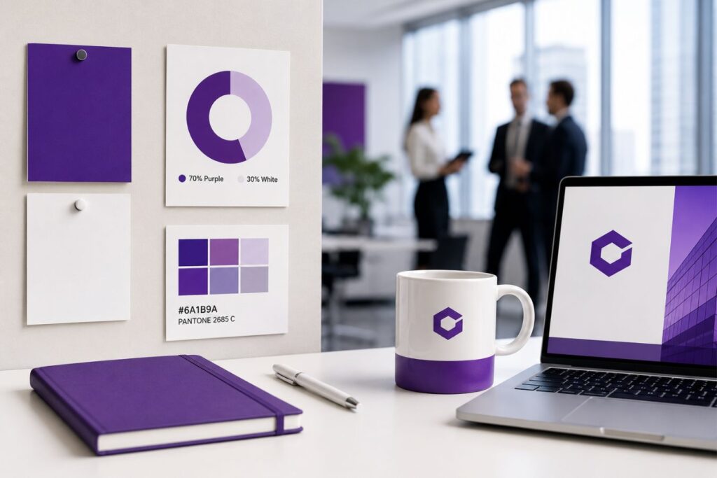
Color is never just decoration; it is a silent, subconscious psychological trigger. When engineering visual identities for enterprise-level clients, we frequently deploy a highly strategic, high-contrast palette: crisp white backgrounds anchored by deep, authoritative purple accents.
To understand why this specific combination dominates the modern B2B landscape, we have to look at the psychology behind the pixels:
- The White Canvas (Absolute Clarity): Crisp white provides the ultimate architectural canvas for negative space. It guarantees a frictionless reading experience while acting as the universal visual signal for transparency, honesty, and operational cleanliness.
- The Purple Anchor (Premium Authority): Deep purple is an incredibly powerful strategic choice. It bypasses basic aesthetics to subconsciously communicate ambition, seasoned wisdom, and uncompromising premium quality.
- The Strategic Pattern Interrupt: Purple immediately stands out in a saturated sea of generic competitors, providing differentiation without resorting to the aggressive, high-anxiety urgency associated with the color red.
When you shift away from expected industry colors, you force the market to see you differently. Here is how standard corporate color choices impact buyer perception:
| Color Strategy | Psychological Trigger | The Market Perception |
| Generic Corporate Blue | Safe, expected, and heavily overused. | Blends in with thousands of other B2B companies; lacks distinction and premium appeal. |
| Aggressive Red | High urgency, warning, or high-pressure sales. | Creates subconscious anxiety and friction for the cautious enterprise buyer. |
| Deep Purple & White | Wisdom, luxury, and frictionless clarity. | Acts as a confident, distinct pattern interrupt that commands instant respect. |
When color is applied with this level of strategic intent, your brand doesn’t just look better, it commands the room.
The Rebranding Trigger: When to Strip it Down
Nostalgia is a terrible business strategy. Many founders cling to legacy branding simply because it feels familiar, ignoring the harsh reality that an outdated, cluttered identity actively repels enterprise clients who expect modern sophistication. If your brand feels visually heavy, overly complex, or difficult to explain, you are not just losing aesthetic appeal you are bleeding revenue to cleaner competitors.
Stop letting nostalgia dictate your market positioning. If your brand has to explain itself before it can sell itself, your visual identity is failing.
You cannot afford to let an outdated logo create friction in your sales cycle. Here are the three undeniable indicators that your company is currently suffering from severe visual bloat and requires an immediate minimalist intervention:
- The Scalability Test (The Mobile Failure): Your legacy logo might look fine on a massive office wall, but it instantly becomes an unreadable, chaotic blur when scaled down for a smartphone screen or a LinkedIn avatar.
- The Inconsistency Problem (The Fragmented Brand): Your marketing materials, pitch decks, and website all look like they belong to completely different companies because your design team is drowning in too many confusing graphic rules.
- The Explainer Fatigue (The Confusion Tax): Your sales team has to constantly spend the first five minutes of every meeting explaining what your company actually does because your complex visual ecosystem completely fails to communicate it instantly.
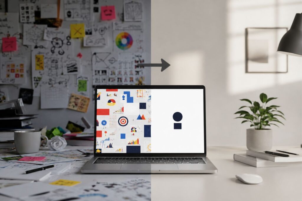
The Creative Riz Approach to Minimalism
Crafting a truly minimal brand is significantly harder than designing a complex one. It requires deep, strategic restraint to distill a massive corporation’s identity down to its absolute purest essence.
At Creative Riz, we do not just draw logos we fundamentally re-engineer how your company is perceived by the high-ticket buyers you need to attract.
To achieve this level of undeniable visual authority, our process requires a radical departure from traditional design workflows.
Here is exactly how we execute the transformation from cluttered to commanding:
- The Unforgiving Audit: We begin with an aggressive, microscopic evaluation of every single visual asset your company owns, identifying the exact friction points where you are losing market trust.
- Ruthless Elimination: We strip away the noise, eliminating any color, graphic, or font that does not directly serve a specific, revenue-driving communication goal.
- Flawless Scalability: We build a resilient, stripped-down identity framework that is engineered to scale perfectly across every future digital platform, from mobile screens to massive corporate pitch decks.
This deliberate, highly disciplined approach guarantees that your brand commands the room before you ever say a single word.
Deploying Minimalism Across All Touchpoints
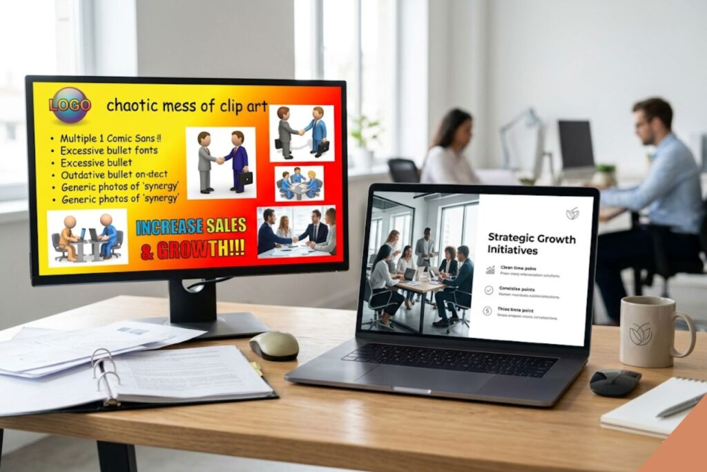
A beautifully minimal logo is completely useless if your sales pitch deck remains a chaotic mess of clip art. True market trust is not built in a single interaction; it is cemented through relentless, unyielding visual consistency.
To project absolute authority, your streamlined identity must be deployed flawlessly across every digital and physical touchpoint your client encounters.
When your brand aesthetics fracture, client trust fractures with it. Here is exactly how to engineer a flawless, omnichannel minimalist ecosystem:
- The Corporate Website: Strip away heavy background videos and intrusive pop-ups, focusing instead on ultra-fast load times, bold typography, and clear, single-step navigation.
- The Pitch Deck: Eradicate massive walls of text by using one powerful, isolated statistic per slide, utilizing generous white space to force the boardroom to focus.
- The Social Feed: Stop posting busy, text-heavy flyers and transition entirely to clean, high-contrast text graphics and highly curated, professional photography.
- The Backend Software: Carry the exact same minimal aesthetic into your client portals and user dashboards so the premium experience never stops after the sale.
To understand the immense financial value of this consistency, consider these real-world transformations:
Mini Case Snapshot: The High-Stakes Enterprise Pitch
- The Bottleneck: A B2B software firm was losing major enterprise deals at the final presentation stage due to cluttered, 40-slide pitch decks that overwhelmed decision-makers.
- The Minimalist Fix: We stripped the deck down to 12 slides, utilizing stark white backgrounds and highlighting a single, bold purple metric per page to guide the narrative.
- The ROI: The executive team maintained absolute focus during the pitch, leading to a frictionless Q&A session and a 60% increase in closed enterprise contracts.
Mini Case Snapshot: The Disconnected Client Portal
- The Bottleneck: A corporate consultancy had a beautiful, modern public website, but their post-sale client dashboard looked like a chaotic, disorganized spreadsheet from 2005.
- The Minimalist Fix: We re-engineered the backend portal to perfectly mirror the clean typography, intuitive navigation, and high-contrast color system of their public brand.
- The ROI: Client retention surged immediately because the premium, authoritative experience remained consistent from the very first marketing click to their daily operational usage.
The Fear of “Looking Boring”
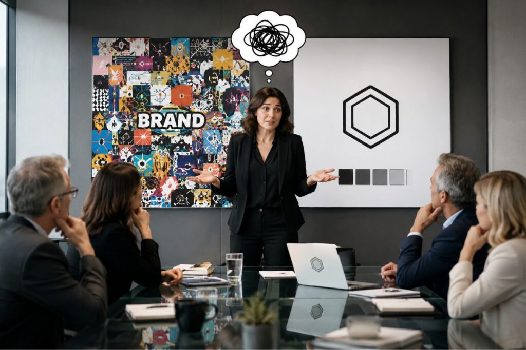
When pitching a minimalist rebrand, the most common hesitation from executive leadership is the terrifying fear of “looking boring.” This anxiety stems from a massive industry misconception: the false belief that visual complexity equals creative value.
Stop confusing visual noise with brand authority. True creativity is finding the absolute simplest way to solve a complex communication problem.
A minimal corporate identity is never boring it is sharp, highly focused, and unapologetically confident. When your competitors are desperately screaming for attention with chaotic, messy graphics, your quiet elegance becomes the ultimate pattern interrupt. It forces the entire market to stop, lean in, and actually listen to what you have to say.
To overcome this internal leadership hurdle, you must look at how the market actually interprets design choices:
| The Leadership Fear | The Market Reality | The Business Outcome |
| “A simple logo won’t stand out.” | Simple logos scale perfectly, load instantly, and are recognized at a glance. | Higher brand recall across all digital platforms and physical media. |
| “We need more colors to look creative.” | Excessive colors cause cognitive fatigue and look distinctly amateurish. | A restrained palette immediately projects premium, enterprise-level authority. |
| “Minimalism is just empty space.” | Strategic negative space directs the eye straight to your primary value proposition. | Faster comprehension, reduced friction, and significantly higher conversion rates. |
When you embrace the power of restraint, you stop fighting for attention and start commanding it.
Final Thoughts: Respecting Your Client’s Time
The era of loud, chaotic marketing graphics in the B2B space is completely over. Corporate decision makers reward brands that respect their time and provide absolute visual clarity.
By embracing the minimalist advantage, you signal to the market that you are a premium, trustworthy authority. You remove the friction from the buying process.
If your visual identity is currently holding your business back, a professional brand audit is the critical first step. We specialize in crafting high-impact, frictionless identities for ambitious brands across the globe.
Frequently Asked Questions (FAQs)
1. Does minimalism mean my brand can only be black and white?
Absolutely not. Minimalism is about the number of elements used, not a lack of color. A minimal brand can use a very bright, vibrant color palette, as long as it is highly disciplined, uses plenty of negative space, and avoids visual clutter like heavy gradients or unnecessary patterns.
2. We have been using the same complex logo for ten years. Will changing it hurt our brand recognition?
If executed correctly by a professional agency, a minimalist evolution strengthens recognition. Think of brands like Apple, Mastercard, or Starbucks; they have all systematically stripped away complex details from their legacy logos over the years, resulting in modern, instantly recognizable, and highly scalable icons.
3. How long does a complete corporate visual rebranding process typically take?
For an enterprise-level rebrand, the process generally takes anywhere from 4 to 8 weeks. This allows time for deep strategic auditing, conceptual design, rigorous testing of the new identity across digital and print mediums, and the final rollout of the comprehensive brand guidelines.