The Friction Breakdown: Analyze a Common UX Problem and How to Solve It
The Silent Revenue Killer Why Beautiful Websites Still Lose Customers
Every click on your website is a silent conversation with your user. When that conversation gets confusing or difficult, they do not ask for clarification, they simply close the tab and take their business to your competitors.
This invisible drain on your bottom line is known as UX friction, and it can ruin even the most aesthetically perfect platforms.
In our 9+ years of engineering digital experiences, we have seen this exact scenario play out repeatedly. Today, we are breaking down one of the most expensive UX problems businesses face to help you stop the leak and reclaim your lost revenue.
Here is exactly what we will explore in this breakdown:
- The Anatomy of a Roadblock: Why convoluted checkout and onboarding flows are the leading cause of user abandonment.
- The Root Causes of Friction: How to identify the hidden digital barriers that are frustrating your potential buyers.
- The Revenue Recovery Blueprint: Actionable, proven steps to streamline your user journey and immediately boost your conversion ROI.
What is UX Friction?

UX friction is anything that prevents a user from achieving their goal effortlessly. It is the digital equivalent of a heavy, ungreased door that is hard to push open.
In design terms, it manifests as cognitive overload, confusing navigation, or unnecessary steps.
The 3 Types of Friction
- Cognitive Friction: When a user has to think too hard to understand a page’s purpose.
- Visual Friction: When cluttered layouts, poor typography, and low contrast make reading difficult.
- Interaction Friction: When buttons are too small, unresponsive, or forms demand too much typing.
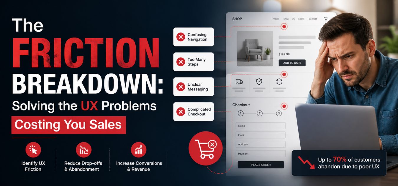
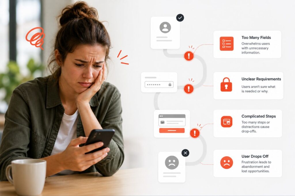
The “Interrogation” Form: Why Your Checkout is Costing You Clients

Users arrive at your checkout or sign-up page excited to take action. Instead of a seamless welcome, they crash into a massive wall of input fields: the “Interrogation” form.
Driven by the urge to quickly qualify leads, businesses mistakenly demand excessive upfront data. Asking for a phone number, company size, and full physical address before a user even creates an account instantly kills their momentum.
Every single non-essential input field you add acts as a direct barrier to entry. Users feel overwhelmed, their trust in your platform vanishes, and they abandon the page entirely.
Here is exactly how this widespread issue impacts your bottom line:
- Momentum Assassination: The excitement of a new purchase or sign-up turns into a tedious chore the moment a user sees a cluttered screen.
- Trust Erosion: Demanding irrelevant personal data like a phone number for a simple digital download makes users highly suspicious of your platform’s motives.
- Conversion Freefall: Analytics consistently show that each unnecessary form field causes a measurable, immediate drop in your overall conversion rate.
To reclaim this lost revenue, we must bridge the gap between what internal sales teams want and what digital users will actually tolerate.
| The Internal Business Goal | The Negative User Reality | The Intelligent UI/UX Solution |
| Qualify leads immediately | “This feels overwhelming and invasive.” | Progressive Disclosure: Collect secondary demographic data later. |
| Gather deep marketing data | “Why do they need my company size?” | Frictionless Entry: Require only an email and a password to start. |
| Ensure complete, verified profiles | “This takes way too much time to fill out.” | Smart Defaults: Utilize browser auto-fill and single-click social logins. |
This exact disconnect is where strategic UI/UX design transitions from a simple visual luxury into a direct, measurable driver of your business ROI.
The Anatomy of a High-Friction Experience
How do you know if your platform suffers from this specific problem?
Look for telltale signs in your analytics, heatmaps, and user feedback.
High bounce rates on specific form pages or cart pages are your first major red flag.
Let’s break down the exact elements that cause users to abandon ship.
- No Guest Checkout: Forcing users to create a permanent account just to make a single purchase.
- Hidden Costs: Revealing shipping, taxes, or setup fees only at the absolute final step.
- Lack of Visual Hierarchy: All buttons look the same, confusing the user about the next logical step.
- Vague Error Messages: Saying “Invalid Input” instead of highlighting the exact error, like “Please add an @ symbol.”
- Slow Load Times: Even a two-second delay breaks the user’s focus, introducing technical friction.
The ROI of Solving UX Friction
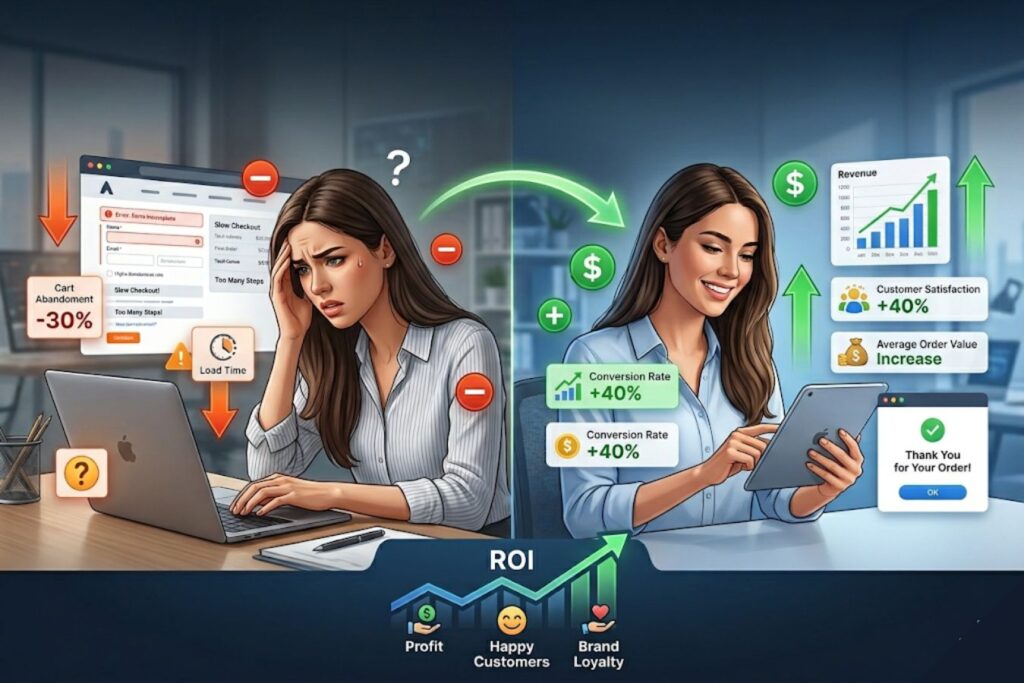
Investing in a frictionless experience is not just about making things look aesthetically pleasing.
It is a highly strategic business decision that directly impacts your bottom line.
When you remove digital barriers, more users naturally complete their intended actions.
- Increased Conversion Rates: Simpler, faster forms lead to significantly more completed purchases.
- Lower Support Costs: An intuitive, self-guiding design means fewer frustrating customer service emails.
- Higher Customer Retention: Users happily return to platforms that respect their time and are easy to use.
If your digital product is currently leaking revenue, a professional evaluation is the first step.
How to Solve It: A 4-Step Framework
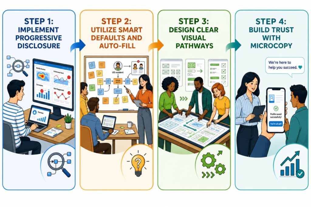
Fixing an interrogation-style form requires a strategic, human-centered approach.
You must carefully balance the business’s need for data with the user’s need for speed.
Here is the exact framework we use at Creative Riz to streamline digital platforms.
Step 1: Implement Progressive Disclosure
Do not ask for everything all at once.
Progressive disclosure means breaking a large, intimidating task into smaller, manageable chunks.
Show users only the information they absolutely need at that specific moment.
- Phase 1: Ask only for the email and password to get them into the system immediately.
- Phase 2: Ask for shipping or billing details only when they initiate a purchase.
- Phase 3: Ask for deeper demographic data later, perhaps as an optional profile setup step.
Step 2: Utilize Smart Defaults and Auto-Fill
Computers are smart; let them do the heavy lifting for your users.
Every keystroke you save your user is a massive drop of friction removed from the process.
Use modern web capabilities like geolocation to pre-fill country codes or zip codes automatically.
- Enable browser auto-fill attributes for names, addresses, and credit card details.
- Set the most common choices (like standard shipping) as the default selected option.
- Use real-time inline validation (green checkmarks) as they type, rather than red text after they submit.
Step 3: Design Clear Visual Pathways
Your user should never, ever have to guess what to click next.
We prioritize strict visual hierarchy in all of our branding and UI projects.
The primary action (e.g., “Continue to Payment”) must be impossible to miss.
- Make the primary button large, high-contrast, and clearly labeled with actionable text.
- Make secondary actions (e.g., “Cancel” or “Go Back”) visually subdued as text links or outlined buttons.
- Use subtle directional cues to guide the eye downward toward the conversion point.
Step 4: Build Trust with Microcopy
Friction isn’t just physical on the screen; it’s psychological in the user’s mind.
Users hesitate and stop typing when they are unsure what will happen with their data.
Microcopy the small bits of text on buttons and under fields is your secret weapon here.
- Under an email input field, simply add: “We respect your privacy and will never spam you.”
- On a final payment button, write: “Secure Checkout” accompanied by a recognizable padlock icon.
- Instead of the robotic word “Submit,” use action-oriented, value-driven words like “Get Your Free Report.”
Comparing the Experiences
To truly understand the impact of good design, let’s look at a side-by-side comparison.
This table illustrates the stark difference between an agency-level design and a generic template.
Small changes in layout and feedback create a drastically different emotional response.
| Feature | High-Friction Design (The Problem) | Low-Friction Design (The Solution) |
| Layout | Cluttered, multiple columns, heavy blocks of text. | Single, focused column with generous whitespace. |
| Error Handling | Red text grouped at the top of the page after clicking submit. | Real-time inline validation as the user types. |
| Call to Action | Multiple buttons fighting for equal visual weight. | One clear, high-contrast primary action button. |
| Data Entry | Manual entry required for every single address field. | Auto-fill enabled with smart zip-code lookups. |
| Trust Signals | No security badges, guarantees, or privacy reassurances. | Clear privacy guarantees and recognized secure icons. |
Real-World Application: The Creative Riz Approach
Theory and best practices are great, but flawless execution is what drives real business growth.
When partnering with growing brands in Pakistan and globally, our agency focuses purely on measurable results.
Design must always serve a functional, commercial purpose.
Consider a recent scenario where a fast-growing client struggled with an overwhelming checkout page.
Users were enthusiastically adding items to their cart, but abandoning the site at the final step.
Our team stepped in to completely redesign and engineer their conversion pathway.
- What We Did: We broke the interrogation form into a seamless, multi-step progress bar.
- The Result: A highly engaged user base and a massive, immediate drop in cart abandonment.
- The Lesson: Human-centered design directly translates to increased revenue and brand loyalty.
Want to see more real-world results? Browse our work to see how we solve complex UI/UX challenges.
Beyond the Surface: Why Technical Performance is the Ultimate UX Pillar

If a beautifully designed checkout page takes five seconds to load, its visual appeal is quickly lost to user frustration.
This is where seamless, secure full-stack development becomes the invisible foundation of user experience.
Even the most intuitive interface fails without strong underlying performance. Speed, reliability, and security are essential pillars of modern, human-centered design.
Here is why technical performance dictates the success of your digital product:
- The Speed Mandate: A slow server response or a delayed API call immediately breaks the user’s concentration, reintroducing the exact friction you designed away.
- Asset Optimization: Heavy, uncompressed images and bloated scripts cause layout shifts, making buttons jump just as a user tries to click them.
- Database Efficiency: Clunky database architecture (like N+1 query issues) slows down dynamic content rendering, causing users to abandon carts before the items even appear.
To understand how design and development must work in tandem, review this breakdown of common technical failures and how we solve them:
| The UX Symptom (What Users Feel) | The Technical Cause (Under the Hood) | The Full-Stack Solution |
|---|---|---|
| The “Infinite Spinner” | Slow backend API responses or highly unoptimized database queries. | Streamlined database architecture and intelligent server-side caching. |
| Janky Scrolling & Jumping Text | Uncompressed media files and heavy scripts loading inconsistently. | Strict asset optimization, modern formats (WebP), and lazy-loading protocols. |
| Unexpected Checkout Timeouts | Inefficient third-party routing or insecure server configurations. | Robust, scalable backend infrastructure utilizing secure endpoints and rate limiting. |
Sustaining a Frictionless Environment
UX design is not a one-time project that you “set and forget.”
It is an ongoing, iterative process of optimization, testing, and refinement.
User expectations constantly evolve, and new technologies rapidly change how we interact with screens.
- A/B Testing: Constantly test different button colors, microcopy variations, and page layouts.
- Behavior Analytics: Use heatmaps to see exactly where users click, scroll, and where they get stuck.
- Direct Feedback: Never be afraid to simply ask your users what frustrated them about their experience.
If you are ready to eliminate friction and scale your brand’s digital presence, we are here to help.
Our holistic approach combines deep branding, premium UI/UX, and robust development to build seamless platforms.
Contact our team today to start engineering a frictionless experience for your users.
Frequently Asked Questions (FAQs)
How do I identify the biggest friction points currently on my website?
Start by analyzing your analytics platform to find pages with the highest bounce rates or exit rates. Combine this quantitative data with qualitative tools like session recordings to see exactly where users hesitate, repeatedly click, or abandon their journey.
Does removing UX friction always mean deleting features or content?
No. Removing friction is about clarity and hierarchy, not necessarily extreme minimalism. It means organizing features logically, using progressive disclosure to hide complex options until they are needed, and ensuring the interface guides the user naturally.
How long does a professional UI/UX audit typically take to complete?
A comprehensive UI/UX audit generally takes between one to three weeks, depending heavily on the size of the platform. This allows experts ample time to review analytics, conduct heuristic evaluations, and map out a strategic, prioritized plan for redesign.