12 Must-Have Sustainable Font Choices in Digital Design Now
Why Choosing the Right Fonts Matters in Digital Design?
Sustainable font choices in digital design are essential for improving readability, reinforcing brand identity, and enhancing user experience. The right fonts set the tone, convey emotions, and make content accessible to all users. A well-chosen font boosts engagement and ensures your message is clear, while the wrong font can detract from your design’s effectiveness.
- Boosts readability and clarity
- Reinforces brand identity
- Enhances overall user experience
- Conveys the right emotions
- Ensures accessibility for all users
- Supports cohesive design aesthetics
12 Must-Have Sustainable Font Choices in Digital Design Now
In digital design, Sustainable Font Choices in Digital Design are increasingly vital. Designers are more aware of their environmental impact, striving to create stunning, functional designs while minimizing their ecological footprint. A key element in sustainable design is font choice—sustainable fonts are optimized for efficiency, with reduced file sizes and lower data demands, which cuts energy consumption and boosts project performance.
This guide highlights 12 essential sustainable fonts that are revolutionizing the field. These fonts are not only beautiful and versatile but also eco-friendly, making them perfect for today’s eco-conscious designers.
1. Roboto
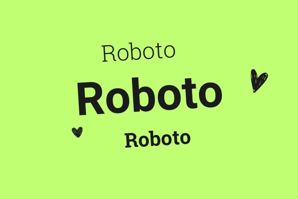
Roboto is a sans-serif typeface family developed by Google as part of the Android operating system. Known for its clean, modern look, and excellent readability, Roboto has become a staple in digital design.
Sustainability Features:
- Optimized File Size: Roboto’s file size is relatively small compared to other typefaces, reducing the amount of data transferred over the web. This efficiency helps lower the energy consumption associated with font rendering.
- Variable Fonts: The variable font format allows designers to use multiple font styles and weights from a single file, further minimizing the need for multiple font files. This reduces server load and speeds up page load times, contributing to overall energy savings.
Usage:
Roboto is a versatile font that works well for both body text and headings. Its clean lines and modern appearance make it suitable for a wide range of applications, from websites and apps to printed materials.
Case Study:
Roboto is the default font in the Android operating system, ensuring text remains clear and legible on various screen sizes and resolutions. Its widespread use in Google’s ecosystem, including apps like Google Maps and YouTube, demonstrates its versatility and sustainability.
2. Lato
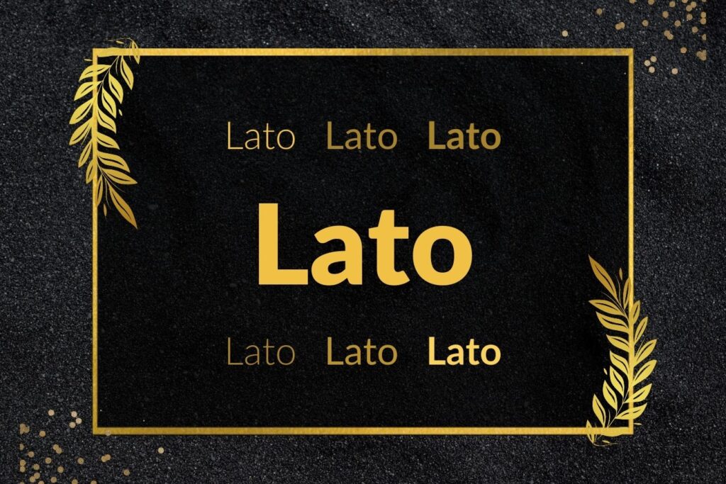
Lato is a sans-serif typeface family designed by Łukasz Dziedzic. Initially created as a set of corporate fonts, Lato has gained popularity in digital applications due to its clean and professional look.
Sustainability Features:
- Efficient Design: Lato’s design focuses on legibility and clarity, ensuring text remains readable at various sizes and resolutions. This efficiency reduces the need for multiple font weights and styles, simplifying the design process and minimizing data usage.
- Web Optimization: Lato is optimized for web use, with a small file size that ensures fast loading times. This optimization reduces server load and energy consumption, making it an eco-friendly choice for digital designers.
Usage:
Lato is an excellent choice for both body text and headings. Its professional appearance makes it suitable for corporate websites, blogs, and online publications.
Case Study:
Lato is widely used on Medium, where its readability and clean design contribute to an enjoyable reading experience. Its efficient design ensures that articles load quickly, providing a seamless user experience while promoting sustainability.
3. Open Sans
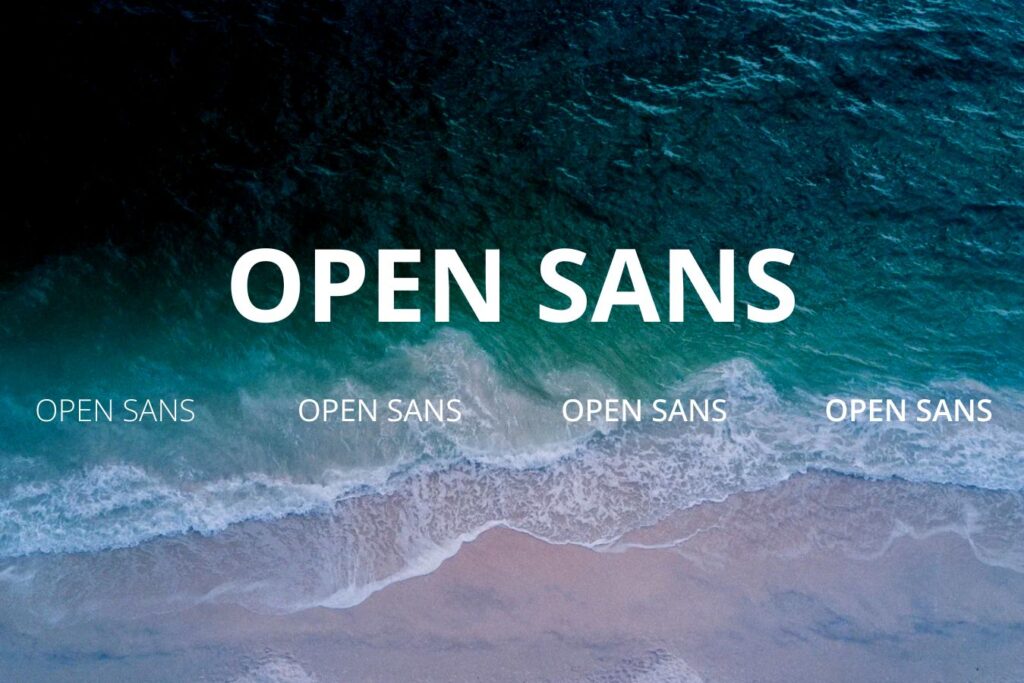
Open Sans, designed by Steve Matteson, is a widely used sans-serif typeface known for its friendly and neutral appearance. This font’s versatility makes it suitable for a wide range of applications.
Sustainability Features:
- Versatility: Open Sans includes a large number of characters and weights, reducing the need for multiple font families. This consolidation minimizes data transfer and server load, contributing to a more sustainable web environment.
- Performance: The typeface is optimized for web use, offering small file sizes and fast load times. This efficiency ensures that websites using Open Sans load quickly, reducing energy consumption and improving user experience.
Usage:
Open Sans is ideal for both body text and headings. Its neutral appearance makes it suitable for various design contexts, from corporate websites to personal blogs.
Case Study:
Open Sans is the default font for many Google services, including Google Maps and Google Docs. Its widespread use in Google’s ecosystem highlights its versatility and sustainability, ensuring clear and readable text across different applications and devices.
4. Montserrat
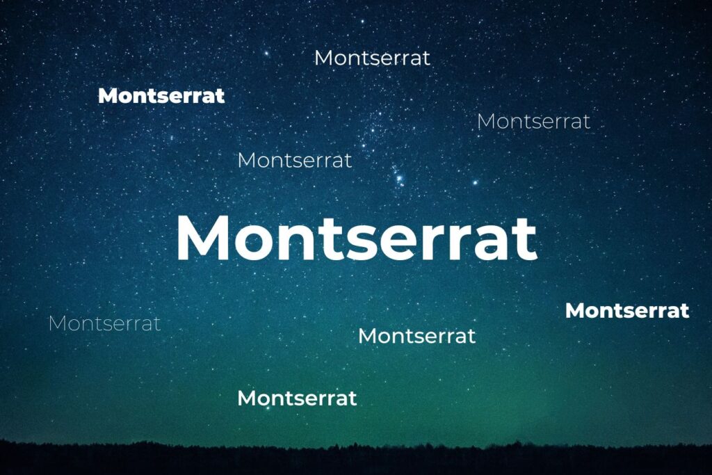
Montserrat, designed by Julieta Ulanovsky, is a geometric sans-serif typeface inspired by old posters and signs in Buenos Aires. This font brings a touch of vintage charm to modern digital design.
Sustainability Features:
- Minimalist Design: Montserrat’s clean lines and geometric shapes contribute to its efficiency, requiring less data to render. This minimalist approach reduces server load and speeds up page load times, promoting sustainable web design practices.
- Open Source: As an open-source font, Montserrat is freely available, encouraging widespread use and reducing the need for proprietary fonts with larger file sizes. This accessibility supports the broader adoption of sustainable design practices.
Usage:
Montserrat is well-suited for headings and display text. Its geometric shapes and clean lines give it a distinctive and modern appearance, making it ideal for branding, advertising, and web design.
Case Study:
Montserrat is used extensively on websites and in branding projects, particularly for tech companies and startups. Its clean and modern appearance, combined with its efficient design, makes it a popular choice for sustainable digital design.
5. Source Sans Pro
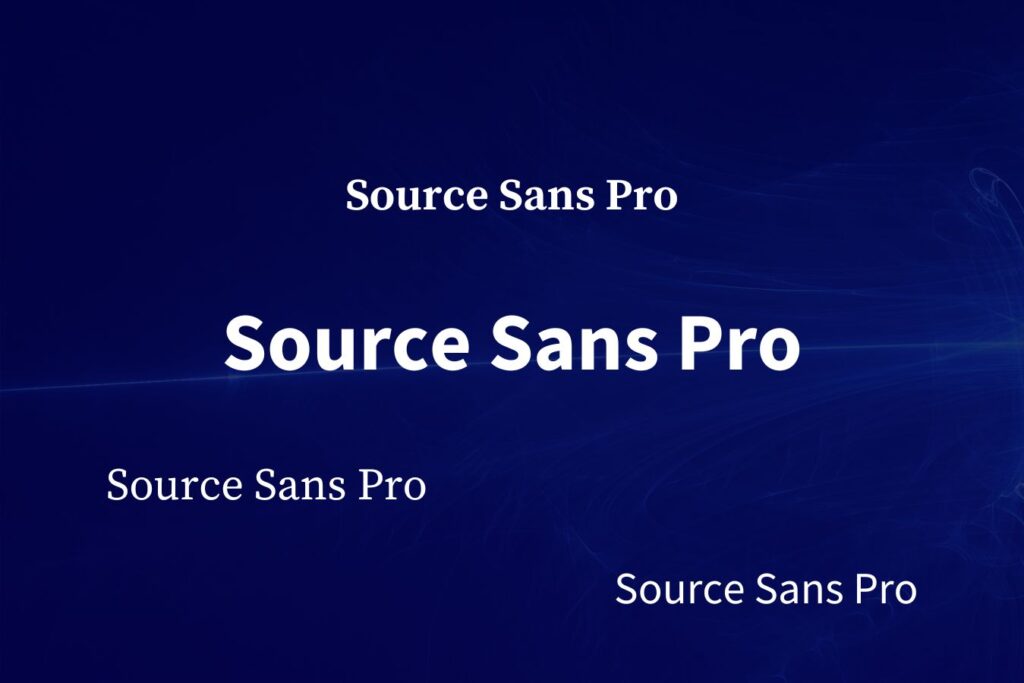
Source Sans Pro, Adobe’s first open-source typeface family, was designed by Paul D. Hunt. This sans-serif typeface pairs well with other fonts, making it a versatile choice for digital design.
Sustainability Features:
- Open Source: Being open-source, Source Sans Pro is freely available, promoting its use in sustainable design practices. This accessibility encourages designers to choose eco-friendly fonts, reducing reliance on proprietary options with larger file sizes.
- Efficiency: The font is designed to be highly legible and efficient, with a small file size that enhances web performance. This efficiency reduces data transfer and server load, contributing to overall energy savings.
Usage:
Source Sans Pro is suitable for both body text and headings. Its clean and professional appearance makes it ideal for corporate websites, blogs, and online publications.
Case Study:
Source Sans Pro is used on numerous websites, including Adobe Fonts. Its efficient design and readability make it a popular choice for sustainable digital design, ensuring that websites load quickly and provide a seamless user experience.
6. Raleway
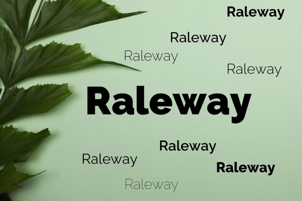
Raleway, designed by Matt McInerney, Pablo Impallari, and Rodrigo Fuenzalida, is an elegant sans-serif typeface family. Known for its sleek and modern look, Raleway is ideal for contemporary digital designs.
Sustainability Features:
- Variable Fonts: Raleway is available in variable font formats, allowing designers to use different weights and styles from a single file. This consolidation minimizes data transfer and server load, promoting sustainable web design practices.
- Legibility: The font’s design ensures high legibility across various devices, reducing the need for additional font weights and styles.
Usage:
Raleway is well-suited for headings and display text. Its elegant and modern appearance makes it ideal for branding, advertising, and web design.
Case Study:
Raleway is used extensively on websites and in branding projects, particularly for fashion brands and creative agencies. Its sleek and modern look, combined with its efficient design, makes it a popular choice for sustainable digital design.
7. PT Sans
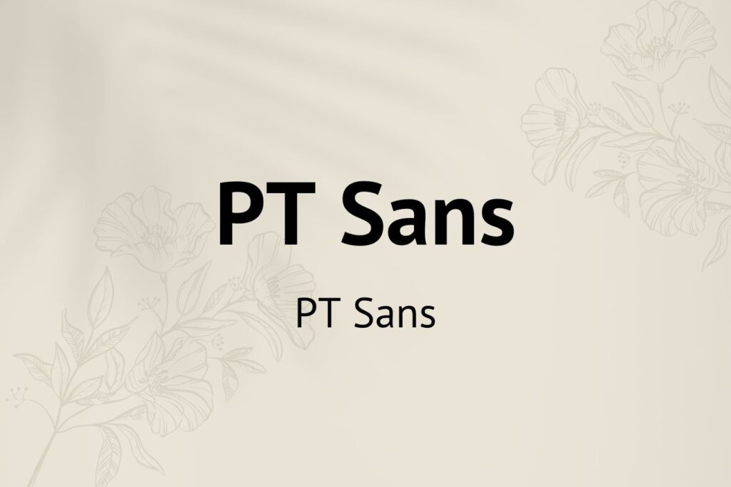
PT Sans, designed by ParaType, is a humanist sans-serif typeface. Developed as part of the Public Types of the Russian Federation project, PT Sans is known for its readability and versatility.
Sustainability Features:
- Public Domain: PT Sans is available in the public domain, encouraging its use in sustainable design projects. This accessibility supports the broader adoption of eco-friendly design practices.
- Efficiency: The typeface is designed to be legible at small sizes, making it an efficient choice for web and mobile applications. This efficiency reduces data transfer and server load, contributing to overall energy savings.
Usage:
PT Sans is suitable for both body text and headings. Its humanist design makes it ideal for websites, blogs, and online publications.
Case Study:
PT Sans is used on numerous websites and in various design projects. Its efficient design and readability make it a popular choice for sustainable digital design, ensuring that websites load quickly and provide a seamless user experience.
8. Merriweather
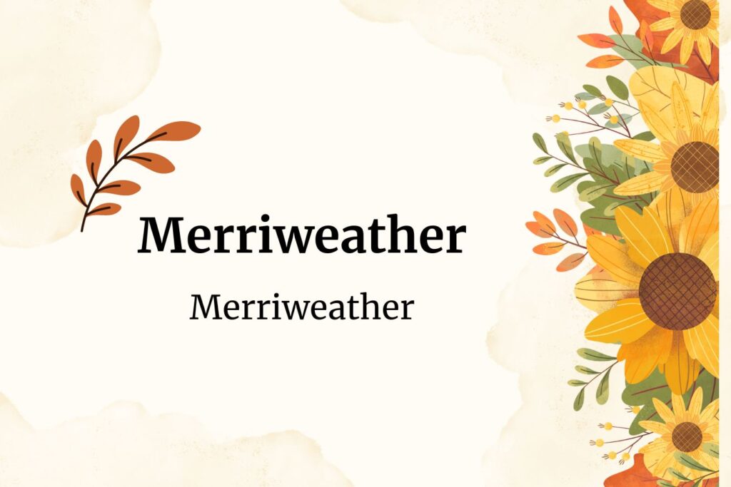
Merriweather, designed by Eben Sorkin, is a serif typeface optimized for screen readability. This font is a popular choice for digital design projects that require a serif font.
Sustainability Features:
- Screen Optimization: Merriweather is designed specifically for digital screens, ensuring high readability and efficient rendering. This optimization reduces data transfer and server load, promoting sustainable web design practices.
- Open Source: The font is available as an open-source typeface, encouraging its use in sustainable design projects. This accessibility supports the broader adoption of eco-friendly design practices.
Usage:
Merriweather is suitable for both body text and headings. Its classic serif design makes it ideal for websites, blogs, and online publications.
Case Study:
Merriweather is used extensively on websites and in digital publications. Its efficient design and readability make it a popular choice for sustainable digital design, ensuring that websites load quickly and provide a seamless user experience.
9. Work Sans
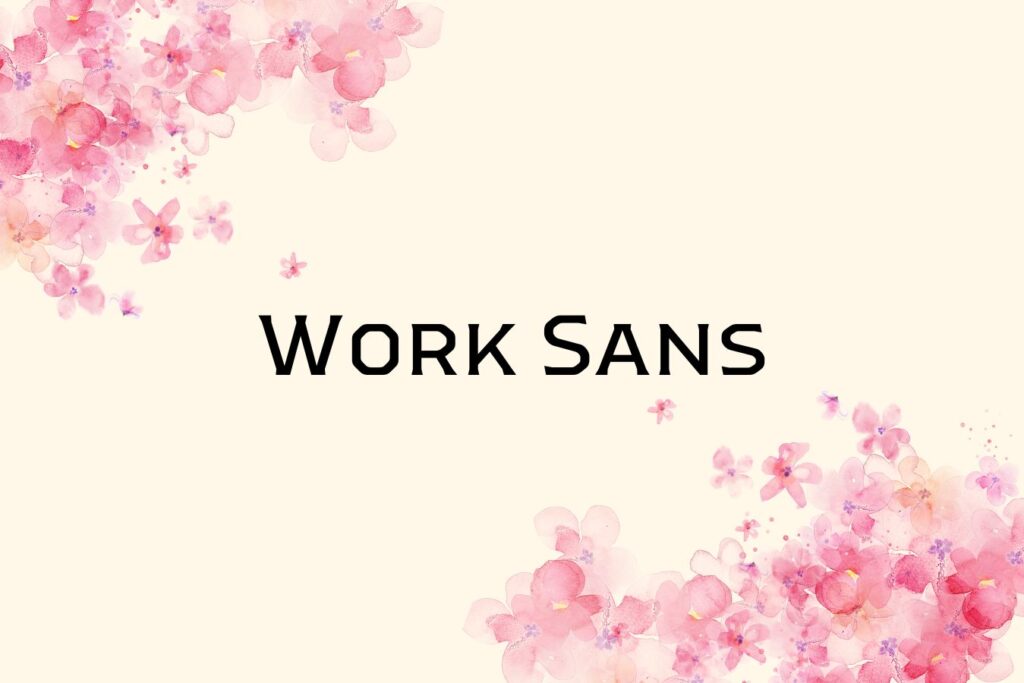
Work Sans, designed by Wei Huang, is a sans-serif typeface family based on early grotesque typefaces. It is optimized for on-screen text, making it an ideal choice for digital design.
Sustainability Features:
- Web Optimization: Work Sans is optimized for web use, with small file sizes that ensure fast loading times. This optimization reduces server load and energy consumption, making it an eco-friendly choice for digital designers.
- Variable Fonts: The typeface is available in variable font formats, allowing designers to use different weights and styles from a single file. This consolidation minimizes data transfer and server load, promoting sustainable web design practices.
Usage:
Work Sans is suitable for both body text and headings. Its clean and modern design makes it ideal for websites, blogs, and online publications.
Case Study:
Work Sans is used on numerous websites and in digital publications. Its efficient design and readability make it a popular choice for sustainable digital design, ensuring that websites load quickly and provide a seamless user experience.
10. Poppins
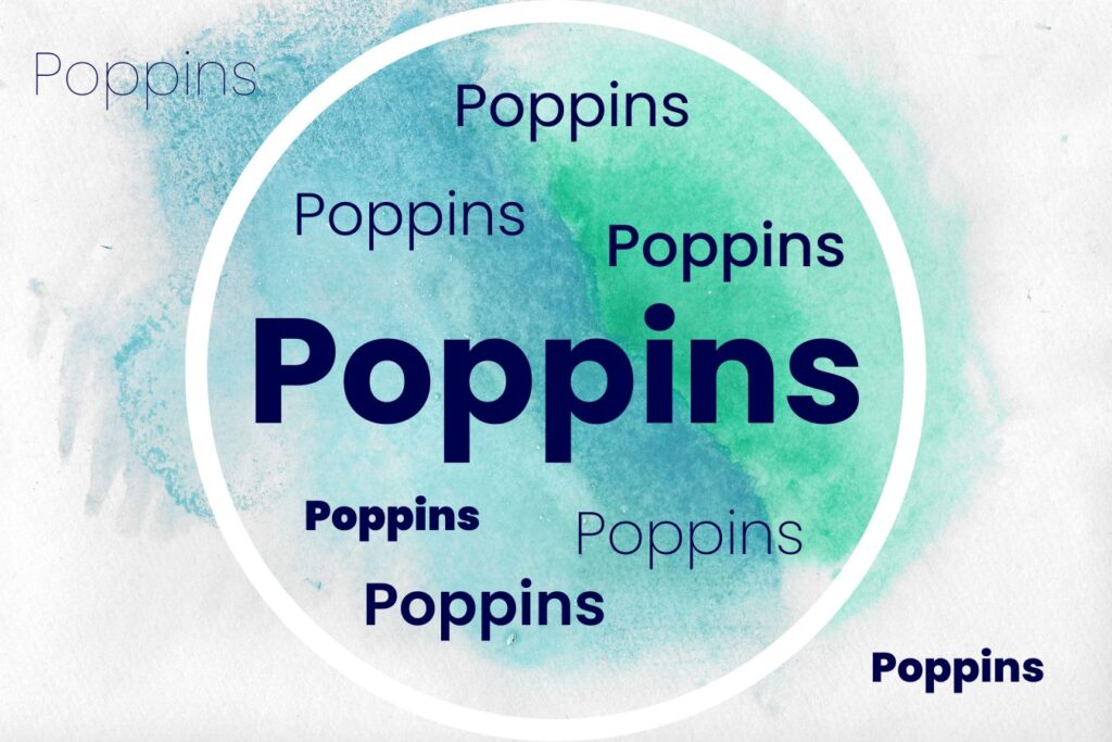
Poppins, designed by the Indian Type Foundry, is a geometric sans-serif typeface known for its clean and modern appearance. This font is ideal for contemporary digital designs.
Sustainability Features:
- Efficient Design: Poppins’ clean lines and geometric shapes contribute to its efficiency, requiring less data to render. This minimalist approach reduces server load and speeds up page load times, promoting sustainable web design practices.
- Variable Fonts: The variable font format allows designers to use different weights and styles from a single file. This consolidation minimizes data transfer and server load, contributing to overall energy savings.
Usage:
Poppins is well-suited for headings and display text. Its geometric shapes and clean lines give it a distinctive and modern appearance, making it ideal for branding, advertising, and web design.
Case Study:
Poppins is used extensively on websites and in branding projects, particularly for tech companies and startups. Its clean and modern appearance, combined with its efficient design, makes it a popular choice for sustainable digital design.
11. Nunito
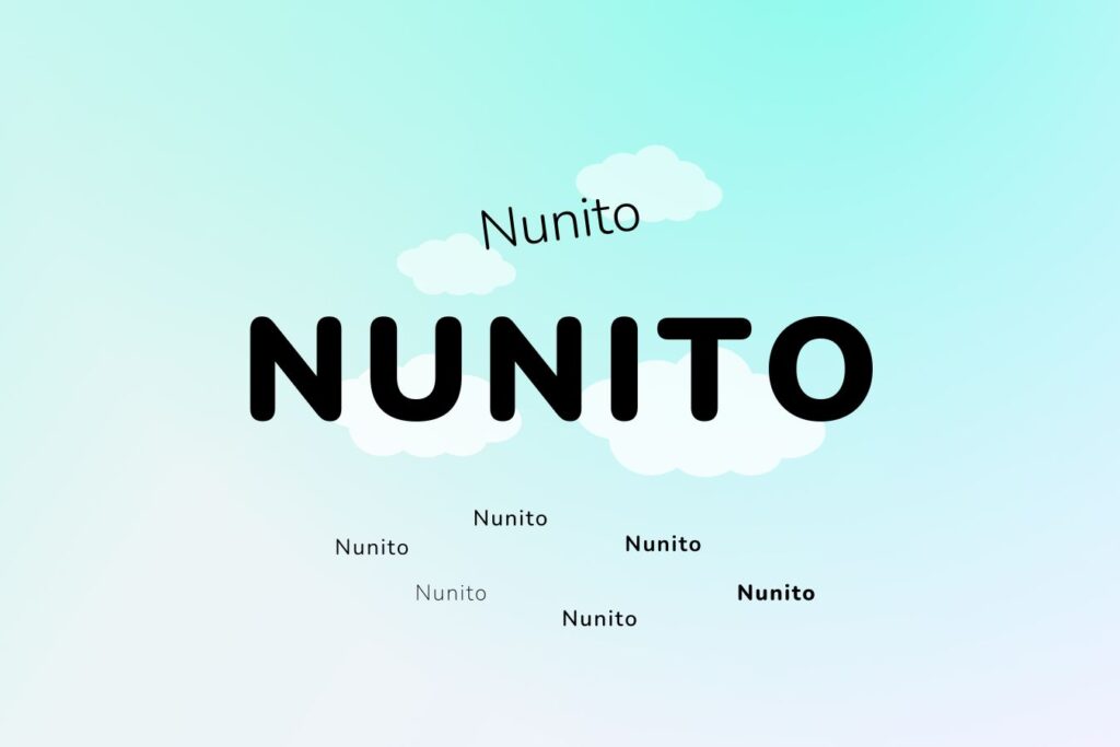
Nunito, designed by Vernon Adams, is a well-balanced sans-serif typeface known for its rounded terminals. This font’s friendly and approachable appearance makes it ideal for various digital design applications.
Sustainability Features:
- Efficient Design: Nunito’s rounded terminals and clean lines contribute to its efficiency, requiring less data to render. This minimalist approach reduces server load and speeds up page load times, promoting sustainable web design practices.
- Variable Fonts: The variable font format allows designers to use different weights and styles from a single file. This consolidation minimizes data transfer and server load, contributing to overall energy savings.
Usage:
Nunito is suitable for both body text and headings. Its friendly and approachable appearance makes it ideal for websites, blogs, and online publications.
Case Study:
Nunito is used on numerous websites and in various design projects. Its efficient design and readability make it a popular choice for sustainable digital design, ensuring that websites load quickly and provide a seamless user experience.
12. Karla
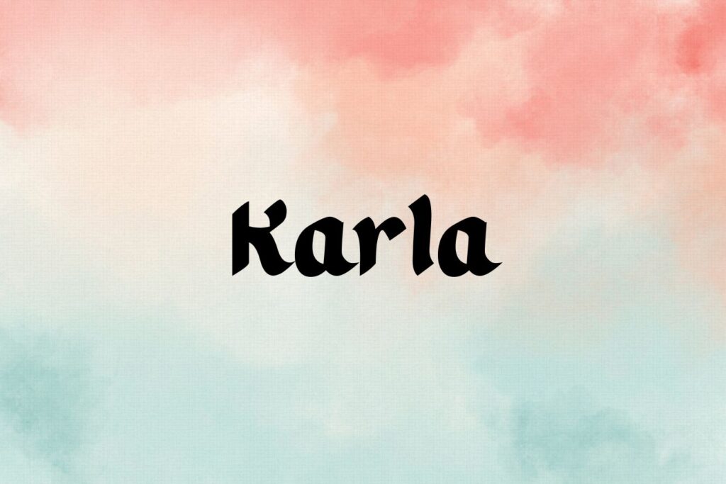
Karla, designed by Jonathan Pinhorn, is a grotesque sans-serif typeface family known for its readability and versatility. This font is ideal for various digital design applications.
Sustainability Features:
- Optimized File Size: Karla’s file size is relatively small compared to other typefaces, reducing the amount of data transferred over the web. This efficiency helps lower the energy consumption associated with font rendering.
- Legibility: The font’s design ensures high legibility across various devices, reducing the need for additional font weights and styles.
Usage:
Karla is suitable for both body text and headings. Its clean and professional appearance makes it ideal for corporate websites, blogs, and online publications.
Case Study:
Karla is used on numerous websites and in various design projects. Its efficient design and readability make it a popular choice for sustainable digital design, ensuring that websites load quickly and provide a seamless user experience.
The Impact of Sustainable Font Choices in Digital Design
Sustainable font choices in digital design offer significant benefits beyond aesthetics and performance:
- Reduced Environmental Impact: By optimizing file sizes and minimizing data transfer, sustainable fonts help reduce the carbon footprint of digital design, supporting environmental goals like reducing greenhouse gas emissions.
- Improved User Experience: Sustainable fonts focus on legibility and readability, ensuring users can easily consume content across devices, enhancing their experience.
- Cost Savings: Efficient fonts reduce server load and bandwidth usage, lowering hosting costs and improving website performance.
- Promoting Accessibility: Many sustainable fonts are designed to be legible for all users, including those with visual impairments, supporting inclusive design practices.
- Encouraging Innovation: Sustainable font development encourages designers to create eco-friendly solutions, promoting best practices and new technologies.
Best Practices for Implementing Sustainable Font Choices
To maximize the benefits of sustainable fonts, consider these best practices:
- Optimize Font Loading: Use font-display and preloading to ensure quick and efficient font loading, reducing server load and improving user experience.
- Limit Font Variants: Minimize the number of font weights and styles used to reduce data transfer and server load.
- Use Variable Fonts: Variable fonts consolidate multiple weights and styles into a single file, reducing data transfer.
- Leverage Caching: Store font files locally on users’ devices to save bandwidth and improve load times.
- Choose Open-Source Fonts: Open-source fonts promote sustainable design practices and support eco-friendly solutions.
Comparison of Sustainable Fonts
To help you choose the right sustainable font for your digital design projects, here is a summarizing the key features of each typeface:
| Font | Type | Key Features | Sustainability Aspects | Ideal Usage | Notable Example |
|---|---|---|---|---|---|
| Roboto | Sans-serif | Modern, clean, high readability | Optimized file size, variable fonts | Body text, headings | Android OS |
| Lato | Sans-serif | Professional, versatile | Efficient design, web optimization | Body text, headings | Medium |
| Open Sans | Sans-serif | Friendly, neutral, extensive character set | Versatility, performance | Body text, headings | Google Maps, Google Docs |
| Montserrat | Sans-serif | Geometric, vintage charm | Minimalist design, open source | Headings, display text | Tech companies, startups |
| Source Sans Pro | Sans-serif | Clean, professional | Open source, efficiency | Body text, headings | Adobe Fonts |
| Raleway | Sans-serif | Elegant, modern, sleek | Variable fonts, legibility | Headings, display text | Fashion brands, creative agencies |
| PT Sans | Sans-serif | Humanist, versatile | Public domain, efficiency | Body text, headings | Public Types of Russian Federation |
| Merriweather | Serif | Classic, screen-optimized | Screen optimization, open source | Body text, headings | Digital publications |
| Work Sans | Sans-serif | Based on early grotesques, optimized for screen text | Efficient design, variable fonts | Body text, headings | Corporate websites |
| Poppins | Sans-serif | Clean, modern, geometric | Efficient design, variable fonts | Headings, display text | Tech companies, startups |
| Nunito | Sans-serif | Friendly, approachable | Efficient design, variable fonts | Body text, headings | Various websites |
| Karla | Sans-serif | Readable, versatile | Optimized file size, legibility | Body text, headings | Various websites |
Conclusion
Sustainable font choices in digital design are essential for creating visually appealing, efficient, and eco-friendly designs. Fonts like Roboto, Lato, and Open Sans are optimized for web performance, ensuring fast loading times and reduced data transfer. By following best practices, designers can maximize the environmental and user experience benefits of these fonts.
Sustainable font choices in digital design are not just a trend; they are a crucial aspect of responsible design. As the industry evolves, prioritizing eco-friendly font choices will become increasingly important, paving the way for a greener, more efficient future in digital design.
Frequently Asked Questions (FAQs)
What are sustainable or eco-friendly fonts?
Sustainable or eco-friendly fonts are typefaces designed to reduce environmental impact. These fonts often use less ink, have smaller file sizes, and are created through energy-efficient processes. Sustainable Font Choices in Digital Design help minimize the carbon footprint in both digital and print design.
Why Should Digital Designers Use Sustainable Fonts?
Digital designers should use sustainable fonts to reduce the environmental impact of their projects, improve website performance, and support eco-friendly practices.
How Do Sustainable Fonts Improve Website Performance?
Sustainable fonts are often optimized for energy efficiency and loading speed, which can enhance website performance and user experience.
Where Can I Find Free Sustainable Fonts for My Projects?
Free sustainable fonts can be found on various design resources and font foundry websites that prioritize eco-friendly practices. Examples include Google Fonts and other open-source platforms.
Are Sustainable Fonts Suitable for Both Print and Digital Media?
Yes, many sustainable fonts are versatile and can be used for both print and digital media, offering consistency across various platforms.
What Are the Benefits of Using Sustainable Fonts in Web Design?
Using sustainable fonts in web design can improve loading times, reduce energy consumption, enhance readability, and align with a brand’s sustainability goals.
Can Sustainable Fonts Be Aesthetic and High-Quality?
Absolutely! Sustainable fonts are designed to be both visually appealing and eco-friendly, ensuring high quality without compromising on aesthetics.
How Can I Verify If a Font Is Truly Sustainable?
To verify a font’s sustainability, research the font’s design and production process, and check for information from the designer or foundry about their eco-friendly practices.
Do Sustainable Fonts Affect Readability on Screens?
Sustainable fonts are typically designed to enhance readability on screens, ensuring clarity and legibility across different devices and resolutions.
How Can Sustainable Fonts Contribute to My Brand’s Image?
Using sustainable fonts can enhance your brand’s image by showcasing a commitment to sustainability, which can appeal to eco-conscious consumers and improve brand perception.
What Tools Help Designers Find and Use Sustainable Fonts?
Designers can use various tools and resources, such as font repositories, sustainability-focused design blogs, and software integrations like Adobe Creative Cloud, to find and use sustainable fonts.
What makes a font eco-friendly?
Eco-friendly fonts typically:
1) Use less ink when printed.
2) Have optimized file sizes for quick loading.
3) Feature simple, efficient design to minimize environmental impact.
4) Are produced using sustainable, energy-efficient methods.
Does using an eco-friendly font affect readability?
No, using an eco-friendly font does not affect readability. These fonts are designed to be just as clear and legible as traditional fonts while being better for the environment. Whether you’re designing for digital or print, an eco-friendly font ensures your content is easy to read and aligns with sustainable practices.



2 Comments
zoritoler imol
September 12, 2024I loved as much as you’ll receive carried out right here. The sketch is tasteful, your authored subject matter stylish. nonetheless, you command get bought an impatience over that you wish be delivering the following. unwell unquestionably come more formerly again since exactly the same nearly very often inside case you shield this increase.
Admin
September 13, 2024Thank you for your kind words! I’m glad you enjoyed the content and design.